|
|
Philly-Bob’s Free-for-All 2014One man's visual art, consisting of computer manipulations of images drawn from my own photographs or from the Public Domain. |
Although I have been interested in art and graphic design all my life, I only began working seriously after I retired in 2011. The images in Philly Bob's Free-for-All are digital manipulations of images. The images are either from the Public Domain or from my own archives of photos.
I often use commercial art, illustration, and typography as a source of ideas. My images are strongly influenced by the optical textures of swirls and dots that I see when I close my eyes, and by what I see when I dream. They are also influenced by the near-hallucinations I saw under the influence of anaesthesia following open heart surgery.
For maximum effect with my images, click repeatedly on the image until it is full-size, which may be larger than your computer screen.
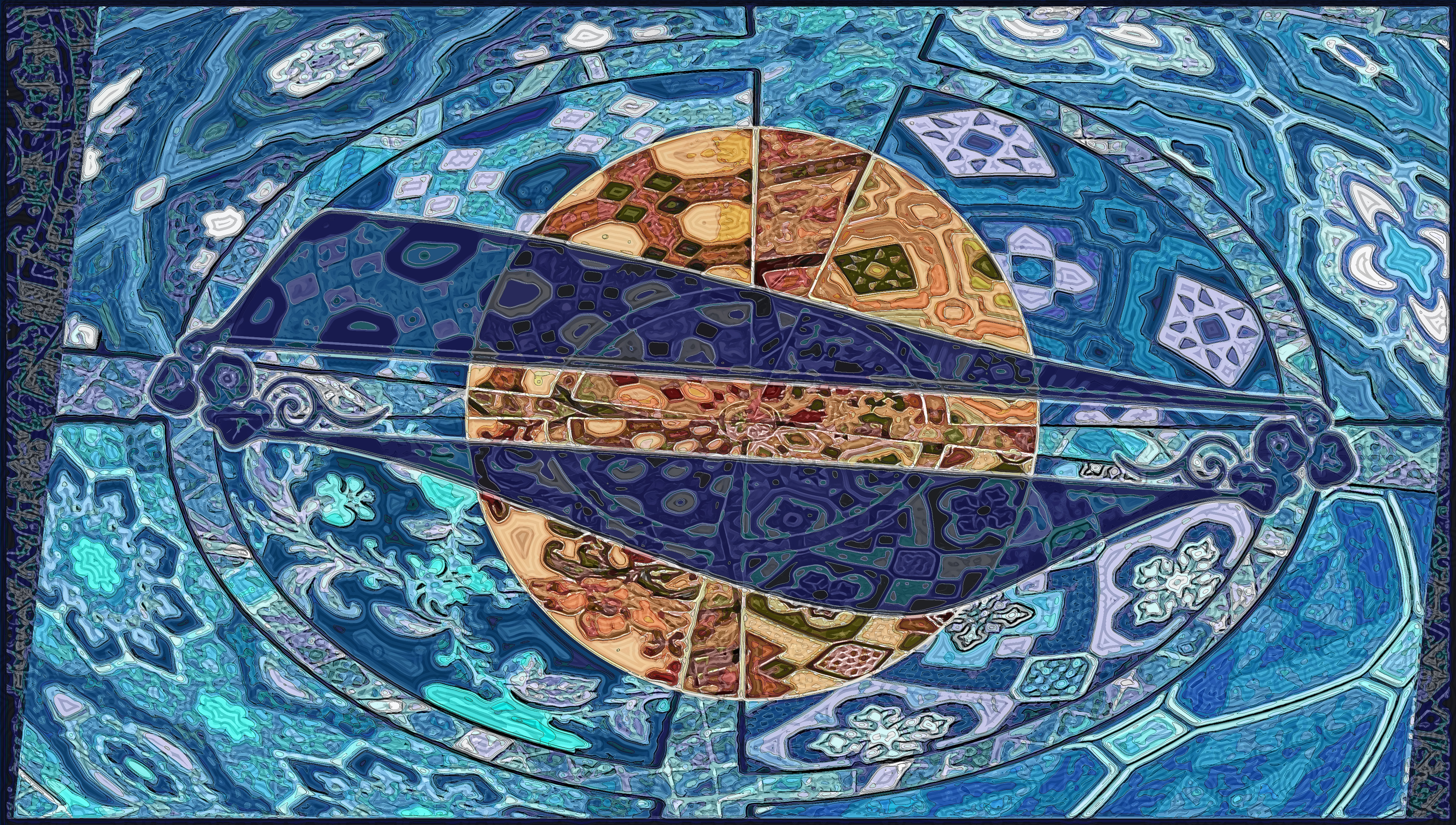
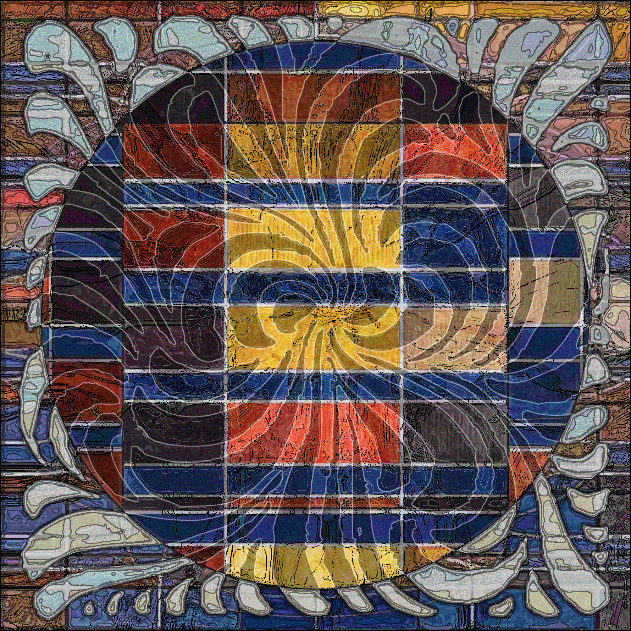
Planning of Ornament: Cleaning up my Bookmark List 2
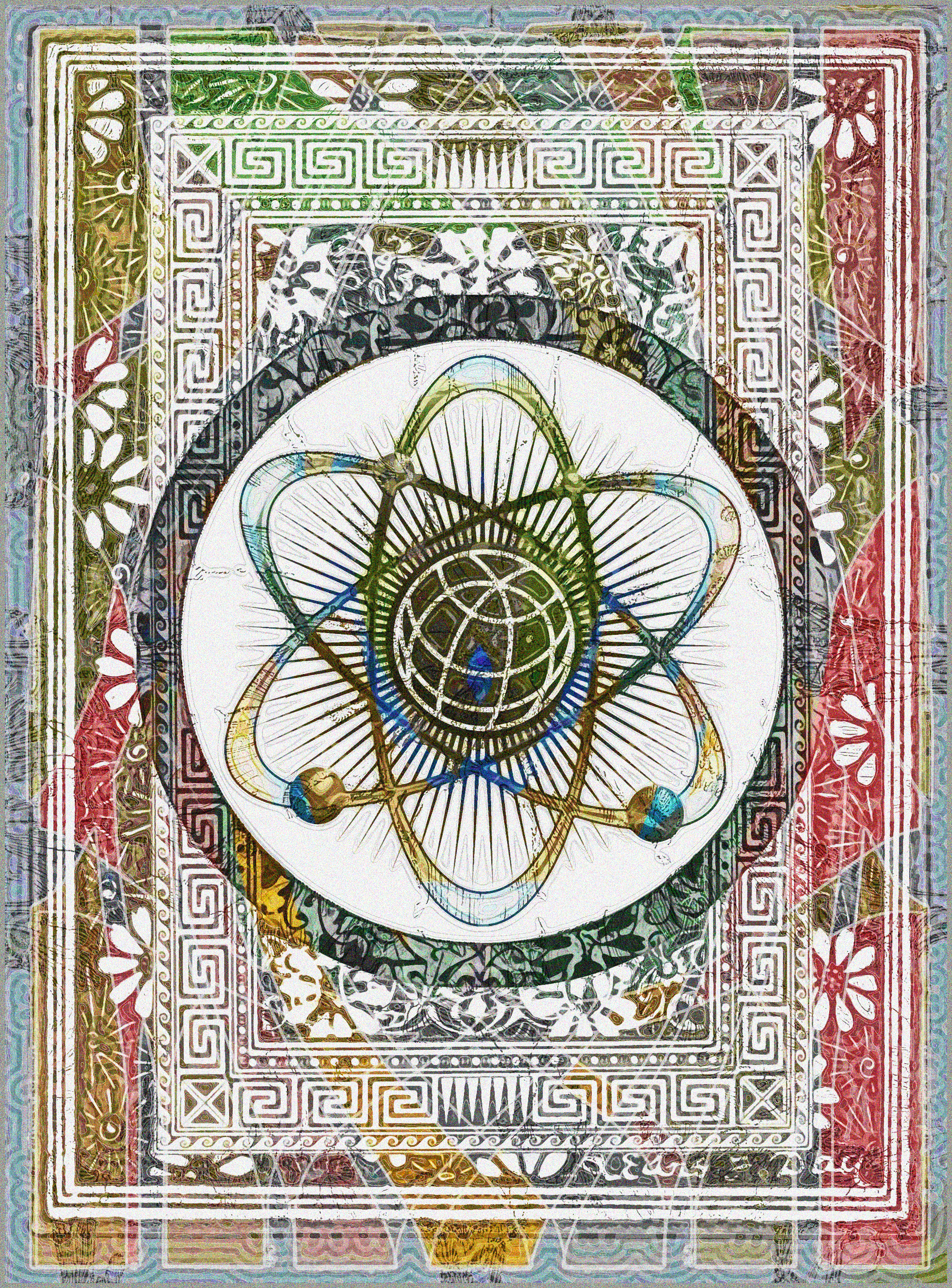
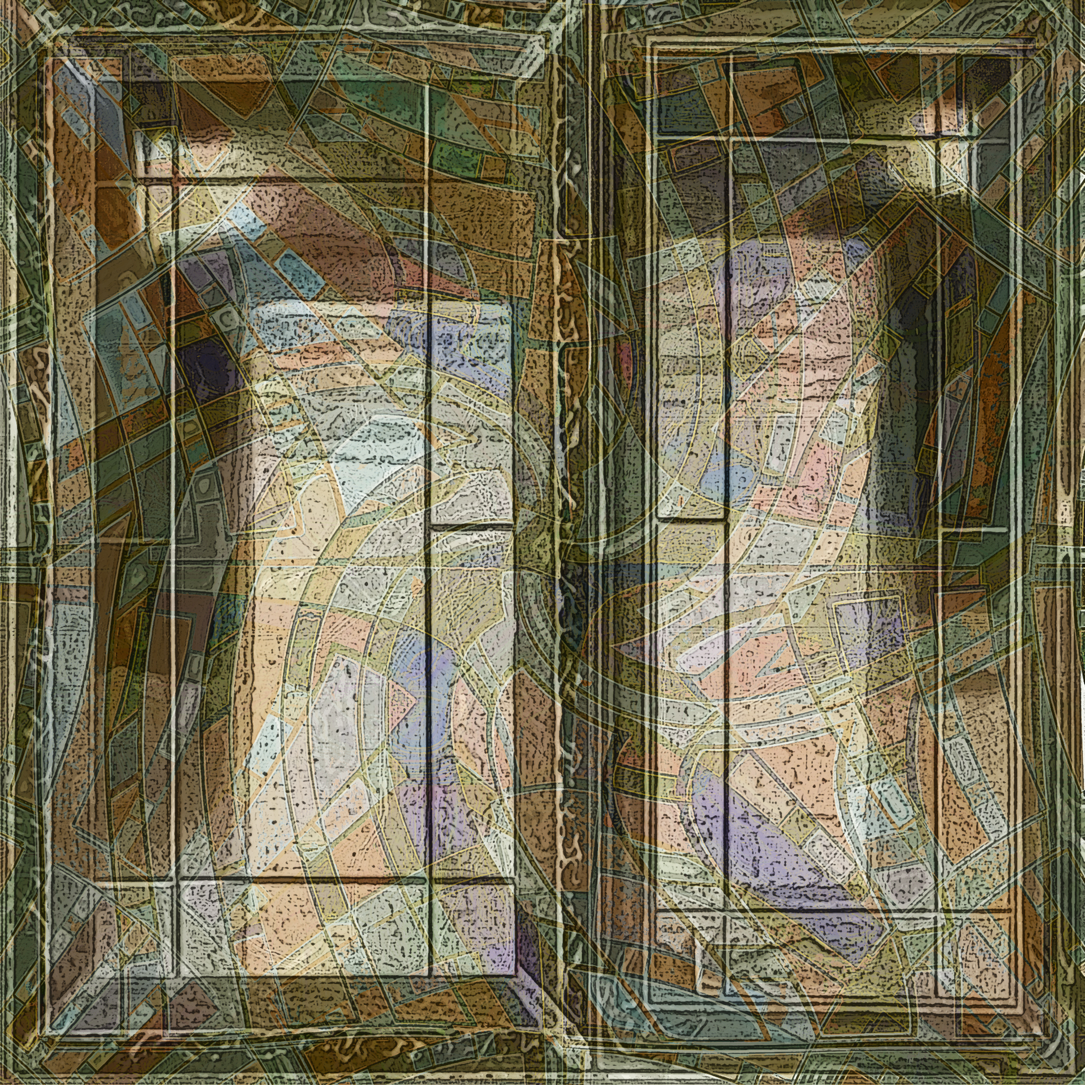
Still cleaning up my bookmark list. Here, a collage of the fine designs from the 1887 The Planning of Ornament (Link1) is a background for a radiation symbol from freegraphiclogo.com (Link2). Colors in the background are designs based on color chips in the 1930 Colors : How to Use Them in your Home (Link3).
Source:
Link1: archive.org/details/gri_33125014097261
Link2: www.freegraphiclogo.com/picture/global-atom-image-blue-vector-pixmac-vector-83581499/000083581499
Link3: archive.org/details/ColorsHowToUseThemInYourHome
January 1, 2015
Artistic Writing: Cleaning up my Bookmark List 1
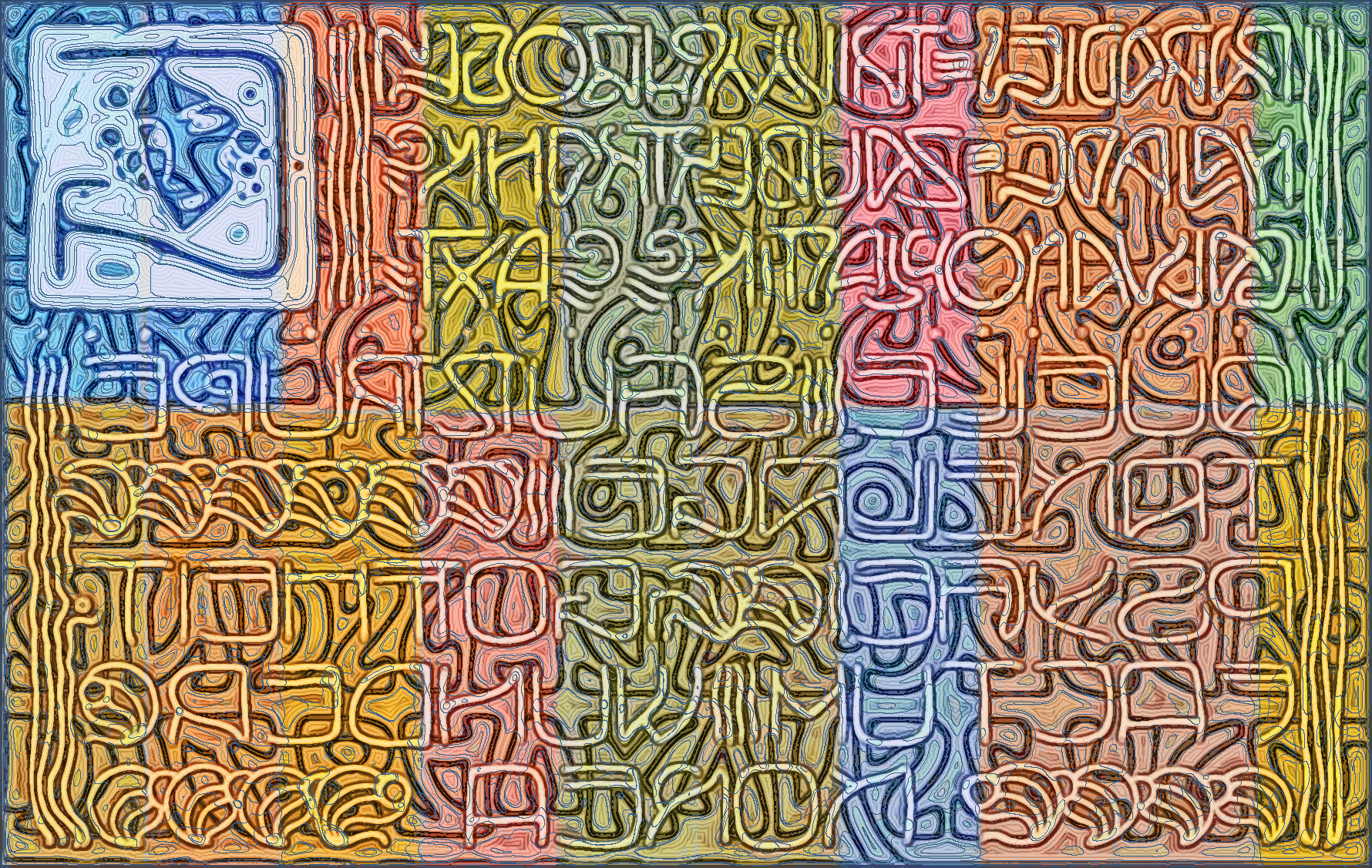
One of the tools I use to keep track of promising public domain (PD) image sources is the Internet Archive Bookmark List. The Bookmark List is my personal list of great finds; it is also publicly viewable here. When the mood hits, I go through recently uploaded PD documents, mainly from American Libraries, and bookmark the ones I want to return to. Unfortunately, I recently found out that with hundreds of documents on my list, I couldn't add any more. The list had grown because, although I intended to remove documents as soon as I used them, there were some that I especially valued; proven veterans were mixed in with the promising rookies. So I have given myself the New Year's task of pruning my Bookmark List.
Three places on the Bookmark List were filled with editions of Beispiele Kunstlerischer Schrift (Google Translate: "Examples of Artistic Writing"), collections from around 1900 of creative hand-drawn texts (Links 1-3). Here is a collage of several of these, overlaid on a composition of color samples from the 1923 Powdrpaint : A Remarkable Discovery, Reduces Cost of Painting 75% (Link4).
Source:
Link1: archive.org/details/gri_33125008890366
Link2: archive.org/details/gri_33125008890309
Link3: archive.org/details/gri_33125008890614
Link4: archive.org/details/PowdrpaintARemarkableDiscoveryReducesCostOfPainting75
December 31, 2014
Revealing Experiment in Color Inversion
<
Despite a near comatose holiday funk (connubial medical anxiety and my own aching back) and binge-watching all six seasons of The Wire, brain still working. Arose out of swamp of despair to run one simple experiment, and am surprised by the result. During the entire experiment with color chips, I was always surprised at how inversions of RGB images (left) led to very narrow range of colors (center). I decided to switch to CMYK mode, and the inversion led to a much wider range of tones and colors (right). Hmmmmmm.
December 30, 2014
1930's: Charles Atlas, Typewriter, Pipe-puffing Hobbyist
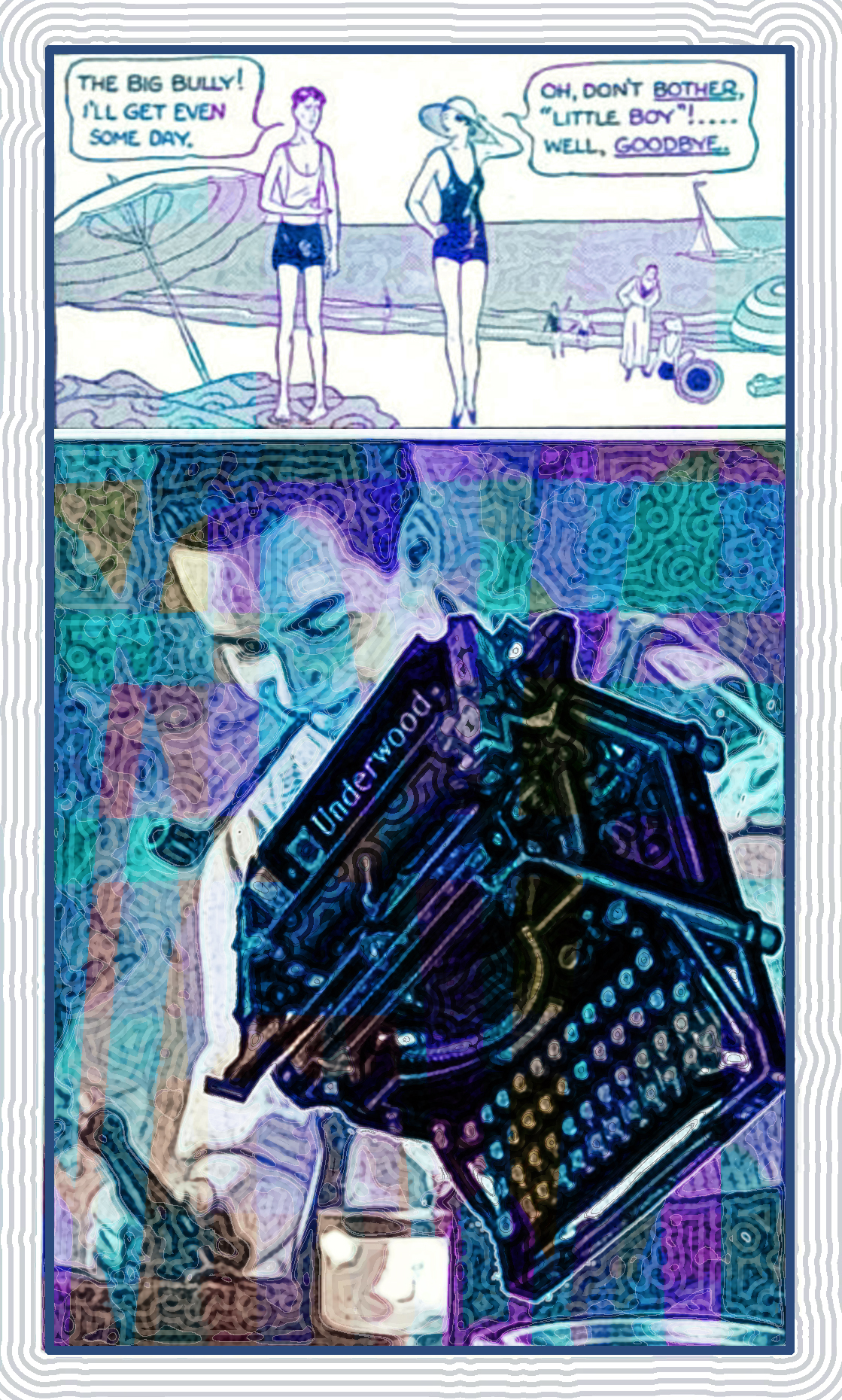
From a November 1933 Popular Science, three advertising illustrations combined: (top) a strip from an ad for the Charles Atlas bodybuilding method, (middle) a illustration of a satisfied user of then-new product Plastic Wood, and (center) an illustration of an Underwood typewriter, a heavy iron contraption upon which I learned to type over one summer in 1958.
Source:
Link1: archive.org/details/bub_gb_7CcDAAAAMBAJ
December 29, 2014
Composition for 70th Birthday
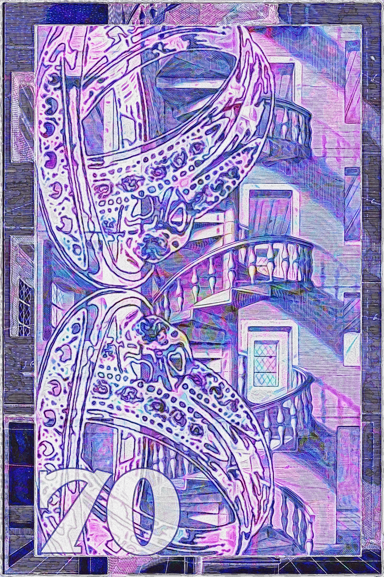
Turning seventy -- the Psalms' "threescore and ten". Did a memorial work based on (1) a 1604 book on Perspective, Perspective, id est, Celeberrima ars inspicientis aut transpicientis oculorum aciei : in pariete, tabula aut tela depicta, in qua demonstrantur quaedam tam antiqua, quam nova aedificia, templorum, sive aedium, aularum, cubicularum, ambulaciorum, platearum, xystorum, hortorum, fororum, viarum et hujusmodi alia, quae nituntur suis fondamentalibus lineis, quorum fondamentum descriptionibus clare exsplicatur, perutilis ac necessaria, omnibus pictoribus, sculptoribus, statuariis, fabriferrariis, architectis, inventoribus, cæmentariis, scrinariis, fabrilignariis, & omnibus artium amatoribus, qui huic arti operam dare volent, majori cum voluptate, & minori cum labore, (2) a graphic used to advertise a ring in a 1990 Weekly World News. The notation in lower left, ("70") is from the font FHA Nicholson French. Color in background is from same source as last two entries.
The Psalm goes on to say a man can make it to 80 if he has the strength -- but warns the way will be full of trouble and sorrow.
Source:
Link1: archive.org/details/GlassPaintsVarnishesAndBrushesTheirHistoryManufactureAndUse
Link2:
archive.org/details/gri_33125009324910
Link2:
archive.org/details/bub_gb_KfUDAAAAMBAJ
Member of Far Eastern Acting Troupe, 1880
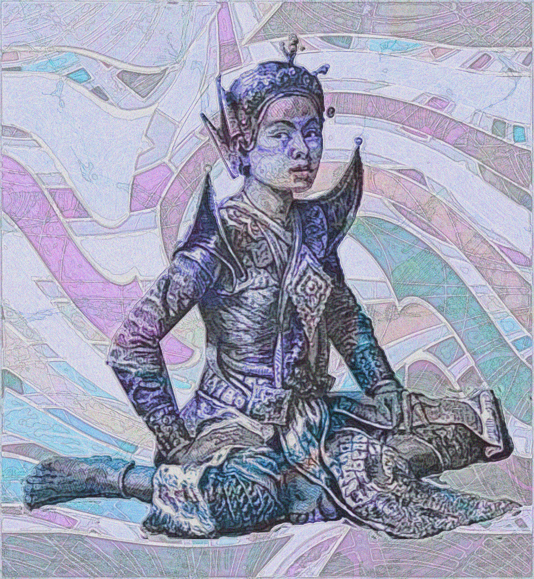
Background is another rearrangement of paint samples from the 1923 Glass, Paints, Varnishes and Brushes: Their History, Manufacture, and Use (Link1). Foreground is a treatment of a an illustration from the 1880 German travel book, Hinterindische länder und völker Reisen in den flussgebieten des Irrawaddy und Mekong ; in Birma, Annam, Kambodscha und Siam. Unter besonderer berücksichtigung der neuesten zustände in Birma bearb. (Google Translate: "Behind Indian national and international travel in the river areas of the Irrawaddy and Mekong; in Burma, Annam, Cambodia and Siam. Edit with particular consideration of the newest states in Burma."
Source:
Link1: archive.org/details/GlassPaintsVarnishesAndBrushesTheirHistoryManufactureAndUse
Link2:
archive.org/details/bub_gb_oC8-AAAAYAAJ
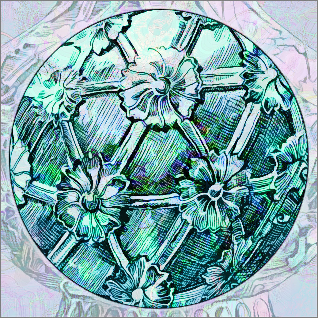
Acropolis Maiden on Paint Chip Pattern
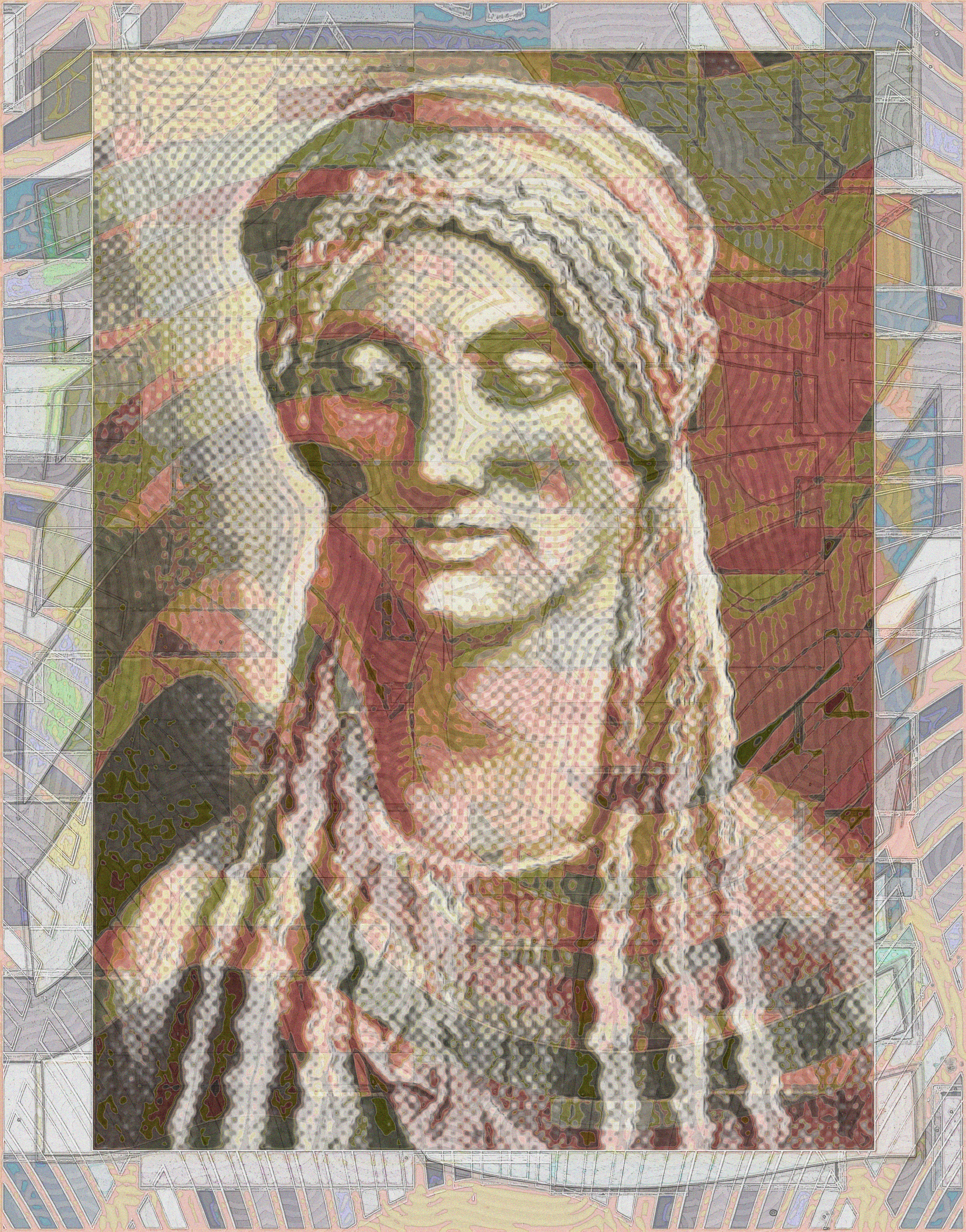
Background is a rearrangement of paint samples from the 1923 Glass, Paints, Varnishes and Brushes: Their History, Manufacture, and Use (Link1). Foreground is a treatment of a photo of a Madchenfigur von der Akropolis ("Figure of a Young Woman from the Acropolis") from the 1894 Eues Korrespondenz-Blatt für die Gelehrten - Und Realschulen Württembergs (Link2) ("New correspondent for the Journal of scholars and secondary schools Württemberg." The image represents a break from my recent styles, since I am quite confused as to the direction I should follow in 2015.
Source:
Link1: archive.org/details/GlassPaintsVarnishesAndBrushesTheirHistoryManufactureAndUse
Link2:
archive.org/details/bub_gb_VG8qAAAAYAA
December 18, 2014
Mage Script over Factory Marking Enamel
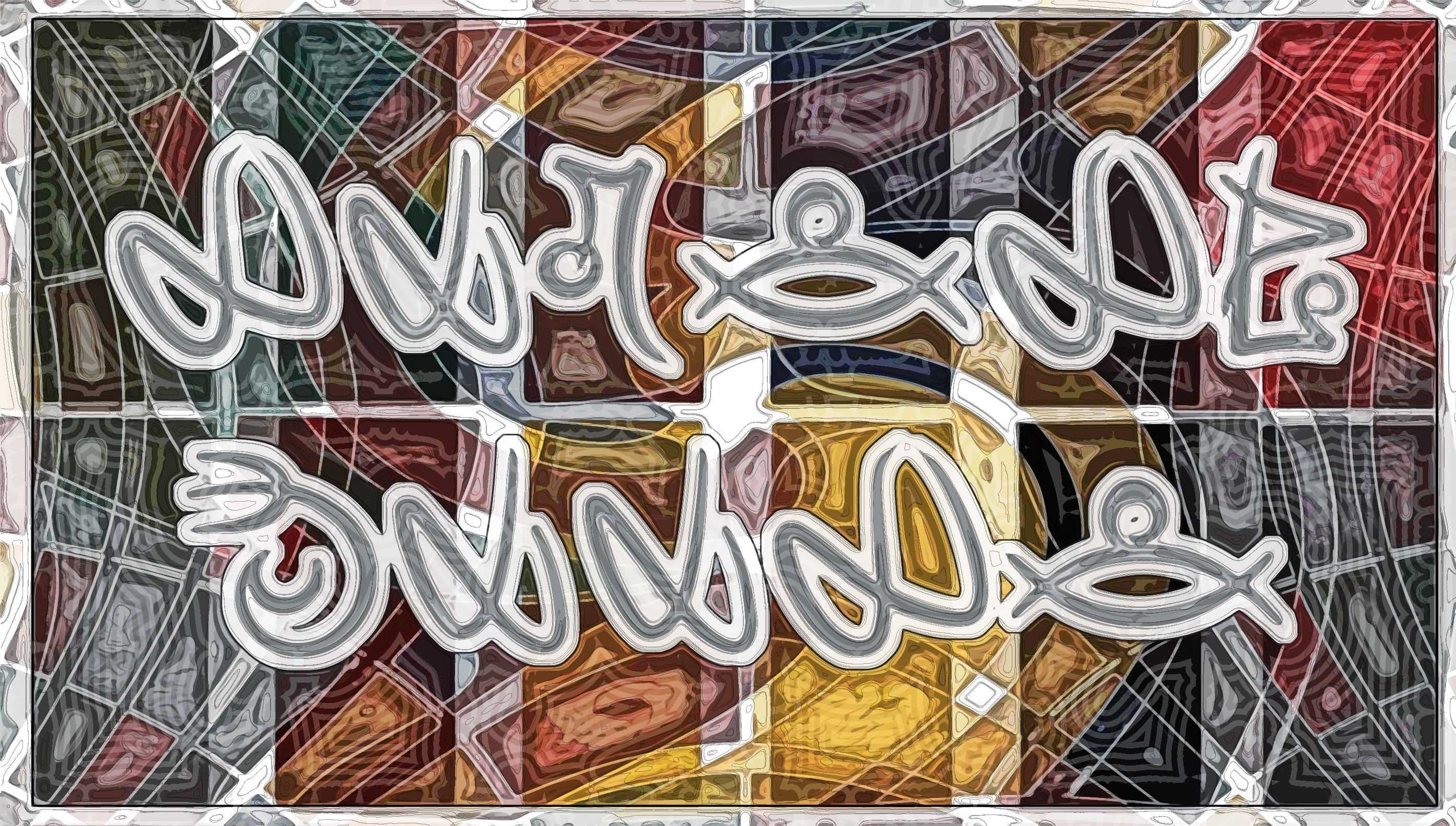
Background is a rearrangement of paint samples from the 1921 Character Paints for Mill and Factory, which shows small subset of colors used to mark valves, pipes, etc. in factories, mills, and power plants. (I remember my father used a similar system of color-coding of parts on the various lathes in his junior high wood shop. Overlaid in them is my name in the Mage Script alphabet.
Source:
Link1: archive.org/details/CharacterPaintsForMillAndFactoryASystemForDefinitelyDesignatingAll
December 18, 2014
HD Format: Star Wars Script over Plochre Color Plate
Background is another rearrangement of paint samples from the 1948 Plochere Color System, from Plate 51. Elements in the foreground are from another one of Pixel Saga's science fictional fonts showing the Aurebesh alphabet, the most common language of the Star Wars fictional universe. The characters reads "Robert Moore".
Source:
Link1: archive.org/details/PlochreColorSystem
December 16, 2014
HD Format: Dragon Claw Script over Paint Sample Plate
Background is another rearrangement of paint samples from the 1948 Plochere Color System. Elements in the foreground are from another one of Pixel Saga's fonts showing the Dovahkiin Script alphabet from another Elder Games: Skyrim edition.
Note date: your old PBob got knocked on his ass by a miserable hacking cough, made doubly worrisome by Janice's medical condition. Listless, watched a lot of TV including last 3 seasons of The L-Word and Marvell's new Guardians of the Galaxy.
Source:
Link1: archive.org/details/PlochreColorSystem
December 15, 2014
HD Format: Fantasy Game Script over Plochre Sample Page
Background is another rearrangement of paint samples from the 1948 Plochere Color System. Elements in the foreground are from another one of Pixel Saga's fonts showing the Mage Script alphabet from another Elder Games version.
Source:
Link1: archive.org/details/PlochreColorSystem
December 7, 2014
HD Format: Videogame Written Language over Plochre Sample Page
Background is another rearrangement of paint samples from the 1948 Plochere Color System. Elements in the foreground are the characters P..V of a fictional alphabet from the role playing game The Elder Scrolls, set to type by the prolific typographer Neale Davison, pen name Pixel Sagas.
Janice is recovering nicely from her lumpectomy, but somewhere in the roundtrip to Richmond, Virginia, taking Janice to the doctors, and running errands, I caught a hacking chest cold.
Source:
Link1: archive.org/details/PlochreColorSystem
December 6, 2014
HD Format: Vintage Frame and Palestinian "entry permit" over Paint Sample

Background is a rearrangement of paint samples from the 1948 Plochere Color System. Two elements in foreground: (1) a vintage panel from Amin Sughayer's Vintage Panels-04 and (2) a piece of political art by a Palestinian artist Khaled Jarrar, whose Live and Work in Palestine project consists of seemingly official Palestinian passport stamps. See his Facebook page
and two articles about his work: here and here. Generally, although I am not deeply familiar with Middle East politics, I think the Palestinians are getting a raw deal.
Source:
Link1: archive.org/details/PlochreColorSystem
December 5, 2014
HD Format: Vintage Panel over Sears Linoleum
>
Background is a rearrangement of linoleum patterns from the 1912 Sears & RoebuckCatalog no. 124, foreground is another ornament from Amin Sughayer's Vintage Panels font.
Source:
Link1: archive.org/details/catalogno12400sear
December 4, 2014
HD Format: Typographic Ornament over Nature's Harmony
Background is a rearrangement of color samples from the 1940 Nature's Harmony: Primary Colors. Foreground is a distorted typographic ornament (capital "O") from Manfred Klein's dingbat font called Typo Backgrounds. The ornament is barely visible, but it seems to be a stylized lion rearing on its two hind legs, tail to the right, mane to the left.
Source:
Link1: archive.org/details/NaturesHarmonyPrimaryColors
December 4, 2014
HD Format: Vintage Panel over Sears Gingham
Background is a rearrangement of samples of gingham sewing cloth from the 1912 Sears & RoebuckCatalog no. 124. The foreground is a panel from Egyptian Amin Sughayer's Vintage Panels font.
Source:
Link1: archive.org/details/catalogno12400sear
December 3, 2014
HD Format: City of Lights 2015 over Sears Carpets
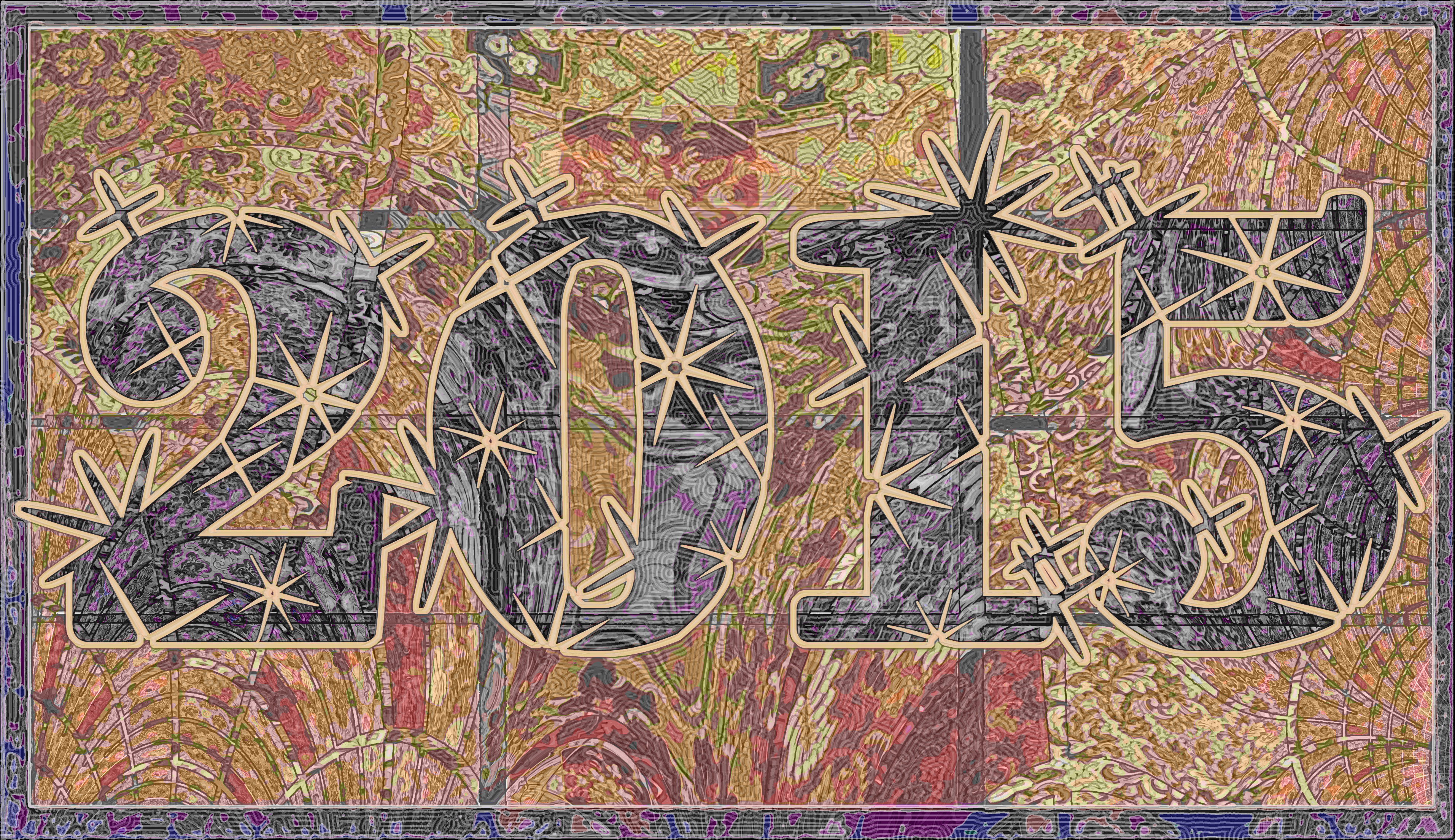
Background is a rearrangement of carpet samples from the 1250-page Sears & RoebuckCatalog no. 124 of 1912. Foreground is "2015" in a font called City of Lights by ImageX Fonts.
This image may become the first one of 2015, as I face the tedious task of pruning and renaming images from 2014 to an archived webpage.
Janice's operation was routine and uneventful and she sleeps peacefully in post-op exhaustion.
Source:
Link1: archive.org/details/catalogno12400sear
December 3, 2014
HD Format: Egyptian Vintage Panel over Color Strips
Back to HD format. The color background is a set of color panels from the 1912 The Use of the Plant in Decorative Designs. The foreground is a panel from Egyptian Amin Sughayer's Vintage Panels font. A nervous evening, with Janice heading in for an operation tomorrow.
Source:
Link1: archive.org/details/TheUseOfThePlantInDecorativeDesigns
December 2, 2014
Custom Format: Cloud Dingbat over Color Wheel

Finally, home to Philly. Here, a custom size (60" x 60" x 52"), designed to fit in an unusually-shaped area over a fireplace in a friend's new house in South Jersey. The room peaks to a cathedral ceiling on the right. A model sailing ship is set to go on top of the fireplace mantel. The colors in the background of the image are a distorted color wheel from a 1912 The Use of the Plant in Decorative Designs. The design in the foreground is another one from Woodcutter Manero's new dingbat font called Clouds Mix.
Source:
Link1: archive.org/details/TheUseOfThePlantInDecorativeDesigns
December 2, 2014
HD Format: Cloud Dingbat over Vitralite Enamel

Back in Bethesda -- halfway home, sleeping on niece's basement sofa -- a new format. Trying the 16:9 horizontal format used in high-definition TV. Image background is deformation of paint samples from the
1949 Pratt & Lambert The New Vitralite Enamel; foreground is a cloud design from a new dingbat font by Woodcutter Manero, called
Clouds Mix. Additional final step is inverted forground, posterized dithering, and drop shadow. Not sure that I like contrast between foreground & background created by color inversion. Next to it is a fully inverted version.
Uh-oh! December. Time to start thinking how to do 2014 => 2015 transition on Free-for-All.
Source:
Link1: archive.org/details/PrattLamertTheNewVitraliteEnamel.12
December 1, 2014
Nine Splashes over Color Tints
Still in Richmond, Virginia. Like the last, this image combines the tint diagrams of the 1947 PPG Color Dynamics for the Home with another one of "Woodcutter" Manero's dingbat font designs called Dripping. Learned how to draw 3x3 grid.
Source:
Link1: archive.org/details/PpgColorDynamicsForTheHome
November 30, 2014
Woodcutter's Drippings over Color Wheel

Now in Richmond, Virginia. This image is fourth try at combining the color wheel of the 1947 PPG Color Dynamics for the Home with another one of "Woodcutter" Manero's dingbat font called Dripping.
Source:
Link1: archive.org/details/PpgColorDynamicsForTheHome
November 30, 2014
Swirled Stencil over Wood Stain Samples II
Still in Bethesda, for family Thanksgiving. Finished another piece in hotel room. Showed this page to my niece's family. Again, the overlay is from the 1924 catalog, Excelsior Fresco Stencils (Link1), against a background swirled and spherized from another page of the 1954 Furnishing finishes facts: a handbook for wood finishing hobbyists. (Link2).
Source:
Link1: archive.org/details/ExcelsiorFrescoStencils
Link2: /archive.org/details/FurnishingFinishesFactsAHandbookForWoodFinishingHobbyists
November 27, 2014
Swirled Stencil over Wood Stain Samples
In Bethesda, for family Thanksgiving. Finished this piece in a Marriott hotel room with a Book of Mormon in the bedside stand. The black piece is a stencil from from a 1924 catalog, Excelsior Fresco Stencils (Link1), against a background swirled and spherized from the 1954 Furnishing finishes facts: a handbook for wood finishing hobbyists. (Link2).
Source:
Link1: archive.org/details/ExcelsiorFrescoStencils
Link2: /archive.org/details/FurnishingFinishesFactsAHandbookForWoodFinishingHobbyists
November 26, 2014
Klein Ornament over Character Paint Samples
Number 14 is an ornamental design from Manfred Klein's dingbat font
called Typo Backgrounds. The design has the look of sperm swimming toward an egg -- but maybe that's just me. The background is a sphere-and-swirl deformation of paint samples from the book Character Paints for Mill and Factory: A System for Definitely Designating All of the Various Equipment in Factory, Mill or Power Plant from about 1921. The book describes a scheme to paint pipes, conduits, machines, sprinkler lines, fire pails, etc., different colors.
Getting ready for trip to Bethesda, Maryland, and Richmond, Virginia, for Thanksgiving. Hope my back is up to a five-hour drive.
Source:
Link1: archive.org/details/CharacterPaintsForMillAndFactoryASystemForDefinitelyDesignatingAll
November 24, 2014
Christogram IHS over Glazed Paint Samples


Number 13 in this confusing series: from the 1924 catalog, Excelsior Fresco Stencils (Link1), a stencil designed for church walls, with IHS, a Christogram popular in the 50's Catholic Church of my youth, standing for the first three letters of Jesus' name in Greek, iota-eta-sigma, or ΙΗΣ. The symbol is placed atop a composition of color samples from a 1934 catalog titled Sherwin-Williams Glaze Effects. Heavy post-processing (especially inversion) pretty much removes the original colors, but I like the effect. For comparison sake, an un-inverted image is on the right.
Source:
Link1: archive.org/details/ExcelsiorFrescoStencils
Link1: archive.org/details/Sherwin-williamsGlazeEffects
November 23, 2014
Stonetex Paint Chips and Desymmetrized Stencil
Number 12 in this strange series. The paint chips that are the basis of the underlying image is from a catalog called Truscon Stone Tex, A Protective Coating Made Especially for Damproofing and Beautifying Concrete, Stucco, Brick and Masonry Exterior Walls (Link1) from about 1926. The graphic element superimposed on that image is a decorative stencil from a 1924 catalog, Excelsior Fresco Stencils (Link2). A new technique here: the stencil was perfectly symmetrical and balanced (as in the original on the right), but I took it into a vector editing program and made it less symmetrical and balanced. Another technical development: the blue color of the stencil comes from a Photoshop inversion of the yellow and pink colors of the underlying paint chip design. I have been struck by how the inversion technique seems to move all colors into a relatively narrow spectrum of blue. I find the resulting blue colors quite pleasing.
Source:
Link1: archive.org/details/TrusconStoneTexAProtectiveCoatingMadeEspeciallyForDamproofingAnd
Link2: archive.org/details/ExcelsiorFrescoStencils
November 22, 2014
Dripping & Reflecting, Light & Color
One more in the series (now up to 11 by my count) of distorted paint chip sample pages with one graphic element. Color samples here are from The Light Reflection Value of Color in Paint from around 1930 (Link1). The graphic element here is from Spaniard "Woodcutter" Manero's dingbat font called Dripping. Woodcutter's production is prodigious: see his work on the font sharing site dafont.com.
Source:
Link1: archive.org/details/TheLightReflectionValueOfColorInPaint_713
November 22, 2014
Woodcutter's Drippings with How-to-Use Colors
Again, a composition of manipulated color samples from the consumer publication Colors: How to Use Them in your Home from approximately 1930. Around the edges is a dingbat font by my old favorite, the Spanish bad-boy Woodcutter, called Dripping.
Source:
Link1: archive.org/details/ColorsHowToUseThemInYourHome
November 21, 2014
Yet Another Klein Design with Pigment Color Samples
Not sure what's happening, but I keep doing (practically) the same image over and over. Here, a digital discombobulation of color paint samples from
Powdrpaint: A Remarkable Discovery Reduces Cost of Painting 75% from about 1923. (Powdrpaint was a dry pigment to be mixed with cold water to a creamy texture.) On top of that, another Klein dingbat design.
Source:
Link1: archive.org/details/PowdrpaintARemarkableDiscoveryReducesCostOfPainting75br>
November 20, 2014
Klein Design with Rust Prevention Paint Chips
Background is another digitally manipulated composition of paint samples from the circa 1920's Toch's Technical Paints and Waterproofing Compounds page of steel preservative coatings. Superimposed over it is another ornament from Manfred Klein's dingbat font
called Typo Backgrounds.
Source:
Link1: archive.org/details/TochsTechnicalPaintsAndWaterproofingCompounds
November 20, 2014
Another Klein Ornament over Paint Sample Composition
A digitally distorted composition of color paint samples from a 1920 Counter Price List and Counter Book by Lowe Brothers Paint Company (Link1). (Lowe was later acquired by Sherman Williams.) Superimposed on the color chip collage is another ornament from Manfred Klein's dingbat font
called Typo Backgrounds. For more of Klein's remarkable work, check out his for-sale font list.
Source:
Link1: archive.org/details/CounterPriceListAndCounterBookEdition67
November 20, 2014
Typographic Ornament over Paint Sample Composition
A collage of color samples from the 1958 Live Colorfully with Dutch Boy paint catalog. Superimposed on that is a design from a dingbat font
called Typo Backgrounds by German typographic artist Manfred Klein. Klein, born in 1932, has had quite a career behind him.
Source:
Link1: archive.org/details/LiveColorfullyWithDutchBoy
November 19, 2014
Triads and Runic Ornament
A frequent illustration in color theory is a triad of colors, overlaid on each other to illustrate the effects of mixing colors. Here, from the 1923 Color Mixing Guide for Artists, Painters, Decorators, Printing Pressmen, Show Card Writers, Sign Painters, Color Mixers (Link1), a combination of two color triads: one triad is the primary colors (red, yellow, blue) and the other triad is the secondary colors. Besides the usual distortions, I also use the computer's Inverse function. Again, I apply the slightest possible corner shading from the Dingbat font
CornPop.
Source:
Link1: archive.org/details/ColorMixingGuideForArtistsPaintersDecoratorsPrintingPressmenShow
November 18, 2014
Color Bar Symphony Blue
Another deformation and recoloring of a page of paint samples from the 1923 Glass, Paints, Varnishes and Brushes: Their History, Manufacture, and Use by the Pittsburgh Plate Glass Go. (Link1). The slightest possible corner shading is from another Dingbat font by PauloW's Intellecta Designs, in a corner frame from his CornPop font.
The same image is used in the next image to add color to a pair of mirrors from the same catalog. I have always been fascinated by the way that catalog artists illustrating the reflections in wall mirrors depict nonexistent shapes at second (or maybe third) remove from reality, although I have never been able to turn that fascination into beauty.
Source:
Link1: archive.org/details/GlassPaintsVarnishesAndBrushesTheirHistoryManufactureAndUse
November 18, 2014
Twisted Tinted Colors with Four Brazilian Dingbats

Third in paint chip series, but instead of a stencil I use an ornament in each corner, from the dingbat font Cornucopia of Ornaments 2 by the Brazilian graphic designer PauloW of Intellecta Designs. The background color is a digital manipulation of a page of samples of tinted paint pigments from the 1923 Color Mixing Guide for Artists, Painters, Decorators, Printing Pressmen, Show Card Writers, Sign Painters, Color Mixers (Link1).
Still seeking a new direction for 2015. The circle-in-a-square motif was necessary because I had to master the technique of drawing a centered circle, but I'm not sure how much longer I'm going to use it.
Source:
Link1: archive.org/details/ColorMixingGuideForArtistsPaintersDecoratorsPrintingPressmenShow
November 17, 2014
Flower Vase Stencil over Stain Colors

Second in series of compositions based on paint chips and stencils. Paint samples from the 1948 Cabot's Creosote Shingle Stain (Link1); the company was one of the businesses of Boston's powerful Cabot family. The stencil is from the 1929 Great Western Paint Catalog.
Seeking a new and more consistent direction for 2015. A list of stencil catalogs is here. A list of paint catalogs is here. One framing method for square images comes from Ikea, which makes the GLADSAX frame for album covers, but I'm not sure that these permit the side-to-side wire hanging method which is required in most art exhibitions. Maybe some of these hanging hardware hooks will do the trick. I sent a query to the company asking for information.
Source:
Link1: archive.org/details/CabotsCreosoteShingleStain
Link2: archive.org/details/GreatWesternPaintCatalog1929
November 16, 2014
Stencil over Color Composition
First in a series I'm considering that combines 1) paint samples and 2) stencils. This one combines a page of paint samples from the 1923 Glass, Paints, Varnishes and Brushes: Their History, Manufacture, and Use by the Pittsburgh Plate Glass Go., seen in small size in middle, and a page of commercial stencils from the 1929 Great Western Paint Catalog, seen in miniature on the right. (Don't forget to click on the leftmost, finished image to blow it up to full size).
Source:
Link1: archive.org/details/GlassPaintsVarnishesAndBrushesTheirHistoryManufactureAndUse
Link2: archive.org/details/GreatWesternPaintCatalog1929
November 16, 2014
Perspective Study Against Color Sample Composition
In the center, from a 1604 book on Perspective, (Perspective, id est, Celeberrima ars inspicientis aut transpicientis oculorum aciei : in pariete, tabula aut tela depicta, in qua demonstrantur quaedam tam antiqua, quam nova aedificia, templorum, sive aedium, aularum, cubicularum, ambulaciorum, platearum, xystorum, hortorum, fororum, viarum et hujusmodi alia, quae nituntur suis fondamentalibus lineis, quorum fondamentum descriptionibus clare exsplicatur, perutilis ac necessaria, omnibus pictoribus, sculptoribus, statuariis, fabriferrariis, architectis, inventoribus, cæmentariis, scrinariis, fabrilignariis, & omnibus artium amatoribus, qui huic arti operam dare volent, majori cum voluptate, & minori cum labore) (Link1), a perspective view of the inside of a dome. The picture is set against another composition from paint samples,
from Alabastine Water Color for Walls, (c.1930), Link2. I've been enjoying my work with color paint samples, and I may choose to do more. The Canadian Building Technology Heritage Library has a list of paint catalogs here.
Source:
Link1: archive.org/details/bub_gb_4zVAAAAAYAAJ
Link2: archive.org/details/AlabastineWaterColorForWalls
November 15, 2014
Unknown German Historic Anecdote
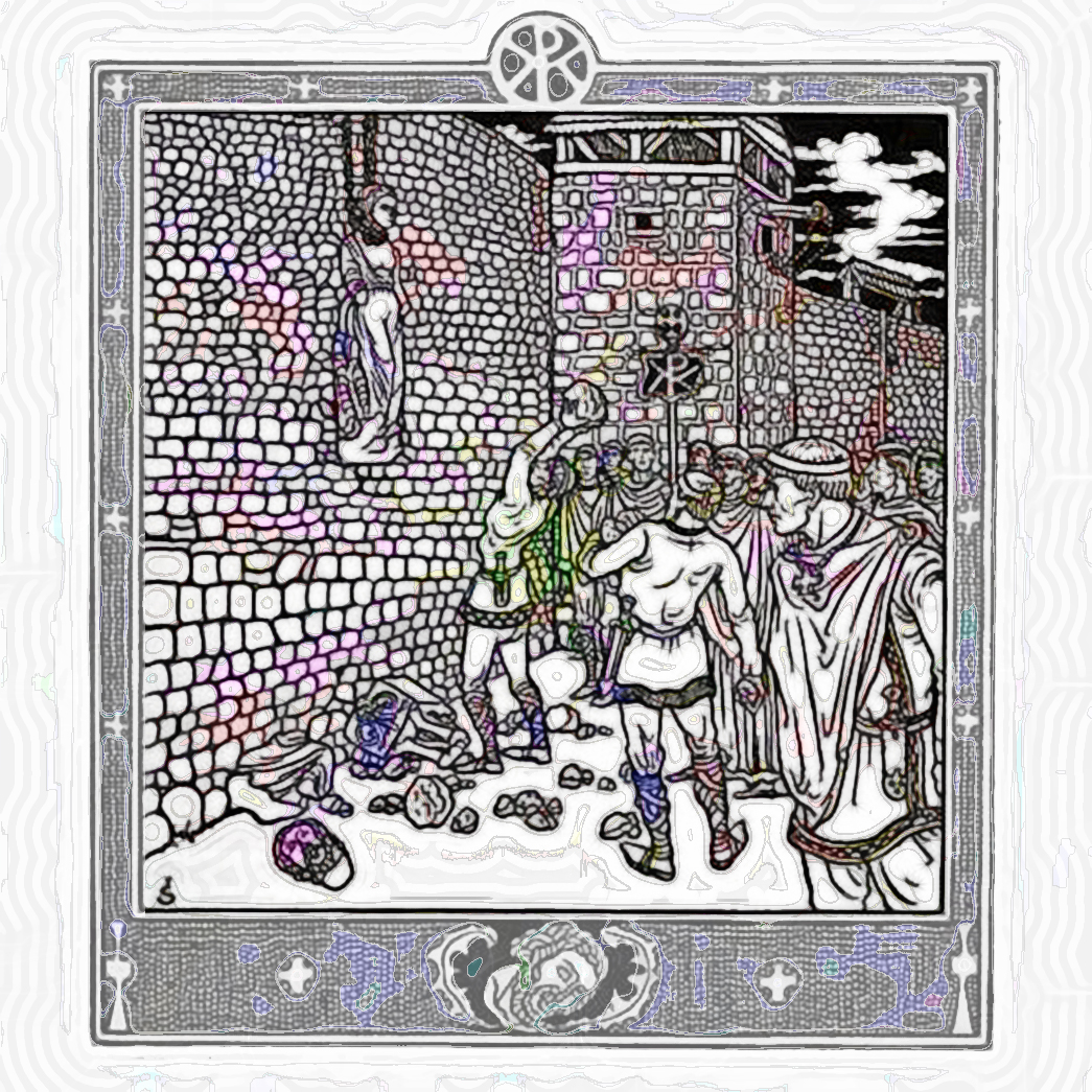
From the same German history book as yesterday's image (Link1), History of the Rhenish Cities Culture from its Beginnings to the Present with Particular Attention to the City of Worms, another illustration by Joseph Sattler. What is going on in this image? (Click on the image repeatedly until it is full-size to see the details.) A rough mob of men gather outside a city's wall to -- what? It looks as if there is either a woman or a statue of a woman suspended by the neck from the wall. And it looks as if the mob is stoning the woman/statue. Is this a moment when a conquering army humiliates the deposed queen? Or is this an iconoclastic religious moment, when one religious faction which does not believe in "graven images" captures a monastery and destroys the offending images? The answer is in the book's text, in German (which I do not read) and particularly in dense Fraktur, or Blackletter, type. (It's a good thing the Allies won World War II or we;d have to read instruction manuals in Fraktur!)
Source:
Link1: archive.org/details/gri_33125009324910
November 13, 2014
Early European Woodsman
An image which I fancy as an early German woodcutter looking down at the Rhine River, from the 1897 History of the Rhenish Cities Culture from its Beginnings to the Present with Particular Attention to the City of Worms ("Geschichte der rheinischen Städtekultur von ihren Anfängen bis zur Gegenwart mit besonderer Berücksichtigung der Stadt Worms") (Link1), with pictures by "Art-Nouveau illustrator" Joseph Sattler. I like the artist's touches of prehistoric fashion: the tooth necklace, the sewing details on his shirt, the laurel around his forehead, and his sturdy axe. The illustration is laid over another composition of paint color samples from Alabastine Water Color for Walls, (c.1930), Link2.
Note to Self: Have to start thinking about how to handle the transition to 2015. Historically, I have copied all the year's images and text into a separate page and then created a brand new page, starting off with a New Year's Day image.
Source:
Link1: archive.org/details/bub_gb_4zVAAAAAYAAJ
Link2: archive.org/details/AlabastineWaterColorForWalls
November 13, 2014
Requiem for the American Space Program

Set against another composition of paint samples, this time from Alabastine Water Color for Walls, (c.1930), a symbol from a dingbat font called Other Space by one of my favorite designers, the Spanish Woodcutter, who combines religion and popular culture clichés with bad-boy drug and prison tattoos. Check out his webpage here.
The meaning behind this image is my disappointment at the slowdown in progress in American space exploration, highlighted this week by the European Space Agency successful launch of a probe, sending it 310 million miles to land on tiny comet 67P. Great work, Europeans! I'm from the Sputnik generation of Americans that sent a man on the moon. I'm glad the Europeans (and Chinese) are making progress, but I despair at the religious zealotry and neoconservative greed that has combined with racism to paralyze my country from moving boldly into the future.
Source:
Link1: archive.org/details/AlabastineWaterColorForWalls
November 12, 2014
Composition in Stippled Paint
A geometric composition composed of samples from the 1930 BPS Pat-Co Flat Wall Finish Mottling and Stippling (Link1). Usually, I use these simply as a background to a foreground graphic, but this time I decided to leave it alone.
Source:
Link1: archive.org/details/BpsPat-coFlatWallFinishMottlingAndStippling
November 12, 2014
Rose on Paint Chips
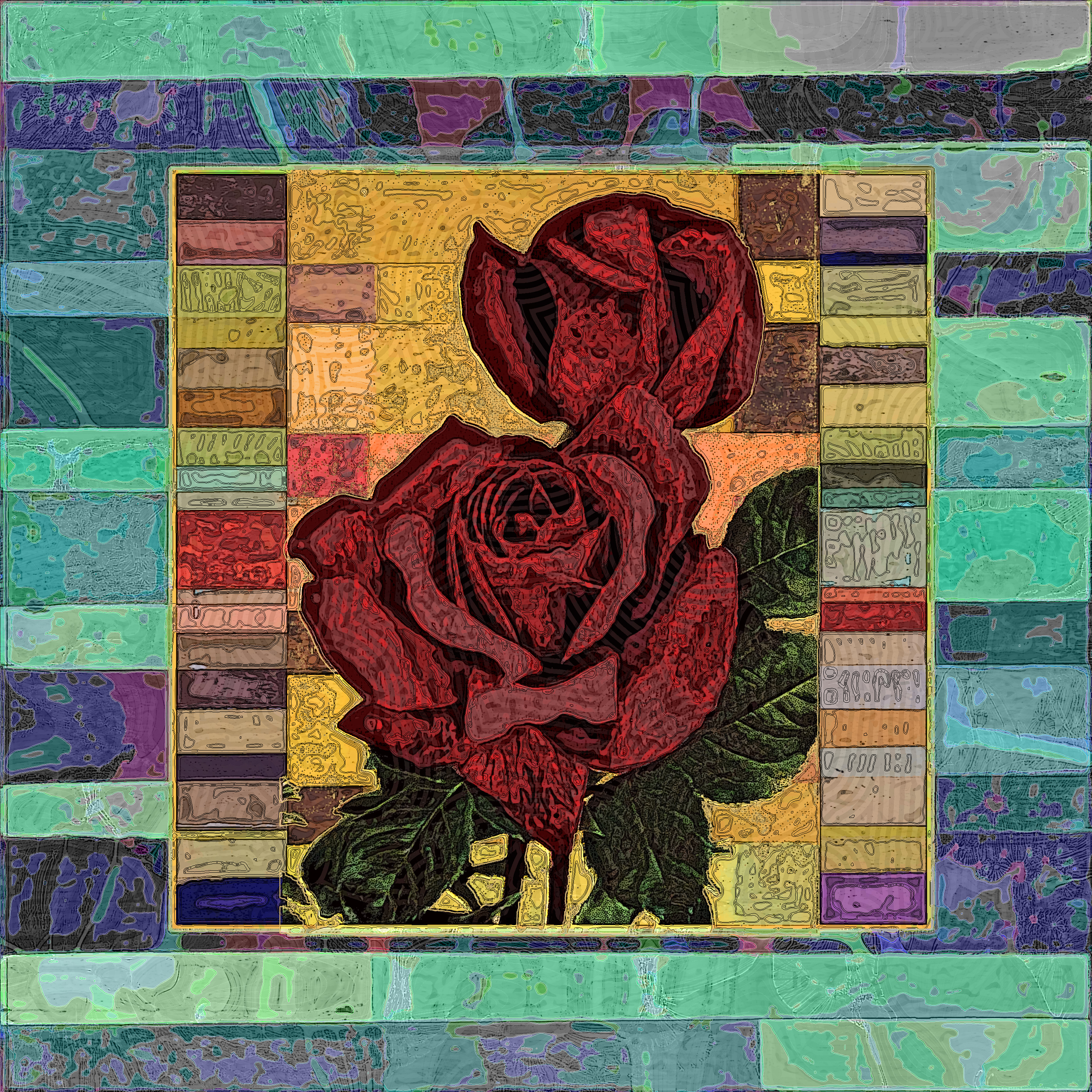
A photograph from the 1931 Annual of the Rose Society of Ontario (Link1) superimposed on a collage of oil pigment paint samples from a 1946 brochure by paint manufacturer Harrison Brand Oil Colors (Link2).
To tell you the honest truth, I learned some worrisome health news last week, and I'm expressing my anxiety by holing up in the apartment and doing a lot of work, both on Philly-Bob's Free-for-All -- six images in four days, plus an HTML workaround that allows me to remove numbers from my image but still keep the information, and a method to include accent marks. I also worked hard on zer0sum.net with Python coding. I believe the shrinks call this "binding my anxiety."
Source:
Link1: archive.org/details/annualofroses1931onta
Link2: archive.org/details/HarrisonBrandOilColors
November 11, 2014
Parisian Reader on Stippled Paint Chips
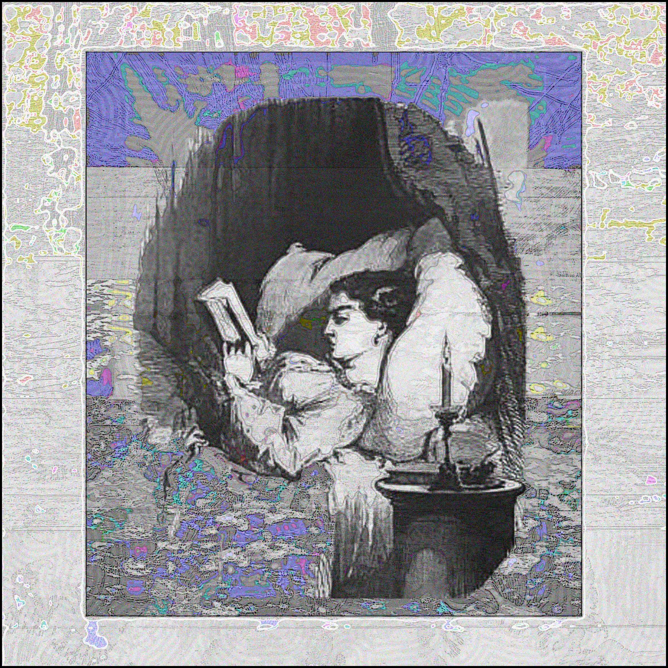
In the center, an illustration from the 1853 Tableau de Paris par Edmond Texier (Link1), showing a young woman reading in bed by candle light. The picture is set against another collage of paint samples, from the 1930 BPS Pat-Co Flat Wall Finish Mottling and Stippling (Link2).
Source:
Link1: archive.org/details/bub_gb_CFShsZKmwcYC
Link2: archive.org/details/BpsPat-coFlatWallFinishMottlingAndStippling
November 10, 2014
Wrought Iron on Paint Color Chips
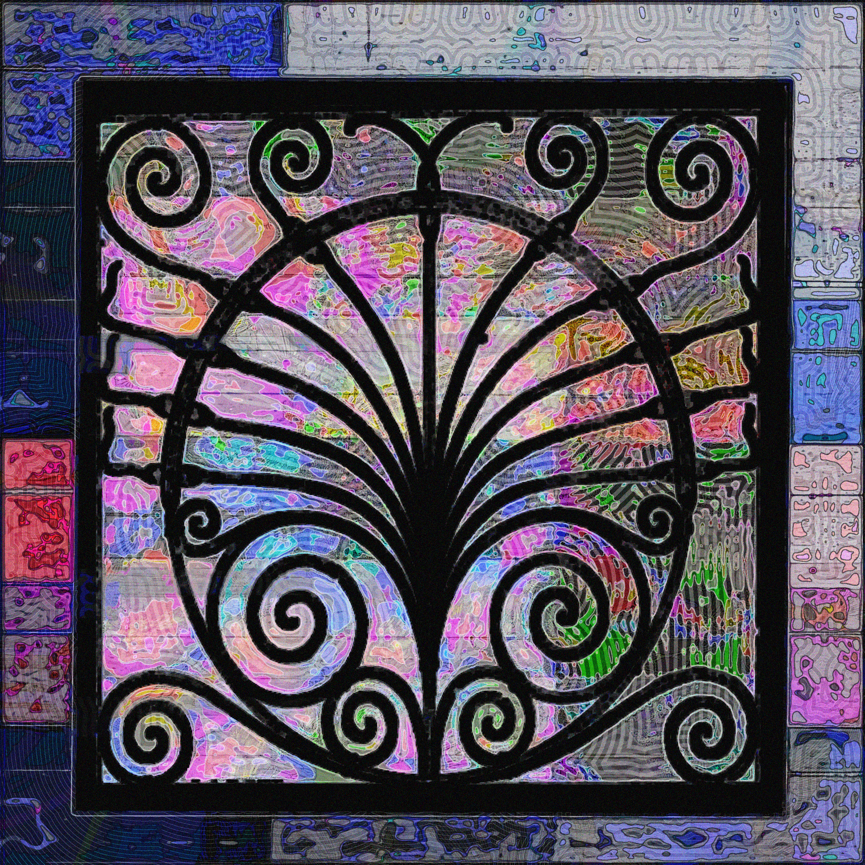
In black, a decorative residential grille from an 1891 catalog by a manufacturer of builders' wire and iron work. (Link1). It is imposed upon a reworking of a collection of tinted samples of oil pigment paints from a 1946 brochure by paint manufacturer Harrison Brand Oil Colors (Link2). The color names are: Cobalt Blue, Ultramarine Blue, Prussian Blue, American Vermilion, Indian Red, and Lamp Black.
Source:
Link1: archive.org/details/E.t.BarnumManufacturerOfBuildersWireAndIronWork
Link2: archive.org/details/HarrisonBrandOilColors
November 10, 2014
Using Image Map III
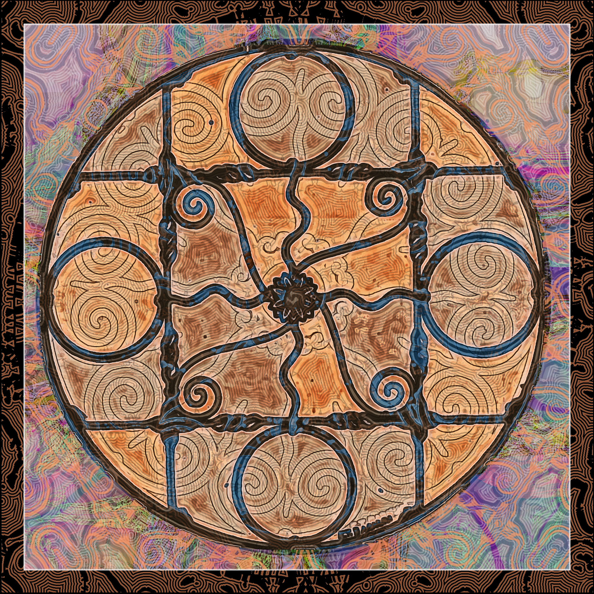
A collage of images from the 1891 catalog of E.T. Barnum: Manufacturer of Builders' Wire and Iron Work: three wrought-iron window guards.
Source:
Link1: archive.org/details/E.t.BarnumManufacturerOfBuildersWireAndIronWork
November 9, 2014
Using Image Map II
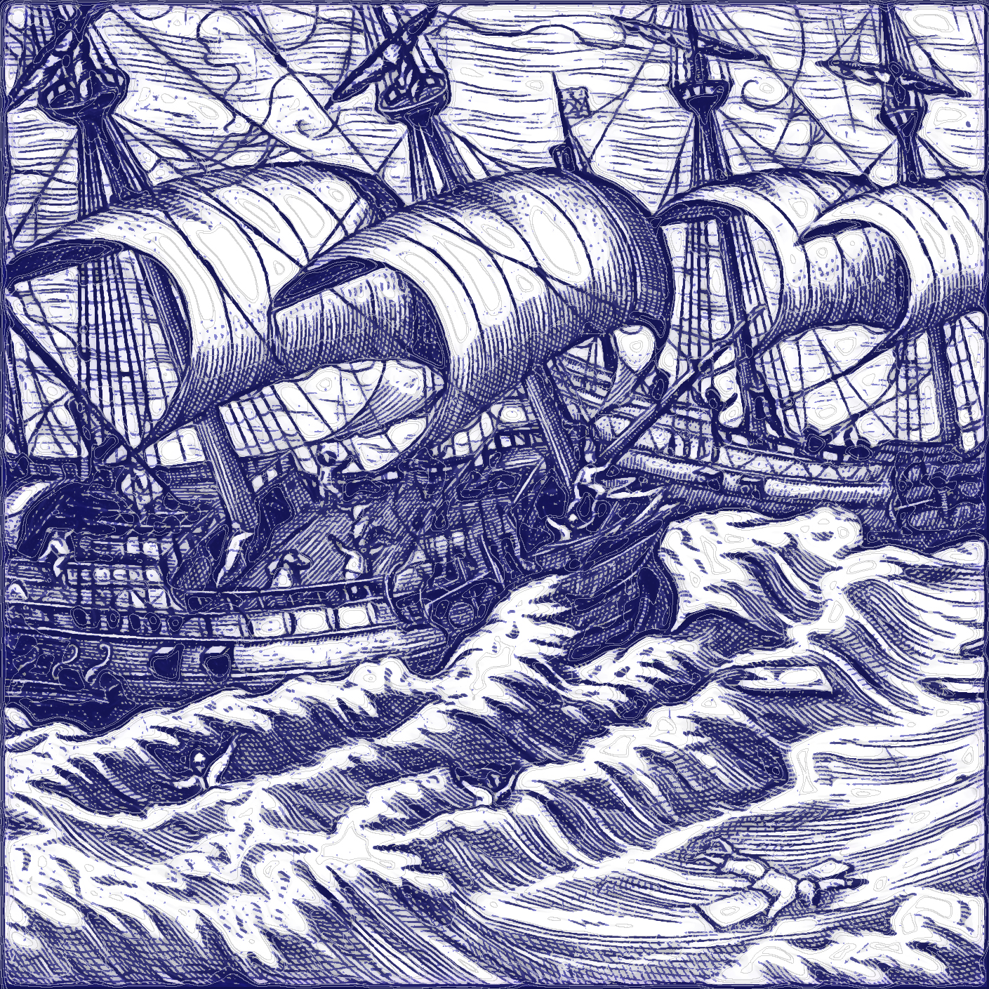
Trial of new image map method. Image is a woodcut from a 1612 German travel book, showing two ships in high waves. Brings back the romance, adventure, and danger of sea-faring in the 16th century. It is the story of one sailor's voyages. The full title of the book is Dritte Theil, Warhafftige Relation... Here's one translation:
The true and perfect description of three voyages : so strange and woonderfull, that the like hath neuer been heard of before: done and performed three yeares, one after the other, by the ships of Holland and Zeland, on the north sides of Norway, Muscouia, and Tartaria, towards the kingdomes of Cathaia & China; shewing the discouerie of the straights of Weigates, Noua Zembla, and the countrie lying vnder 80. degrees; which is thought to be Greenland: whereneuer any man had bin before: with the cruell beares, and other monsters of the sea, and the unsupportable and extreame cold that is found to be in those places, London, 1605,
I tried to match the color of old Dutch chinaware in this piece. Note the sailors adrift, holding on to wreckage. The Dutch made a movie based on this book, called Nova Zembla ("New Land").
Source:
Link1: archive.org/details/drittetheilwarha00veer
November 8, 2014
Using Image Map
Testing a new technique, which "buries" or "hides" the daily mystery numbers for each image in a small "hotspot" in the upper left hand corner of the smaller, initial image. Click in that small hotspot and you see the secret numbers. Click anywhere else in the image, and you get the large full-size image. If this works, this will allow me to make my images more "arty" -- i.e., less texty -- going forward. Requires copying 1) index.htm from top web foler, 2) big and small image files from images folder, and 3) from pythonfiles folder, RR6X.HTM.
The image is a digital treatment of a drawing from the 1907 book Enamelling, a Comparative Account of the Development and Practice of the Art (Link1). It shows an 18th century Chinese vase, described as "repoussé and cloisonné."
P.S. I finally found a way to put in French accent marks. Instructions are here. Had to add "meta charset="UTF-16"" to the "head" section, but it seems to effect other text on the page. Not understanding all this, but two big technical advances.
Source:
Link1: archive.org/details/gri_33125007595487
November 7, 2014
8-3DMN: Santa on Vase Pattern

The image of the bearded fellow is from an advertisement in an 1899 Billboard (Link1), showpiecing a new holiday display poster of Santa Claus. To my modern eye, it is a rather scary and un-saintly Santa. It is superimposed on a pattern from the 1907 book Enamelling, a Comparative Account of the Development and Practice of the Art (Link2). It shows a 17th century grissaille ornament. The font, again, is Generic-Teenager by Ariana Rawson.
Source:
Link1: archive.org/details/billboard11-1899-10
Link2: archive.org/details/gri_33125007595487
November 6, 2014
8-3DMN: Nydia
The image is the worn paper cover of an 1877 "yellow-back" edition of The Last Days of Pompeii, showing Nydia, the blind slave-girl who leads the lovers Glaucus and Ione to safety in the darkness of the volcanic eruption, then [spoiler!] commits suicide by jumping off the ship because of her unrequited love for Glaucus. It's a good story. The font is called Generic Teenager by Ariana Rawson.
Source:
Link1: archive.org/details/190937802.2418.emory.eduC
November 5, 2014
8-3DMN: Fortifications
Behind the digits is the layout of ramparts and parapets of an 18th century fort from the 1752 Traite de la Construction et des Principaux Usages des Instrumens de Mathematique. Avec les Figures Necessaires pour l'Intelligence de ce Traite. The font is DK Hobgoblin by Hanoded.
Election Day: Voted straight Democratic in Philadelphia -- except not for Chaka Fattah, the Representative from Comcast. Full of dread for election outcome nationally, with possibility of Republicans taking both houses of Congress. But too much of the Democratic Party machine has ignored and disrespected its progressive principles and constituents in favor of corporate contributors. I did not volunteer or donate more than $50 to the Democratic effort. It was, as the old joke goes, the least I could do.
Source:
Link1: archive.org/details/bub_gb_2evrFQJZ7E0C
November 4, 2014
8-3DMN: Meat Grinder Gears
Moving toward using more obscure lettering for the digits. This is a font called Wine Tasting, from Zerographer. (Free-for-All fans don't really care about the numbers.) Anyway, the background is formed by
digital manipulation of a display of cutting disks for a "Food Cutter" -- my mother called hers a "Meat Grinder" -- advertised in the 1912 Canadian Hardware magazine.
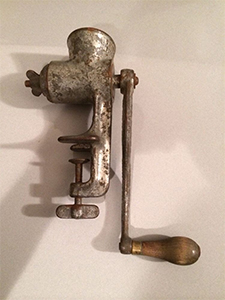
The sight of the food cutter -- about 15" high, made of heavy grey metal, powered by a hand-turned wooden handle -- brought back fond memories of my mother's elegant, heavy duty machine in the 50's. Nowadays, these kitchen implements are electrical -- and made of cheap nondurable plastic and aluminum.
Source:
Link1: archive.org/details/hardwarehouseware1912
November 3, 2014
8-3DMN: Knife Girl
Background to the numbers is a picture of knife-toting ethnic woman from the 1843 Les Beaux-Arts: Illustration des Arts et de la Littérature. Unfortunately, the type is too small in the scan to identify the artist or the subject and I couldn't find it on Google Image Search. The font (again) is Bebas Kai by Ryoichi Tsunekawa at DharmaType.
Source:
Link1: archive.org/details/bub_gb_1Kilb1hRZcoC
October 31, 2014
8-3DMN: Canadian Pulp Factory Scene
Background to the numbers is a picture of an Automatic Magazine Grinder and its operator (well, actually, it's doubled so there are two operators) in a factory, from a 1915 volume of Toronto's Pulp and Paper Magazine of Canada. The font is Bebas Kai by Ryoichi Tsunekawa at DharmaType.
Here's another version of the table explaining (crytically) the mystery numbers I've been running with my images:
| 227wt | |
| 227mn | |
| hicor | locor |
| hiacc | loacc |
| hiallcor | loallcor |
6-3DMN: 463 with Salesman Caught in Trap
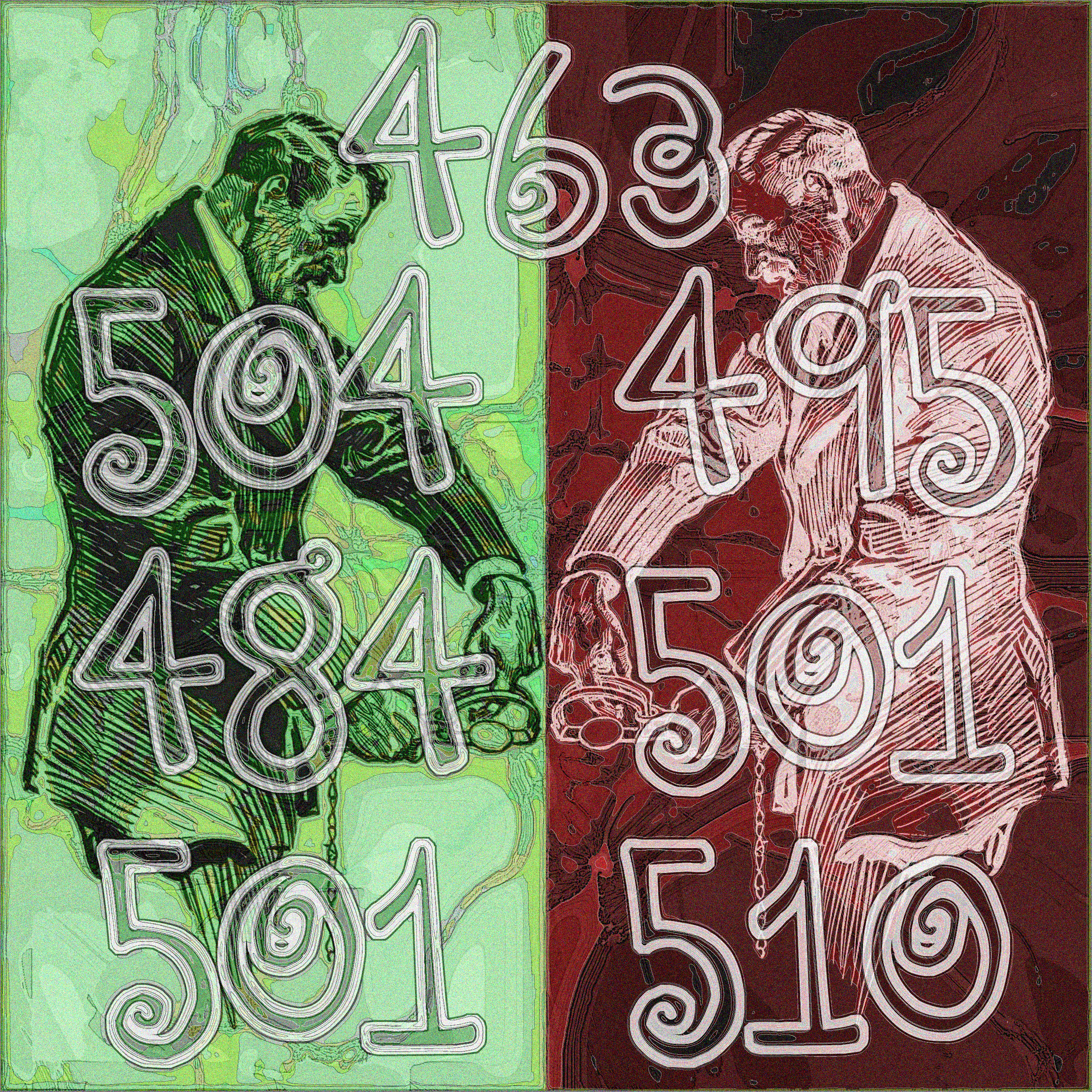
Background to the numbers is an advertisement from a 1912 edition of the trade magazine Canadian Hardware (Link1). The image (by illustrator Gordon Grant) shows a well-dressed hardware salesman who has gotten his finger caught in an animal trap. The font is the same as yesterday's: DJB You Make Me Blush by Darcy Baldwin.
Source:
Link1: archive.org/details/hardwarehouseware1912
October 29, 2014
6-3DMN: 290[240] with Halved Carpet Pattern
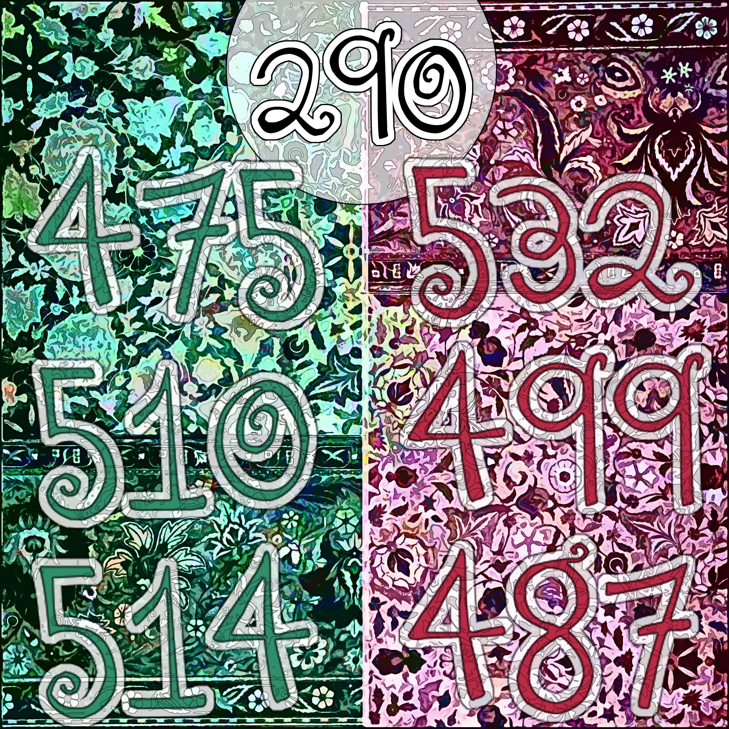
Background to the numbers is a gold-medal-winning carpet from the 1897 An Illustrated Record of the Retrospective Exhibition Held at South Kensington. The image of the carpet is halved and each half is colored differently. The font is unknown.
The second image is an experiment, using a font DJB You Make Me Blush by Darcy Baldwin. I don't think it worked, but it allows a seventh 3DMN.
Source:
Link1: archive.org/details/gri_33125001330675
October 28, 2014
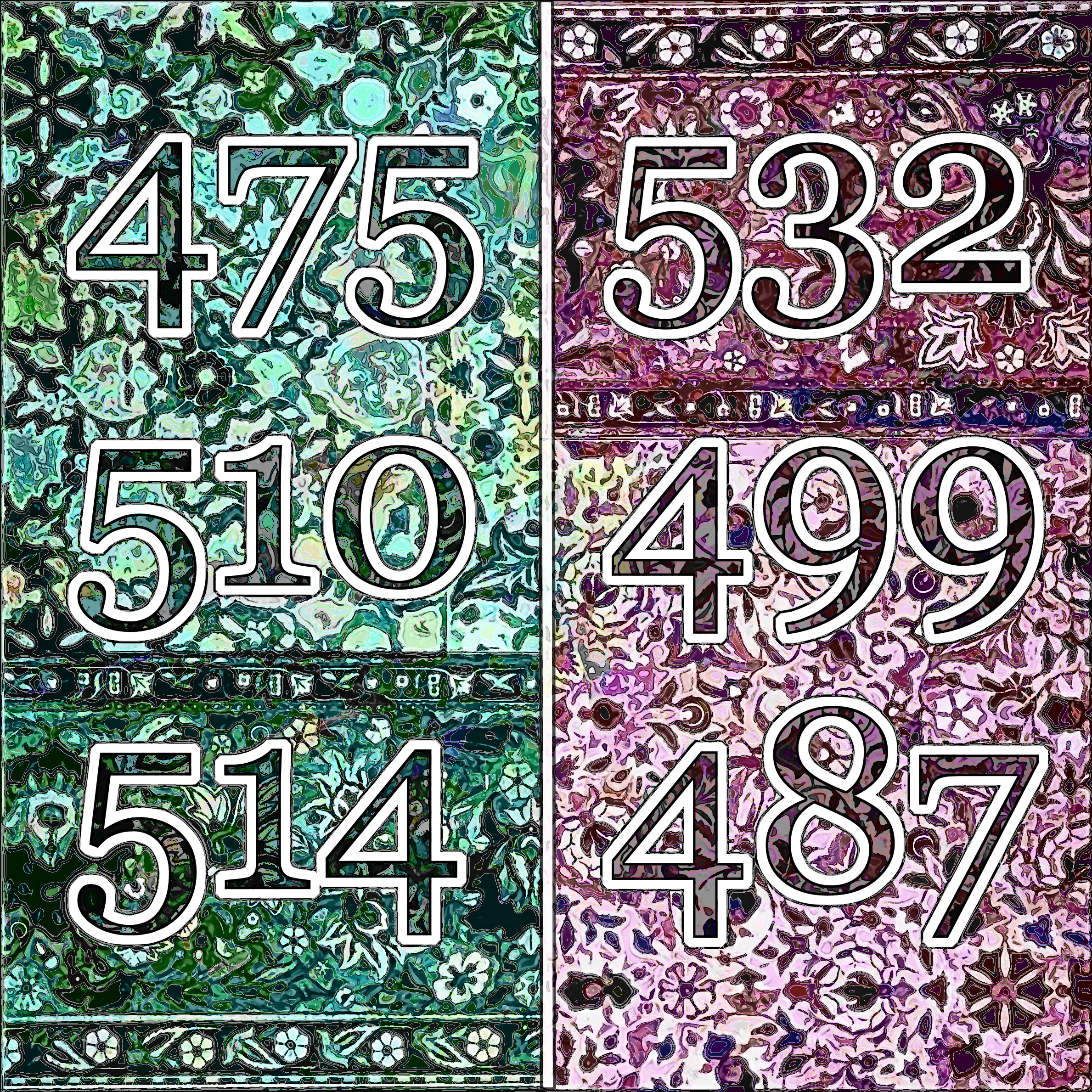
6-3DMN: 599 with Pattern and Design
Background to the numbers are two superimposed designs. One is a step-and-repeat pattern from the 1903 Etude de la plante : son application aux industries d'art : pochoir, papier peint, etoffes, céramique, marqueterie, tapis, ferronnerie, reliure, dentelles, broderies, vitrail, mosaïque, bijouterie, bronze, orfévrerie (Link1) (Google translation: "Study of the plant: its application to art industries: stencil, wallpaper, cloth, ceramics, marquetry, carpets, metalwork, binding, lace, embroidery, stained glass, mosaic, jewelry, bronze, goldsmith." The second element superimposed is a design from the 1887 The Planning of Ornament (Link2), showing a Japanese design of buds and bloosoms for a wooden boxtop. Both books are beautiful, well worth examining at the links below.
I have deliberately not explained the logic behind the 3DMN (Three Digit Mystery Number) series. But here, for my own reference, is an equally mysterious table indicating the meaning of the six-3DMN designs:
| hicor | locor |
| hiacc | loacc |
| hiallcor | loallcor |
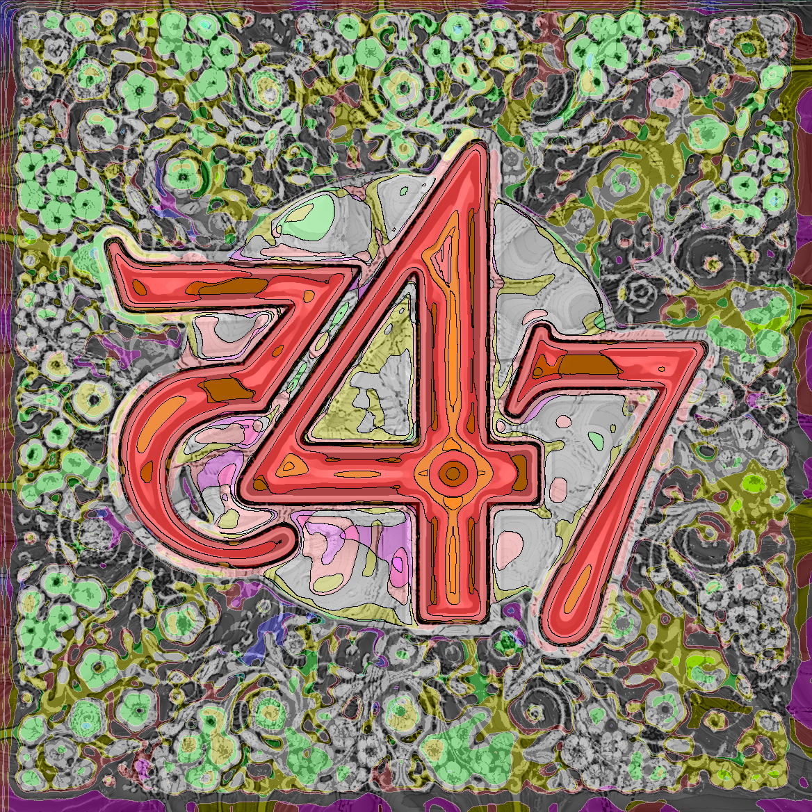
3DMN: 547 with Lace Collar
Background to the digits is an image from an 1897 An Illustrated Record of the Retrospective Exhibition Held at South Kensington, 1896 (Link1), showing an award-winning design for lace. The color scheme is derived from one shown in a 1947 circular by Pratt & Lambert on The New Vitralite Enamel (Link2). Next to it, is a new approach to 3DMN's.
Font: Caslon Pro.
Source:
Link1: archive.org/details/gri_33125001330675
Link2: archive.org/details/PrattLamertTheNewVitraliteEnamel.12
October 25, 2014
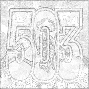
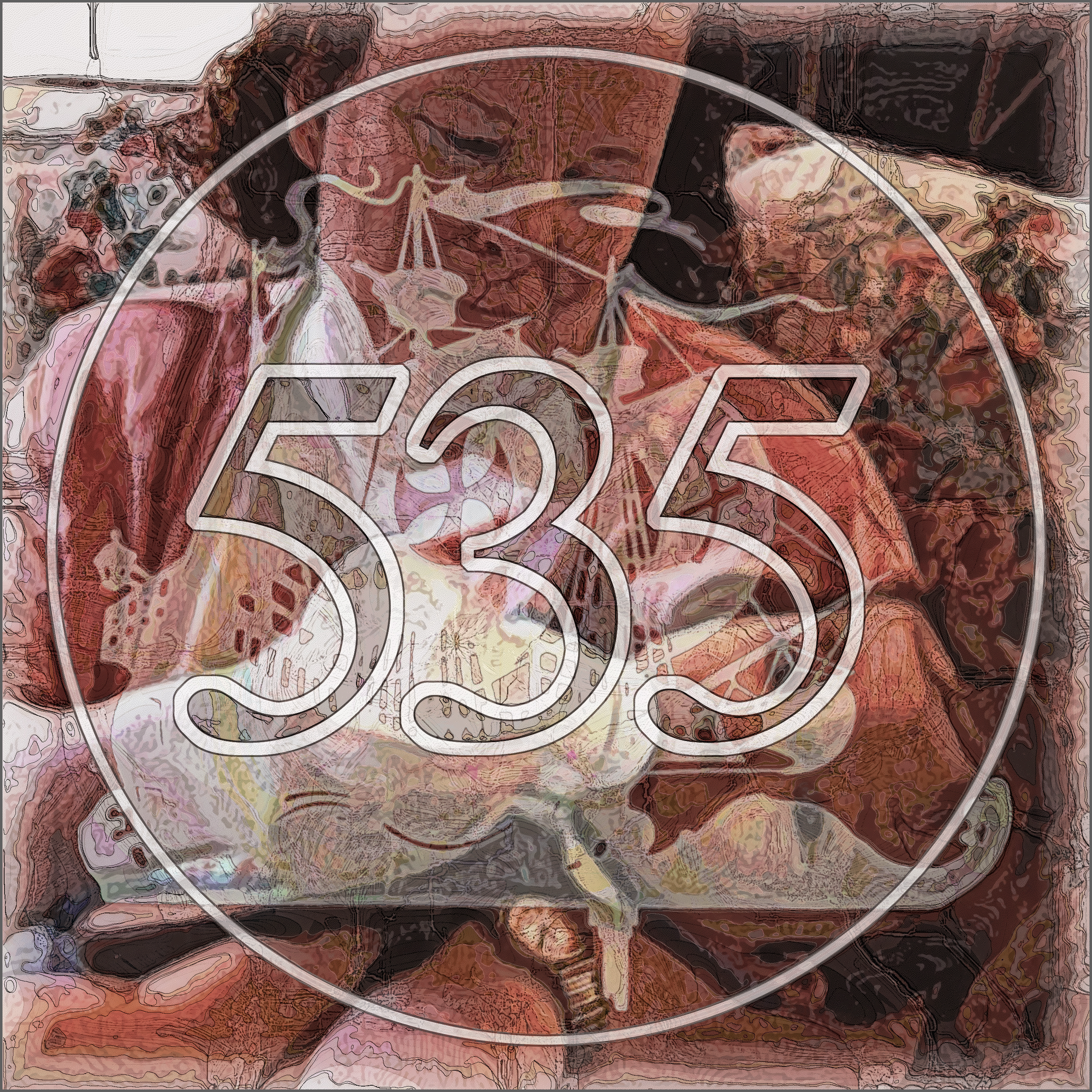
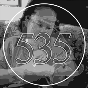
3DMN: 535 with Grape Dust
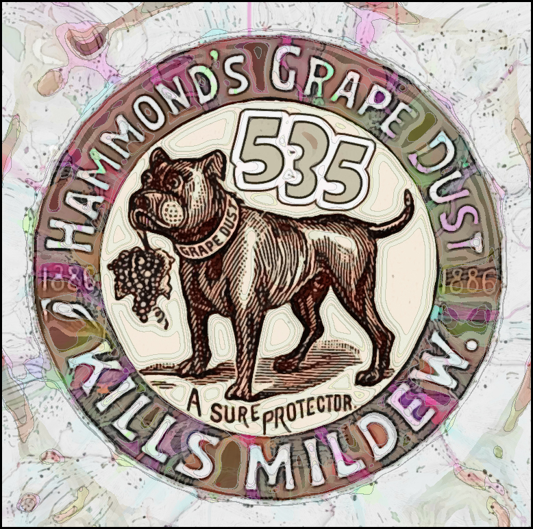
Background to the digits is an image from an 1894 catalog by Chicago seed compan E.H. Hunt, an advertisement for a powder insecticide called "Grape Dust" for vineyards and greenhouses.
Font: Unknown.
Source:
Link: archive.org/details/ehhuntseedsman1894hunt
October 23, 2014
3DMN: 317 with Anarchist Pamphlet
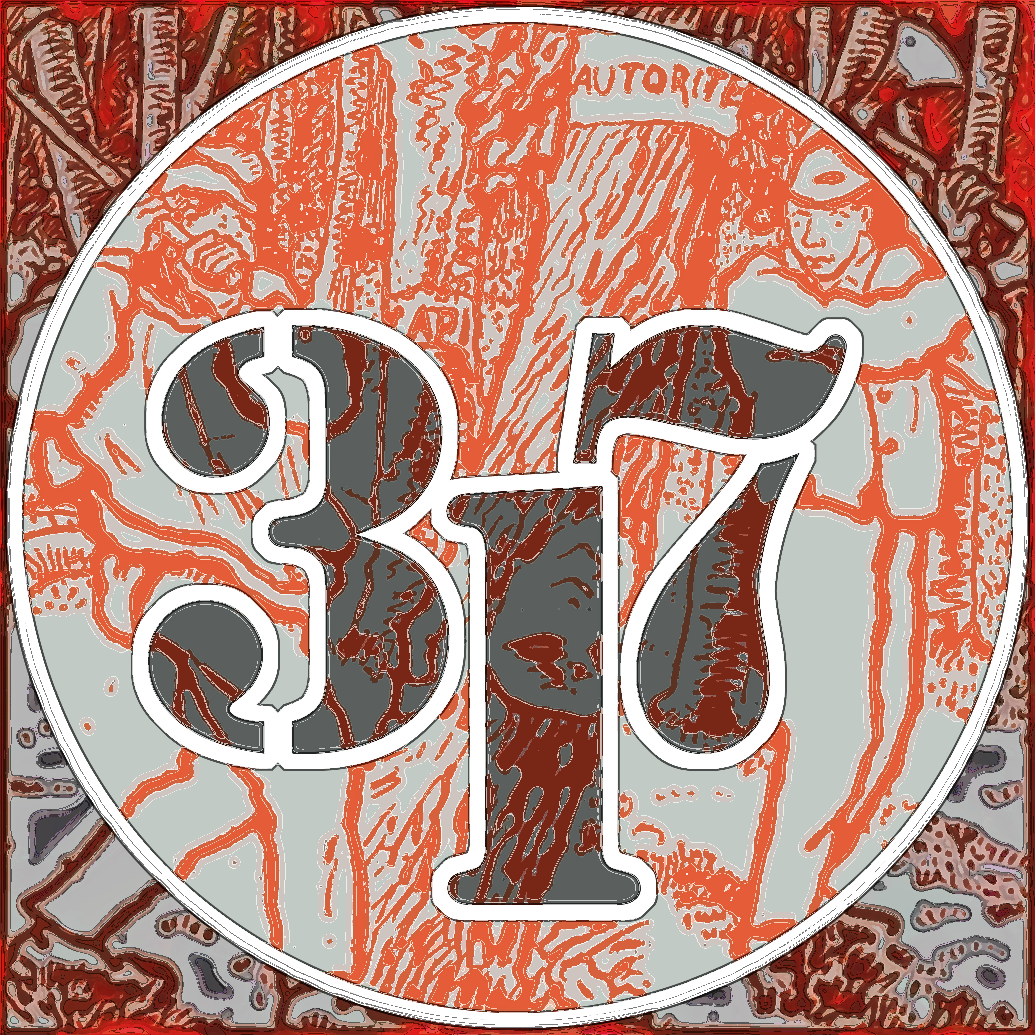
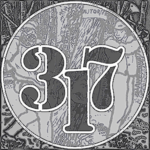
Background to the digits is an image from an 1898 French brochure for Temps Nouveaux by Jean Grave. They show two woodsmen chopping down a tree called "Authority." In the background, another tree to cut: "Capitalism."
Font: Stencil.
Source:
Link: https://archive.org/details/BrochuresDeJeanGrave
October 22, 2014
3DMN: 357 with African Banana Tree

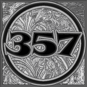
Background to the digits is an illustration of a banana tree from the 1726 Figure, Diversita di Costumi, e di Viveri per l'uso Umano. As you can see, I'm experimenting with different method of going monochrome. Here, I used Photoshop Desaturate, then in Inkscape, Blueprint. Back in Photoshop, then I remove white pixels and fill with black. I like this one.
Font: Snap.
Source:
Link: archive.org/details/gri_33125011120454
October 21, 2014
3DMN: 330 with Architectural Steel Railing
Background to the digits is a repeated pattern from the 1962 Architectural Steel catalog from J.G. Braun.
Font: Engravers.
Source:
Link: archive.org/details/ArchitecturalSteel
October 20, 2014
3DMN: 274 with Another von Larisch Typographic Design
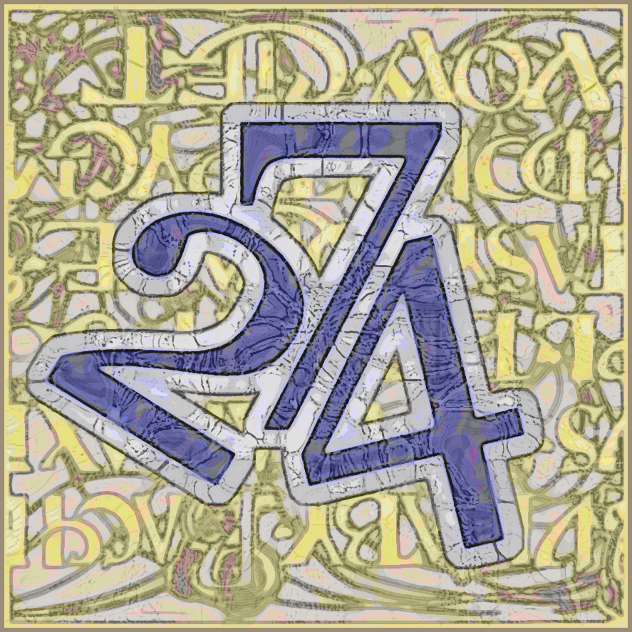
Background to the digits is another typographic decoration by Rudolf von Larisch from the 1900 Beispiele Knstlerischer Schrift. It is turned upside down.
Font: Vijaya.
In another development, I used Scribus graphic design program to create a new one-page newsletter called Weekly Bob.
Source:
Link: archive.org/details/gri_33125008890614
October 17, 2014
3DMN: 519 with von Larisch Typography
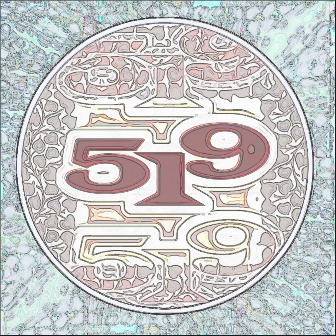
Background to the digits is a section of typographic decoration by 19th century type designer Rudolf von Larisch from the 1900 Beispiele Knstlerischer Schrift. Again, experimenting with two new programs: Inkscape and Scribus.
Font: Wide Latin.
Source:
Link: archive.org/details/gri_33125008890614
October 16, 2014
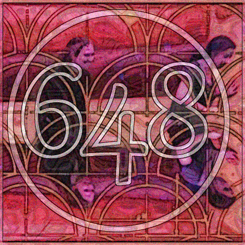
3DMN: 646 with Lalique Rooster
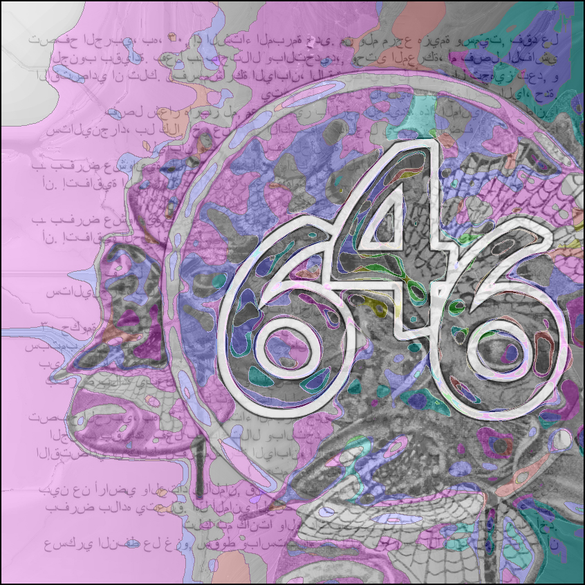
Background to the digits is another piece of jewelry by Rene Lalique from the 1903 L'Arte Decorativa all'Esposizione di Torino del 1902. Experimenting with two new programs: Inkscape and Scribus.
Font: Unknown.
Source:
Link: archive.org/details/gri_33125012571903
October 15, 2014
3DMN: 440 with Three Dragonfly Ladies
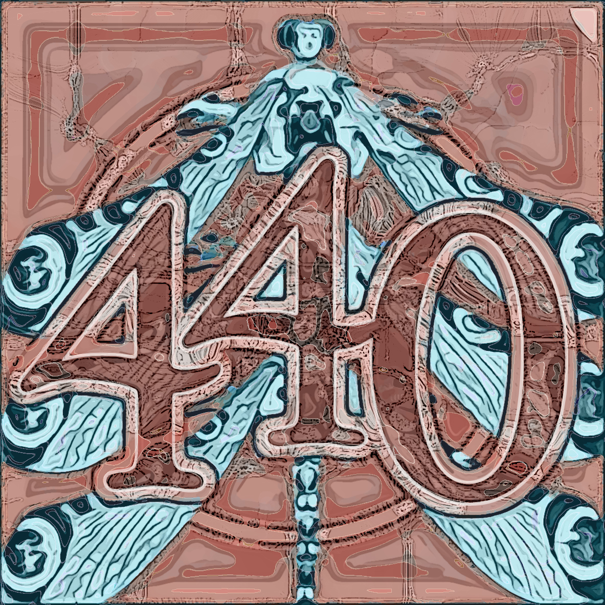
Background to the digits is an illustration from the 1903 L'Arte Decorativa all'Esposizione di Torino del 1902, showing a piece of jewelry designed by Rene Lalique, showing a dragonfly with a woman's head; the dragonfly is repeated three times in this design. Next, a monchrome version, combining Photoshop Desaturate and Inkscape Blueprint.
The font is Poor Richard.
Source:
Link: archive.org/details/gri_33125012571903
October 14, 2014
3DMN: 503 with Frowning Time

Background to the digits is an illustration from the 1937 magazine of the Reading Iron [Pipe] Co., called The Reading Puddle Ball; the illustration shows a man frowning and the text reads: "TIME: That Tough Old Tester knows more than any man can know..." [about iron pipe]. Right is a monochrome version, using InkScape's blueprint utility.
The font is Playbill.
Source:
Link: archive.org/details/TheReadingPuddleBallVolume6No.8
October 13, 2014
3DMN: 535 with Weather Vane and Bottle Time
Background to the digits is composed of (1) a photo of a relative (Janice's nephew's wife Jenny) feeding her baby from a bottle, and (2) a pattern for a Santa Maria ship weathervane from the 1924 catalog of TodHunter. On the right is a black and white version. I'm not satisfied with the way the B&W version turned out. Another try at monochrome next to it. And then another, using the Bit Trace function of Inkscape.
Anyway, happy Columbus Day..
The font is Iskoola Pota.
Source:
Photo by Bob Moore
Link: archive.org/details/WeathervanesByTodhunter
October 10, 2014
3DMN: 703 with Gears and Decorative Nailhead
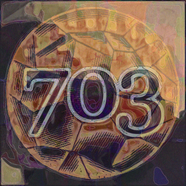
Background to the digits is composed of (1) a photo of a wooden set of gears in a museum, and (2) a drawing of a wrought-iron ornamental nail from the 1930 catalog of Julius Blum & Co..
The font is Georgia.
Source:
Photos by Bob Moore
Link: archive.org/details/JuliusBlumCo.Inc
October 9, 2014
3DMN: 426 with Janice, Life Ring, and Railing
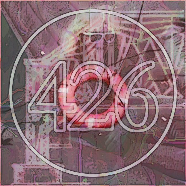
Background to the digits is composed of (1) a photo of Janice jumping about on the picnic blow-up toy, (2) a photo of an orange life preserver floating in New York Harbor, and (3) an ornamental stair railing from the 1930 Ornamental Iron Railings. I made a black & white version (to the right) and I will bring that in to the Plastic Club tomorrow and ask for Art teacher Alice Meyer Wallace's help in coloring it, either with water colors or colored pencil. Far right, is first attempt, but on yesterday's number.
The font is Garamond.
Source:
Photos by Bob Moore
Link: archive.org/details/OrnamentalIronRailings
October 8, 2014
3DMN: 648 with Picnic Funhouse and Grate
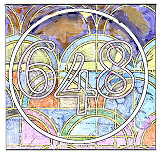
Background to the digits is composed of (1) an old photo of kids playing on a blow-up carnival toy at a Bryn Mawr summer picnic and (2) a decorative grill from a 1920 catalog, Perforated and Cast Newman Grilles.
The font is Gabriola.
Source:
Photo by Bob Moore
Link: archive.org/details/PerforatedAndCastNewmanGrilles
October 7, 2014
3DMN: 436 with Heraldry and Leaded Glass
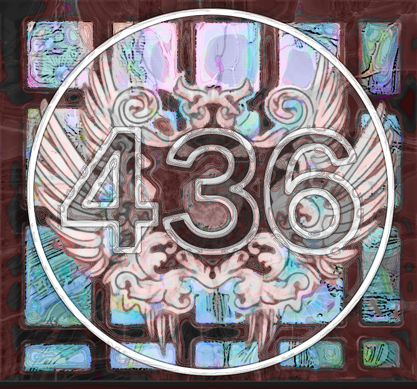
Background to the digits is composed of (1) an old photo of mine taken of the stained glass window of a lighthouse monument on Staten Island and (2) an EPS file of a crest downloaded (as a t-shirt design) from the Internet, source unknown. (I'm working this week on mastering vector-based images, because I ran across my old CD of vector-based Corel Draw (CDR) images.
The font is Franklin Gothic.
Source:
Photo by Bob Moore
October 6, 2014
3DMN: 207 with Ironwork and Snakeskin
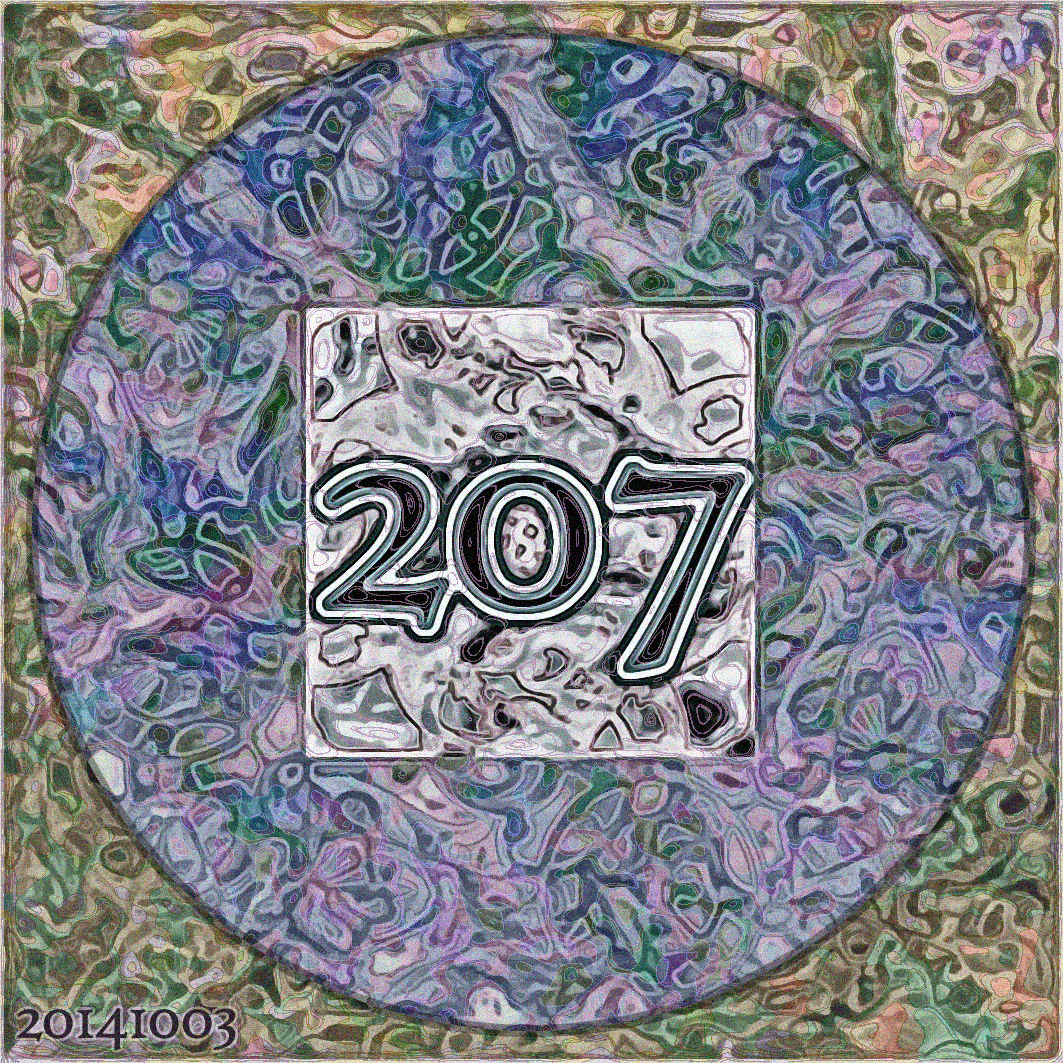
Background to the digits is composed of (1) an old photo of mine taken at the Staten Island snake museum and (2) an illustration from a 1930 catalog Ornamental Designs of Old New Orleans.
The font is High Tower Text.
Source:
Photo by Bob Moore
Link: archive.org/details/OrnamentalDesignsOfOldNewOrleansIron-Aluminum
October 3, 2014
3DMN: 345 with Bandsaw and Sundial
Background to the digits is composed of (1) an illustration from another industry guide, the 1952 Machining Alcoa Aluminum, showing an aluminum worker, in safety suit and goggles, running a band saw and (2) one of my photos of a sundial, taken in suburban Philly.
The font is Harlow Solid.
Source:
Sony Mavica Photo by Bob Moore
Link: archive.org/details/MachiningAlcoaAluminum1952
October 2, 2014
3DMN: 693 with Factory and Bust
Background to the digits is composed of (1) an illustration from the 1953 Riveting Alcoa Aluminum showing aircraft workers building an airplane and (2) one of my museum photos, showing what seems to be a 19th century girl in porcelain. No color in this one because I intend to add color at tomorrow's Plastic Club class, as seen in the second image to its right.
The font is Giddyup Std.
Source:
Sony Mavica Photos by Bob Moore
Link: archive.org/details/RivetingAlcoaAluminum
October 1, 2014
3DMN: 447 with Mother & Daughter
Background to the digits is composed of (1) my photo of the window of an abandoned warehouse on the North Shore of Staten Island and (2) one of my Off-Off-Broadway publicity shots of two Hispanic actresses, one playing mother, the other playing daughter. The play they appeared in was about a family suffering from unbending Immigration policies.
The font is Georgia.
Source:
Sony Mavica Photos by Bob Moore
September 29, 2014
3DMN: 684 with Old Post
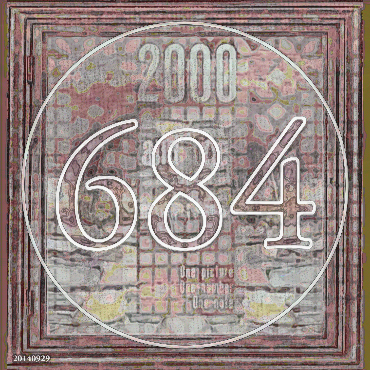
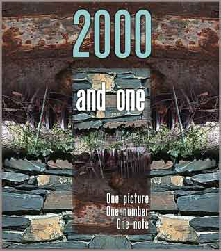
Background to the digits in the left-hand picture are two superimposed images from a 1930 catalog Way Back in 1909, showing a line of then-retro theatre poster frames and perforated metal screens. In the background of the left-image is the image on the right, rediscovered as I sort my piles of old CD's and 3.5" disks and see long-forgotten images. It dates from New Year's 2001, and declares a determination to do "One Picture, One Number, One Note" for the year ahead -- which is pretty much what I'm doing now.
The font is Adobe Garamond.
Source:
Link: archive.org/details/WayBackIn1909
September 29, 2014
3DMN: 302 with Shells & Doll-Eyes
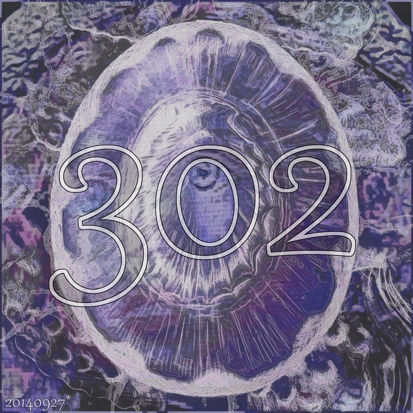
Background to the digits: a picture of seashell from the 1820 The Genera of Recent and Fossil Shells (link1) . The image is superimposed on Janice's photo of a TV ad for a doll by doll-maker Christine Orange. Unfortunately, through Operator Error, the citation and text was lost.
The font is Gabriola.
Source:
Sony Mavica Photo by Janice Moore, 1998
Link1: archive.org/details/generaofrecentfo21820soweSeashell
September 27, 2014
3DMN: 582 with Off-Off-Broadway Snaps
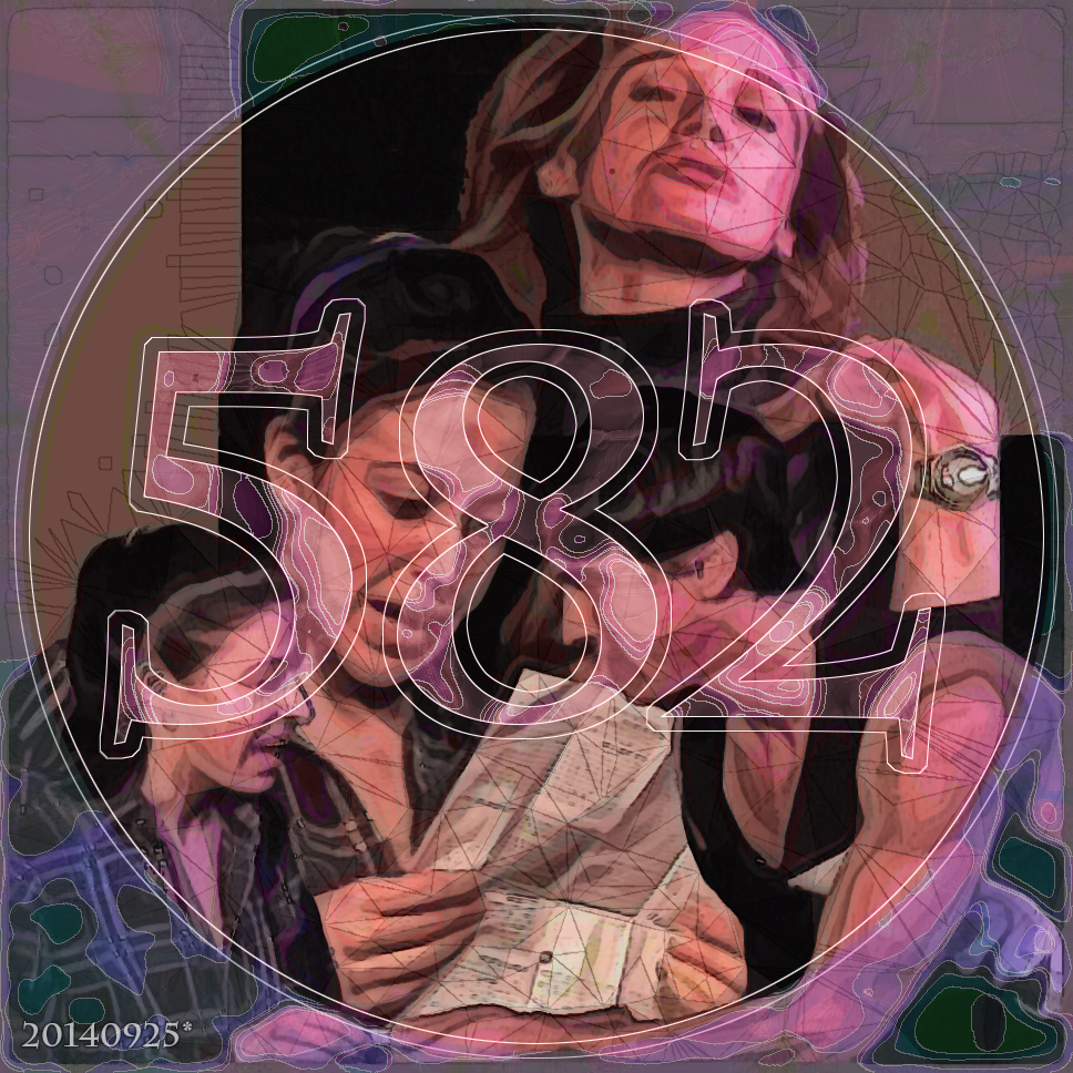
Background to the digits are publicity photos I took during my period working with an Off-Off-Broadway theatre company. Bottom is a couple appearing in a one-act play (she appears twice). They were a handsome pair, but it soon became clear that offstage she was uncomfortable, almost afraid, of him. But it was not at all visible in her performance. I forget the name of the play and the names of the actors. Top is the cool upper-class beauty who delivered a monologue from The Vagina Monologues, a funny bit where during a loveless period her friends gave her a dildo/vibrator -- and she tried to return it to the sex store asking for one "without veins."
The font is Charlemagne Standard.
Source:
Sony Mavica Photo by Bob Moore, 1998
September 25, 2014
3DMN: 368 with Poisonous Plants
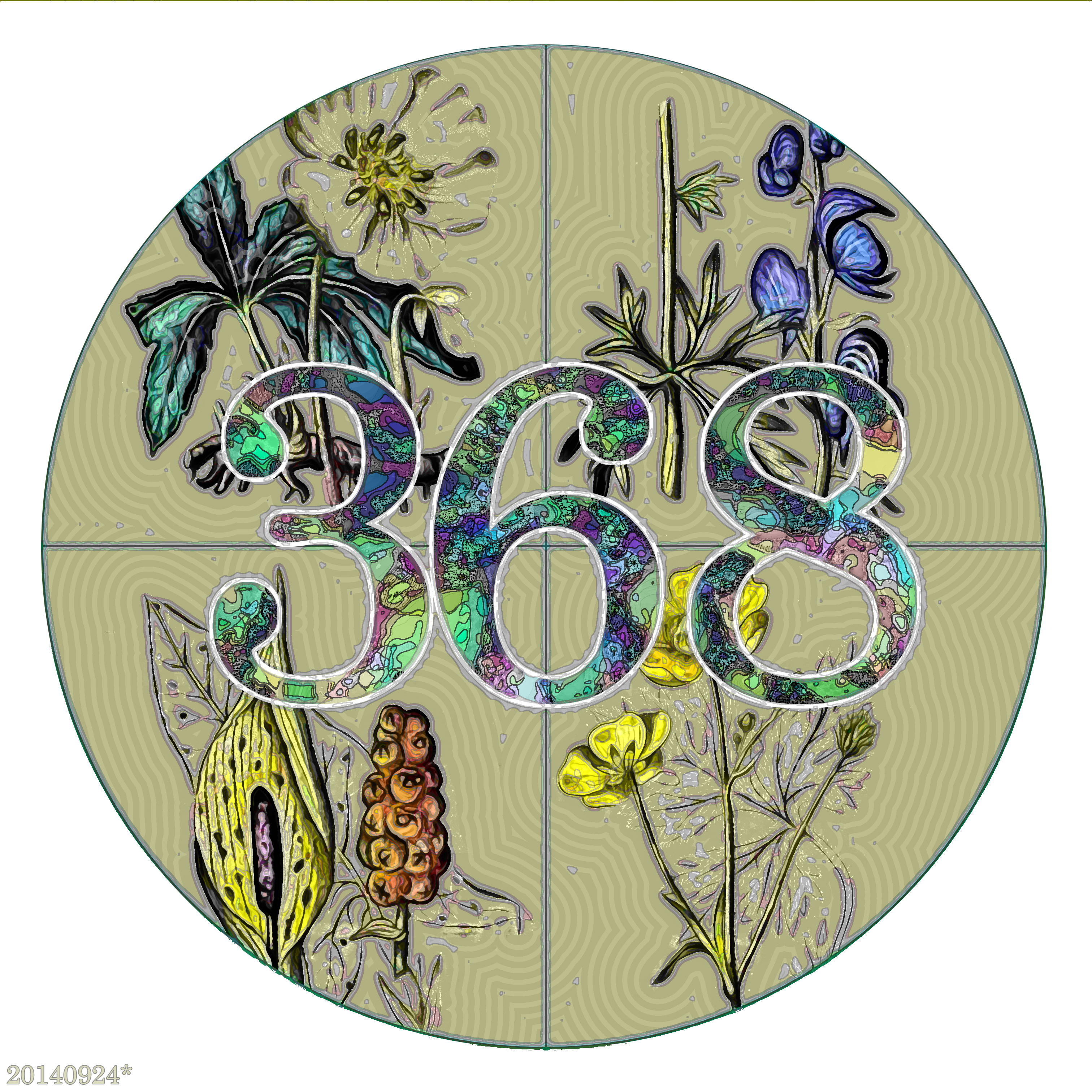
Background to the digits is an illustration from the 1843 A Table of Vegetable Poisons. It is a section from a chart labelled "Irritating Poisons". The four plants illustrated are, counterclockwise from top left: Black Hellebore, Arum or Wake Robin, Upright Meadow Crowfoot (or Buttercups), and Monk's Hood.
The font is Century.
Note the asterisk after the date at lower left. It means something regarding the Inexplicable Mystery Numbers that form the message of the 3DMN series.
Source:
Link:archive.org/details/mobot31753003221774
September 24, 2014
3DMN: 821 with Fossilized Plant
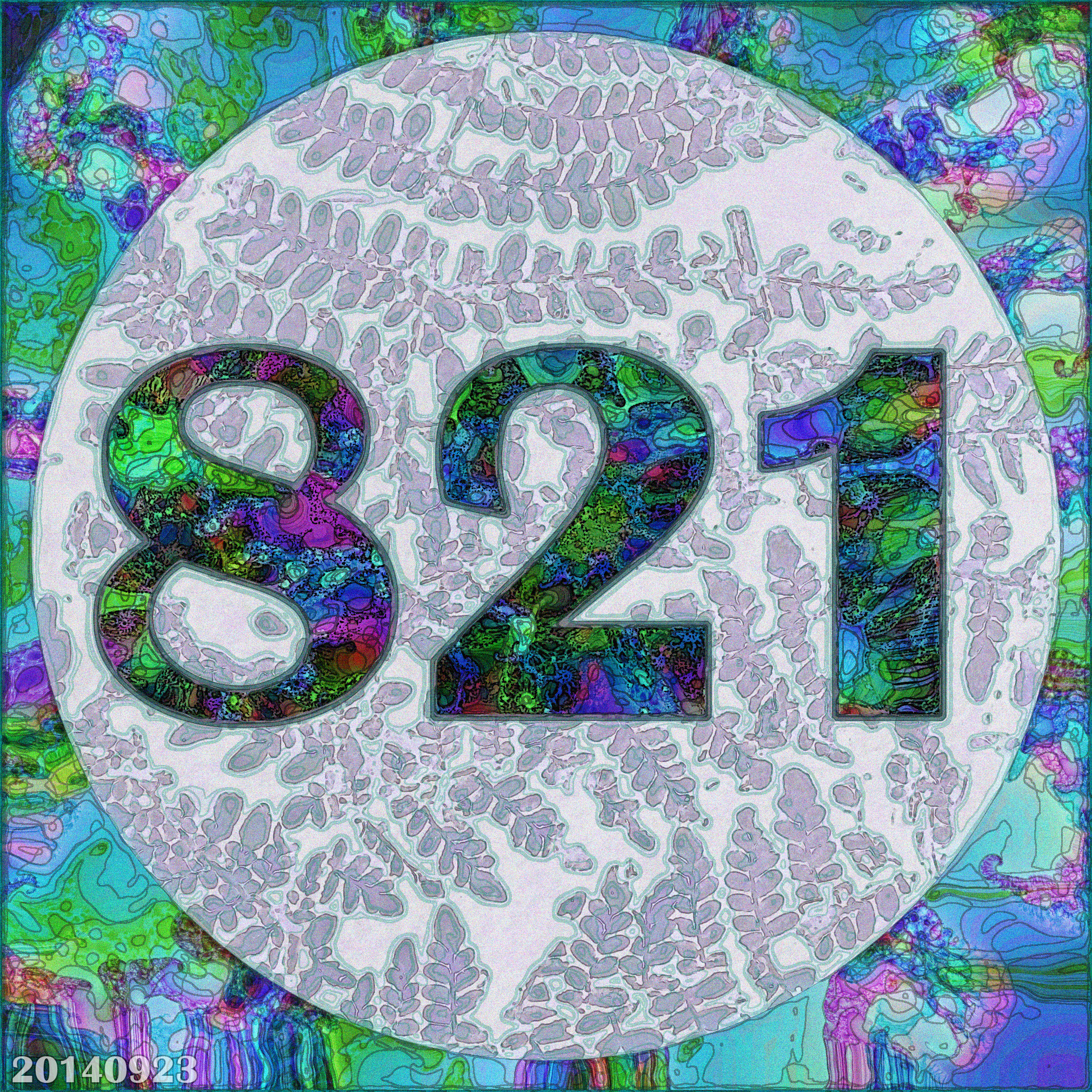
Background to the digits is an illustration from the 1949 Bulletin of the British Museum (Natural History), showing foliage from an extinct flowering plant from approximately 300 million years ago. Also dimly visible in the background is the reconstruction of another plant fossil from the same excavation in Derbyshire.
The font is Britannic Bold.
Source:
Link: archive.org/details/bulletinofbritis4621brit
September 23, 2014
3DMN: 693 with Off-Off-Broadway Actress
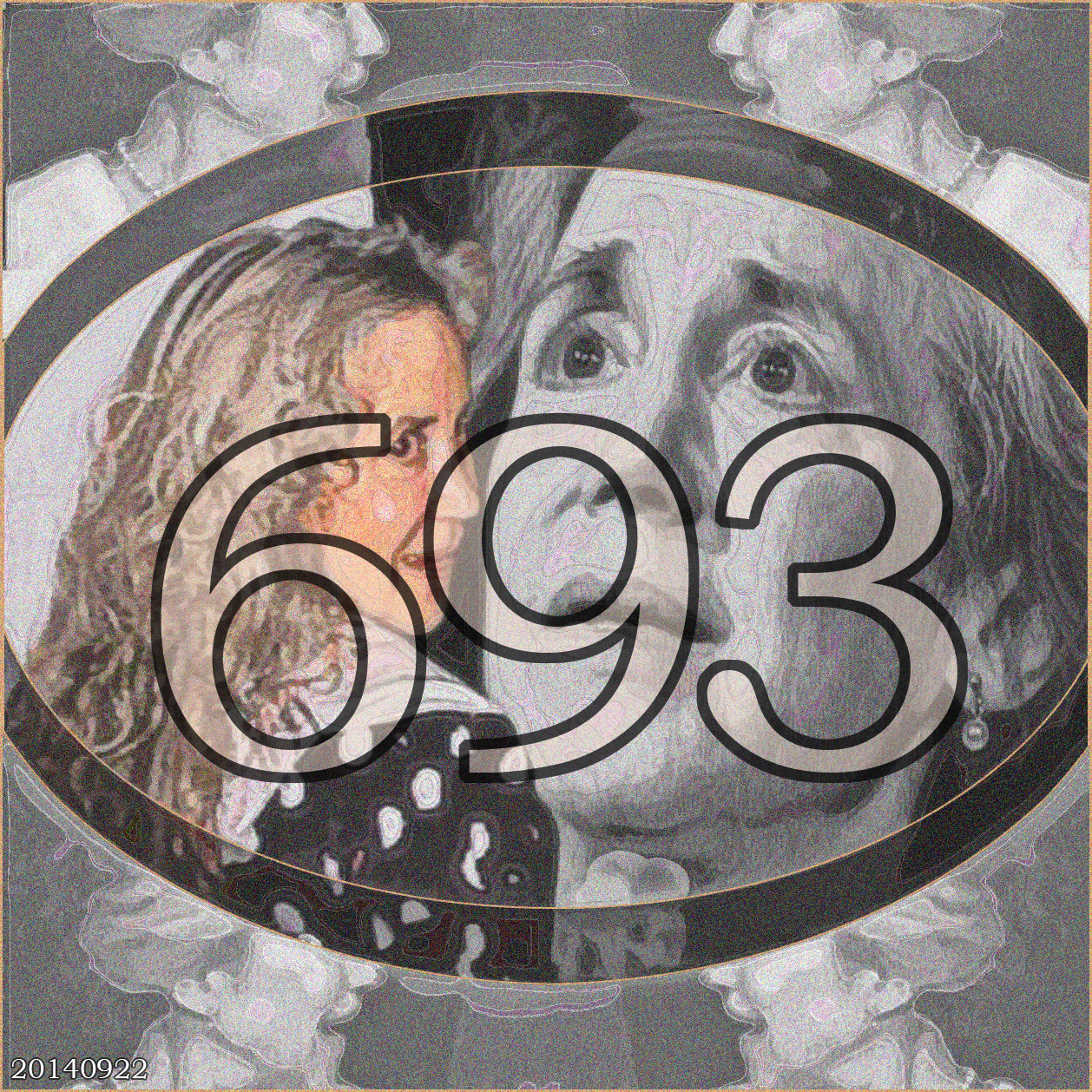
Background to the digits is a photo I took of an actress in a one-act play for which I took publicity photos in 1998. Most regrettably, I have long misplaced the program. The play, I vaguely remember, was about a young woman who experiences a supernatural event and consults an older woman. The older actress played the part with her grey hair up in a bun. But when the play was over and she was getting ready to leave, she let her hair down and revealed this cascade of curly grey locks. Bashfully, I asked her permission to take a couple photographs of her with her hair down and she agreed. The picture on the left, in color, is the result. The other black and white pictures show her in character, with her hair up. She was a nice person, and I'm sorry I forget her name.
The font is Bookman Old Style.
Source:
Sony Mavica Photo by Bob Moore, May 1998
September 22, 2014
Rings in Equilateral Rectangles
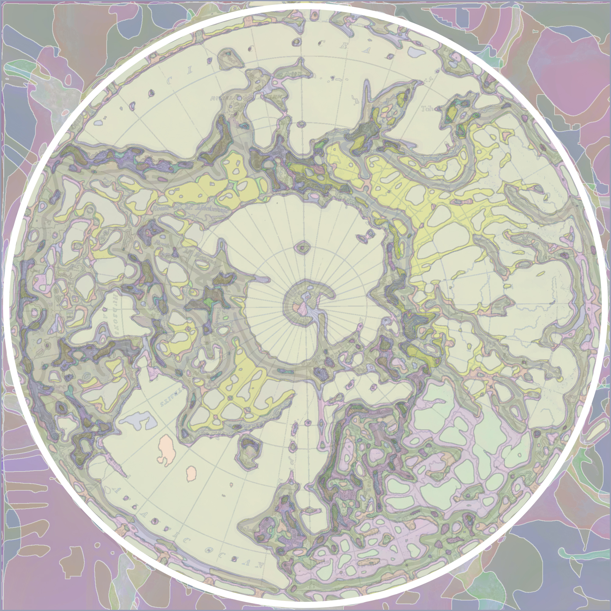
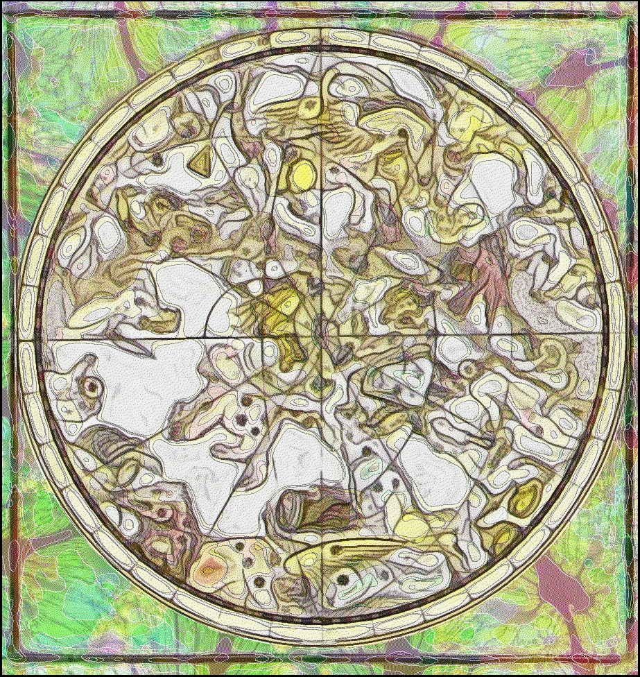
The general arrangement for my recent 3-Digit-Mystery-Number (3DMN) series has been a circle inside a square. So as I visit public domain sites, I am attracted to circle-in-square patterns. When I visited the University of British Columbia contribution to the public domain on Flickr, I noticed a number of circumpolar maps. Here are two.
On the left is a land map (Link1), date unknown, labelled Map of the Northern Hemisphere, showing the continents around the North Pole, with North American on the left and Eurasia on the right.
The image on the right is a 17th century French map (Link2) of the constellations above the Arctic Pole, labelled La Voie Lactee (The Milky Way), with a legend naming the constellations and a gray streak presumably representing the Milky Way.
Both have gone through heavy digital manipulation, so they are more a texture than a useful guide to a territory. See the originals at the links below.
Source:
Link1: www.flickr.com/photos/ubclibrary_digicentre/12796647865/
Link2: www.flickr.com/photos/ubclibrary_digicentre/12619164543/
September 22, 2014
3DMN: 531 with Blind Nydia of Pompei
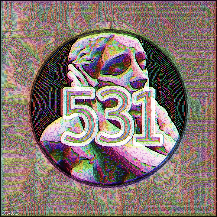
Another in the series I have come to call Three-Digit-Mystery-Numbers (3DMNs) because I have not yet revealed the source of those numbers, preferring instead to blather about portals to other dimensions and Kabbalistic Holy Grail stories. Background to these digits is a photo I took of the National Gallery of Arts statue of Nydia, the Blind Flower Girl of Pompei. Nydia is a character
in Edward Bulwer Lytton's novel, The Last Days of Pompei, where the little blind slave-girl ("half a child") sings this cheery song to her customers:
Ye have a world of light
Where love in the loved rejoices;
But the blind girl's home is the House of Night,
And its beings are empty voices.
As one in the realm below
I stand by the streams of woe!
I hear the vain shadows glide
I feel their soft breath at my side
And I thirst the loved forms to see,
And I stretch my fond arms around,
And I catch but a shapeless sound,
For the living are ghosts to me.
The statue, by Richard Rodgers, is said to be the most popular sculpture of the 19th century.
The font is Euphemia. During the last years of my parents' lives, I would visit them in Washington and spent hours in the various museums. (Later found out my Mother was hurt that I didn't spend more time with them, but tough-minded lady that she was, she never said anything.)
Source:
Sony Mavica Photo by Bob Moore, 1998
September 20, 2014
609 with Stencils
Background to the digits is a section of a page from the 1920 Stencil Catalogs: Cut Stencils for the Use of Practical Men. Original was black and white, color supplied by various digital filters. The font is good ol' Broadway.
Source:
Link: archive.org/details/StencilCatalogsCutStencilsForTheUseOfPracticalMen
September 18, 2014
406 with Spilt Milk
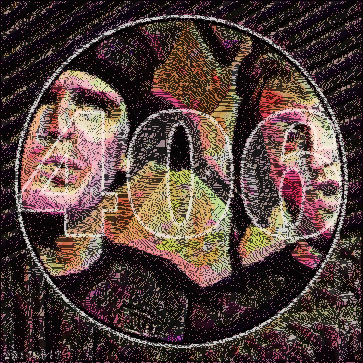
My Kryptonite interdimensional portal to a parallel world is fixed and comes up with 406. The digits are placed upon an image retrieved from a 1998 Sony Mavica 3.5" disk: a snapshot of my red-headed nephew Edward Madden (right) on stage at Caroline's Comedy Club (Manhattan) with Hector, a member of his improvisation troupe, Spilt Milk. Ed's comedy work was a youthful effort, like my rock-and-roll phase. Now Ed's a responsible family man and captain -- or maybe just a lieutenant -- of finance. But he was -- and still is -- funny. Those were good times. Edward's schtick included hilarious accounts of his "dysfunctional" family -- but actually it was a close and loving family and we all took it in good humor. Good times. The font is Brittanic Bold.
Source:
Sony Mavica Photo by Bob Moore, 1998
September 17, 2014
Awaiting Scottish Vote
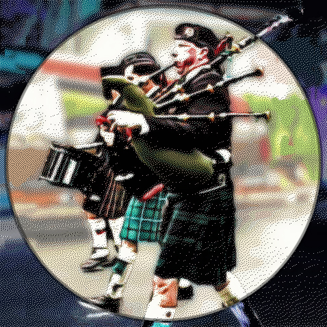
My magic interdimensional thingamabob that produces numbers is on the fritz. So today I run no number, just an image I ran across in my cull of old 3.5" disks.
When I lived in Narberth, Pennsylvania, the annual Memorial Day parade marched past our house, on Iona Avenue. Here's a snapshot from our porch of the marching bagpipers, included as a nod to today's vote on Scottish independence. (For the record, I would have voted No on Scottish independence. Not that I'm fond of the Thatcher/Cameron Tories or the old English empire, but let's face it, an Independent Scotland would need the umbrella of UK military.)
Narberth, the poor ("servants'") section of Philadelphia's Mainline, lost many soldiers in the two world wars. I remember Lou Volpe, the owner of the local diner and vet, talking about how it broke his heart when he thought of his comrades lost in World War II.
Iona Avenue was also the location of many scenes from the recent movie Silver Linings Playbook.
Source:
Sony Mavica Photo by Bob Moore, 1998
September 18, 2014
169 on My Off-Off-Broadway Moment
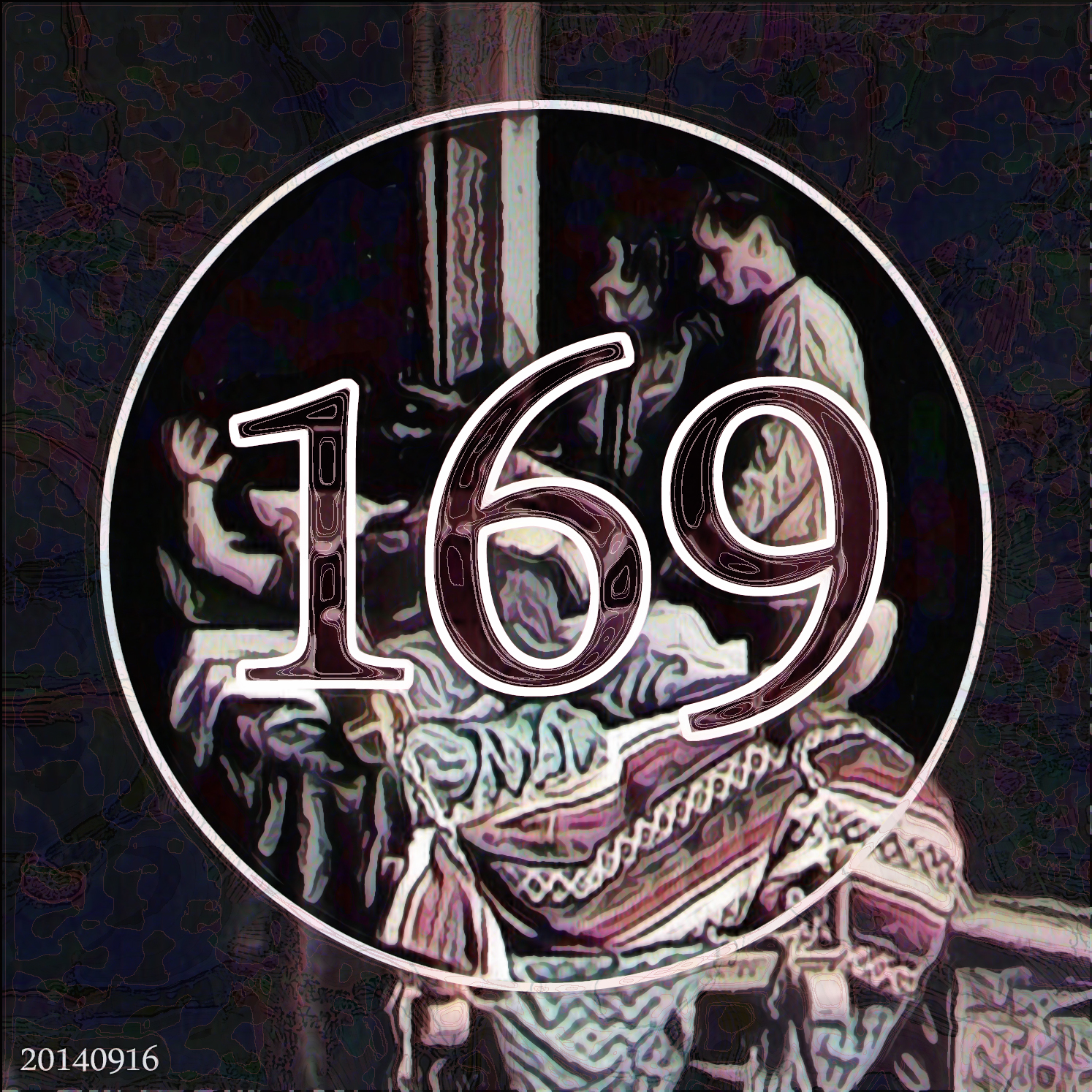
Behind the digits is an old photo of an Off-Off-Broadway production of a Sam Shepherd play. For one performance, I had a one-line role in that play,
because the regular actor
was ill and a friend from work, Roy Trejo, was director. The play was the 1974 play, Geography of a Horse Dreamer, summarized thus on the Sam Shepherd site:
Two-act play. Cody is a sleeping psychic for gamblers who earns his miserable keep while chained to a hotel bed, predicting winners during fitful snoozes. His jailers are jumpy tough guy Santee and softie sidekick Beaujo, who pace the hotel room arguing about horse-dreamer productivity philosophy...My tiny role was a butler who discovered some bodies at the end of the play. The font is DaunPenh.
Roy, This is Bob Moore, who worked with you in New York in 1998 at _____ and also did publicity photos for your various productions.
Hello, Roy, glad to see you've been active in theatre.
I've been going through my old disks, running across a lot of pictures from those times: Horse Dreamer, One Act Plays, Vagina Monologues, etc.
Do you want me to share them with you? Can you help me to identify actors? I've begun using them in artistic collages at my webpage at www.philly-bob.net.
Any comment or just say Hello, email me at [address]. (I don't use Facebook much).
What Every Digit Wants
Material behind the digits is a kind of virtual "shadow" of the number/font structure. Color provided by various GIMP and Photoshop filters.
The font is Magneto.
Source:
NA
September 12, 2014
Number with Toxic Narcotic
The image behind the digits is a recolored botanical illustration from the 1848 Traité de médecine légale, showing a plant called Stinking Nightshade or
or Black Henbane. The font is Bookman Old Style.
Source:
Link: archive.org/details/28430290RX5.nlm.nih.gov
September 11, 2014
Early Enlightenment Cheat Sheet
The images behind the digits are two woodcut illustrations from the 1905 reprint of the 1509 Die Grammatica Figurata by
early humanist and cartographer Matthias Ringman.
The book was a set of playing cards designed to teach
grammar and arithmetic rules to children. There is only one copy of this book. The font is Bodoni.
Source:
Link: archive.org/details/diegrammaticafig00ring
September 10, 2014
Holy Grail/Maltese Falcon/Hitchcockian McGuffin
Two pictures around the digits: (1) inside, my photo of a young protester during a 2003 protest against the Iraq War and (2) Janice's photo of ears of corn
at Philadelphia's Reading Terminal Market. The font is Aparajita.
Source:
Personal photos
September 9, 2014
Cyber-Numerology-Kabbalah-Tarot Random
Background are illustrations from a 1940 Silver Screen (Link1). Eyes are actress Ann Sheridan. Central noise is a glamorous lady preening before a mirror, all you can see is her hand. Font is Hobo.
Source:
Link: archive.org/details/silverscreen10unse_0
September 8, 2014
Private Mad Numerology
Background picture inside the digits is composed of a couple pictures that Janice took at Philadelphia's Reading Terminal Market:
on the left, an Amish lady serving food behind a counter and on the right, lobsters in a tank. The image in the circle is an old bookmark showing a
beautiful naked woman walking hand in hand with a skeleton. It's from the 1903 L'Arte Decorativa all'Esposizione di Torino del 1902 (Link1).
The circular ex libris is by Alfredo Baruffi, designed for the library of Bindo DeVecchi. Font is Bernard MT Condensed.
Source:
Link: archive.org/details/gri_33125012571903
September 5, 2014
Broadcasting Through the Wormhole
Font is Berline Sans FB Demi. Background picture is one of the most beautiful books I've seen in the public domain: the 1907
Budding Life: A Book of Drawings (Link1) by Scottish illustrator Jessie Marion King.
Font again is Berlin Sans FB Demi.
Source:
Link1: archive.org/details/buddinglifebooko00king
September 4, 2014
Message in a Bottle
Another one. Font is Berline Sans FB Demi. Background picture is from 1873 edition of Forest and Stream, showing a herd of deer
in the forest (Link1).
Source:
Link1: archive.org/details/ForeststreamXXXVC
September 3, 2014
Shipbuilding Collage
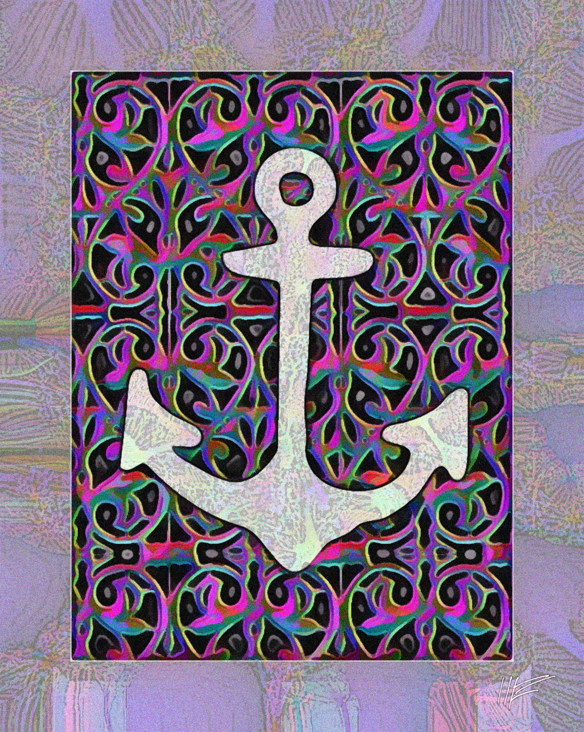
From a 1671 Dutch shipbuilding handbook Aeloude en Hedendaegsche Scheeps-bouw en Bestier (Link1) (rough translation: "Aeloude on Ship Construction and Maintenance"), various images: on far left, a rear half-view of a sea-going merchant ship; in the middle, a picture from classical times showing sailors rowing warships. The crow in the center from an advertisement in a 1907 catalog of the works of the three Maris Brothers (Link2). The anchor is one of Woodcutter's Old-School Tattoo dingbat font, letter "$".
Source:
Link 1: archive.org/details/gri_33125008247716
Link 2: archive.org/details/brothersmarisjam00thom
August 1, 2014
Ornament for an Endangered Species
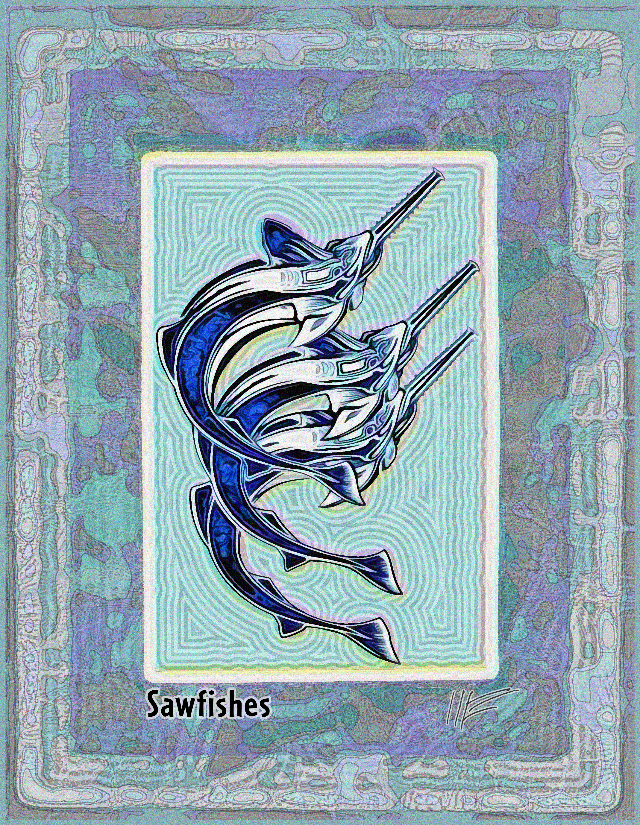
From Volume 2 of the 1904 Entwickelungsgeschichte der Modernen Kunst: Vergleichende Betrachtung der Bildenen Künste, als Beitrag zu einer Neuen Aesthetik (Link1): a graphic ornament in the Art Nouveau style, by Jan Thorn-Prikker. The picture portrays three sawfish, now an endangered species. Freely trsnslated, the title is "Evolutionary Development of Modern Art: Comparative Analysis of the Fine Arts, as a Contribution to a New Aesthetics."
Source:
Link 1: archive.org/details/gri_33125012075616
July 31, 2014
The Other Lazarus in the New Testament
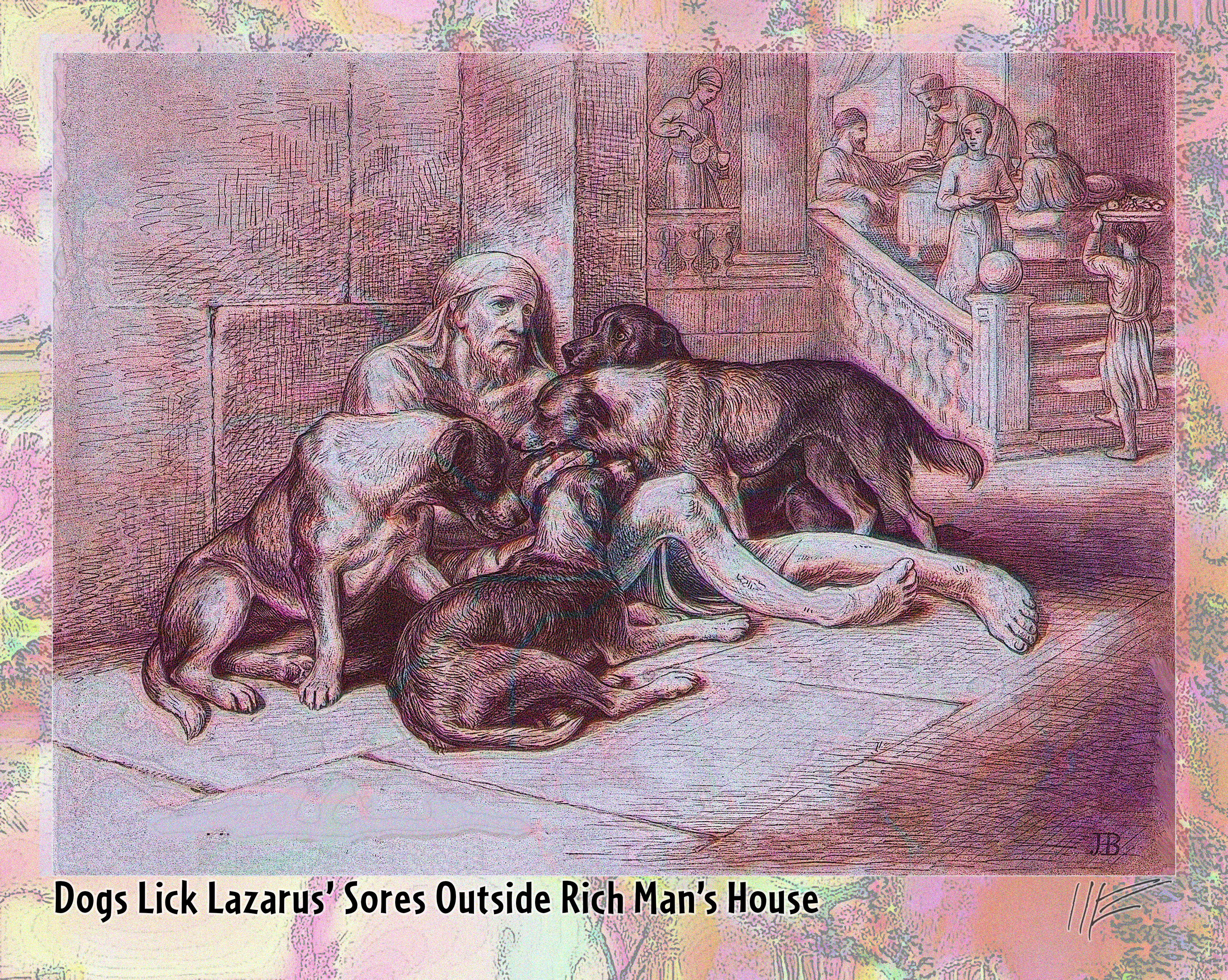
A class-conscious section of the Bible re-discovered: Jemima Blackburn drew the illustrations for the 1886 Bible Beasts and Birds. Here's one for a little-known parable in Luke 16: 19-31, which I retranslate as:
There was a rich man who was dressed in purple and fine linen and lived in luxury every day.
At the gate of this rich man's house was laid a beggar named Lazarus, covered with sores,
longing to eat what fell from the rich man's table. Even the dogs came and licked his sores.
The time came when the beggar died and the angels carried him to Heaven.
The rich man also died and was buried.
In Hell, where he was in torment, the rich man looked up and saw Lazarus with God in Heaven.
The rich man prayed to God, "Have pity on me and send Lazarus to dip the tip of his finger in water and cool my tongue, because I am in agony in this fire."
But God replied, ‘Son, remember that in your lifetime you received your good things, while Lazarus received bad things, but now he is comforted here and you are in agony.
Between us and you a great chasm has been set in place...
Blackburn illustrated the italicized section. Two notes: (1) the licking of sores was considered a cure and (2) some commentators say that dogs were not kept by the rich as pets, but as guard dogs.
Source:
Link 1: archive.org/details/gri_33125013853557
July 29, 2014
Helping Someone Hanging from a Cliff
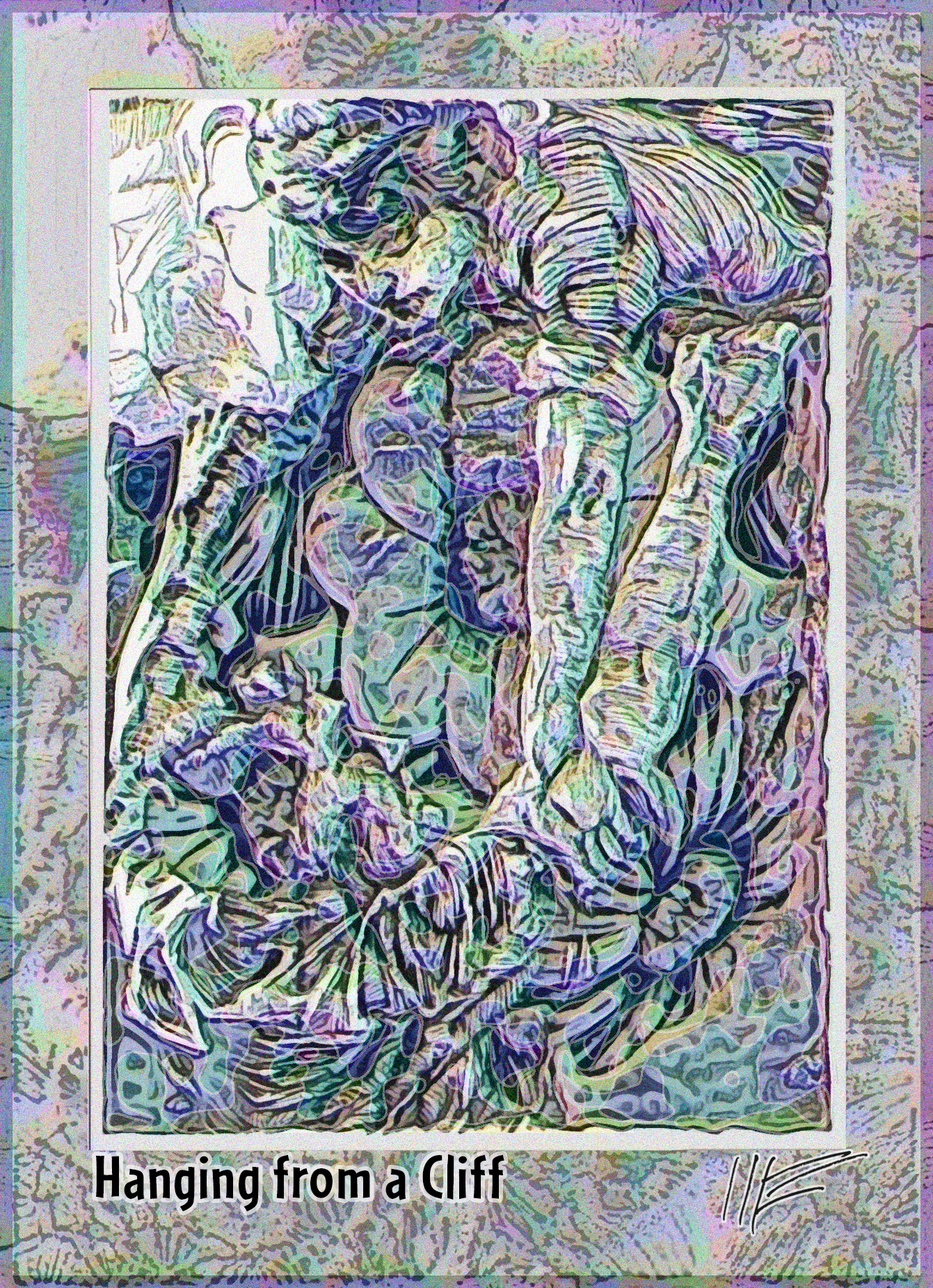
Another illustration from the 1921 Everybody's Magazine (Link1), showing a woman hoisting up a man who is hanging on to a cliff edge. That image overlays a flower image from an 1890 German botanical book, Illustriertes Gartenbau-Lexikon (Link2).
Source:
Link 1: archive.org/details/everybodysmagaz00unkngoog
Link 2: archive.org/details/illustriertesga03rmgoog
July 27, 2014
Deathbed in House
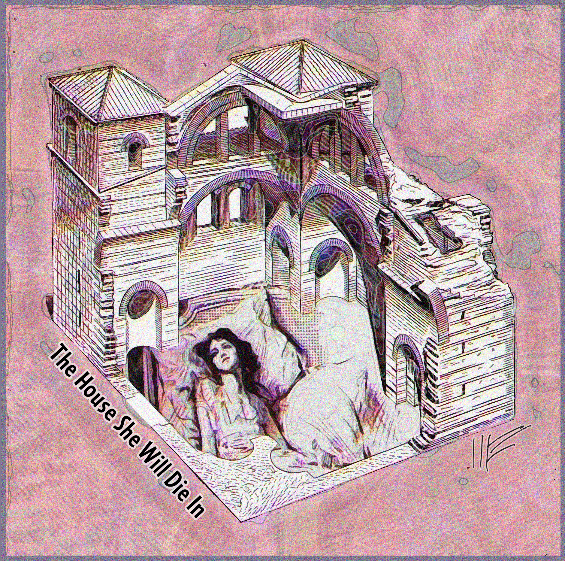
A drawing of a house from the 1863 Entretiens sur L'Architecture (Link1) by Eugene Viollet-le-Duc. Set inside the house is an illustration from a short story appearing in a 1921 issue of Everybody's Magazine (Link2) showing a young girl in her supposed deathbed.
Source:
Link 1: archive.org/details/gri_33125006563064
Link 2:archive.org/details/everybodysmagaz00unkngoog
July 27, 2014
Dutch West Indies Hatmaking
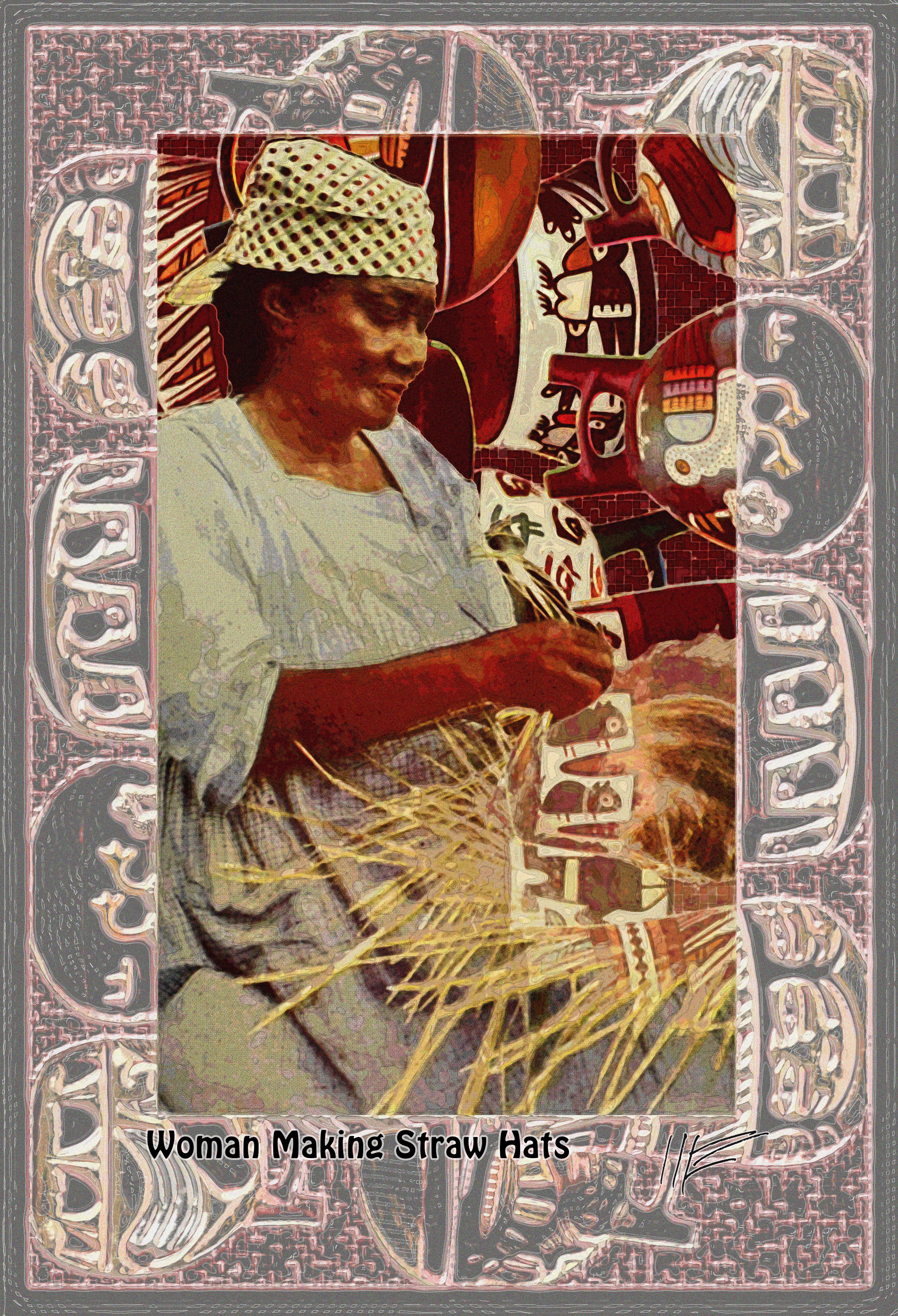
A combination of two images from the 1929 travel/geography book Lands and Peoples : The World in Color (Link 1). In the foreground, a woman from Curacao weaves a straw hat; in the background, a collage of Peruvian pottery.
Source:
Link 1: archive.org/details/landspeoplesworl00tayl_5
July 26, 2014
Combination
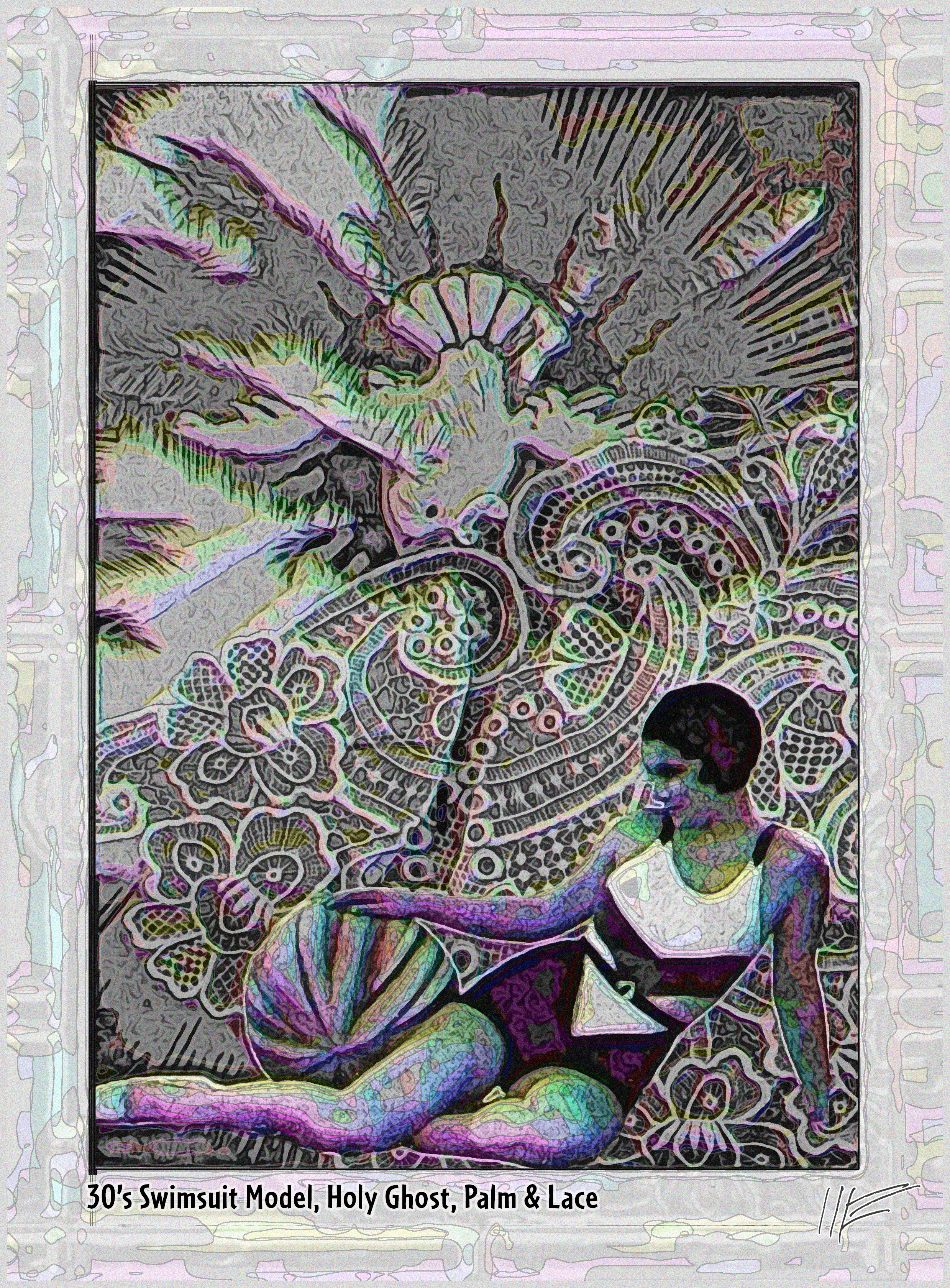
From a 1935 travel brochure for Queensland, Australia (Link 1), a bathing beauty and a palm tree, overlaid on a photograph of Point de Venice lace from the 1911 Singer Instructions for Art Embroidery(Link 2) and then one of the flaming Holy Ghost doves from the 1943 Devotion to the Holy Ghost (Link 3).
Source:
Link 1: archive.org/details/TheSunshineRoute_201401
Link 2: archive.org/details/singerinstructio00sing
Link 3:: archive.org/details/devotiontoholygh00unse
July 23, 2014
Variations on Patterns in Glass
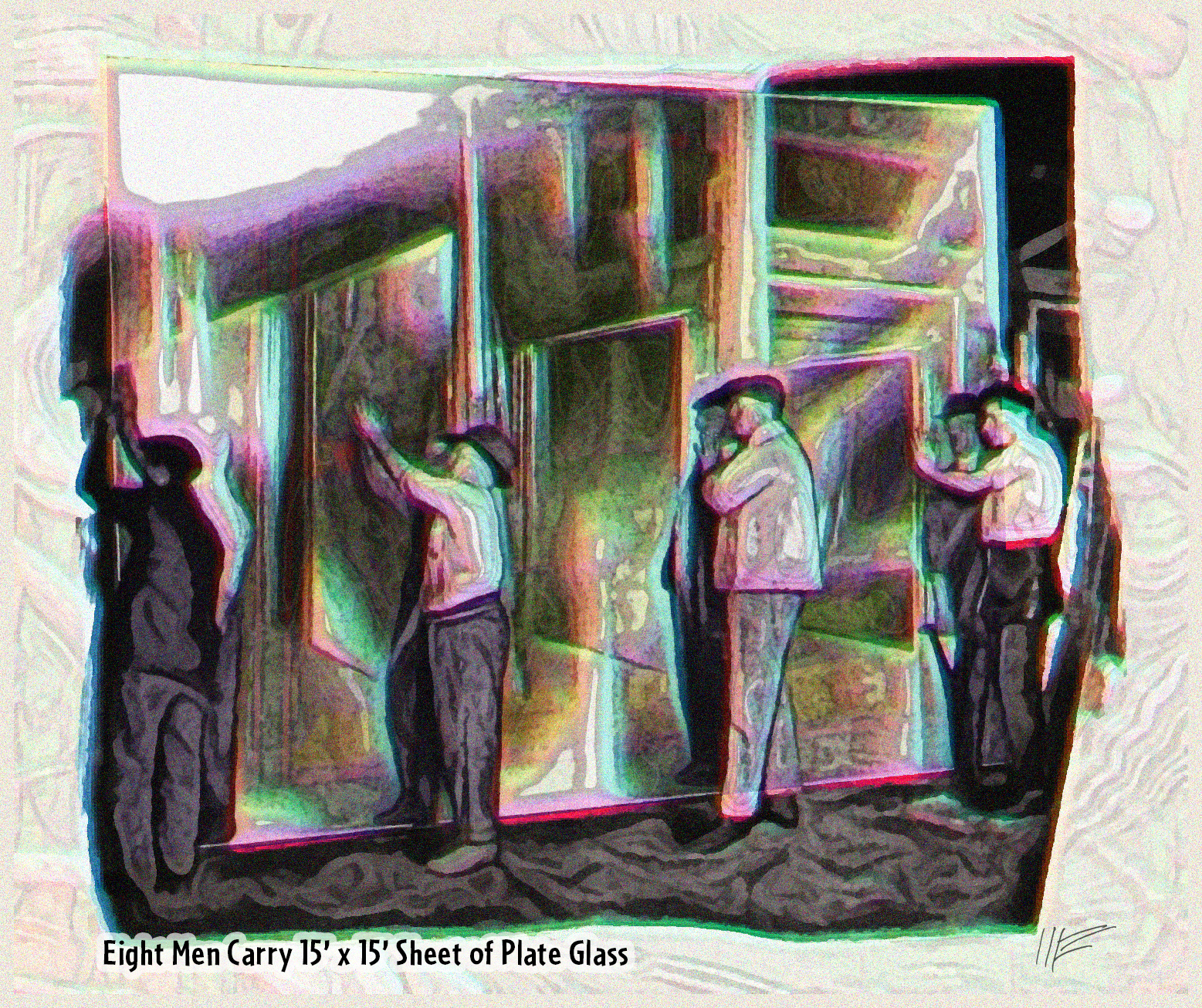
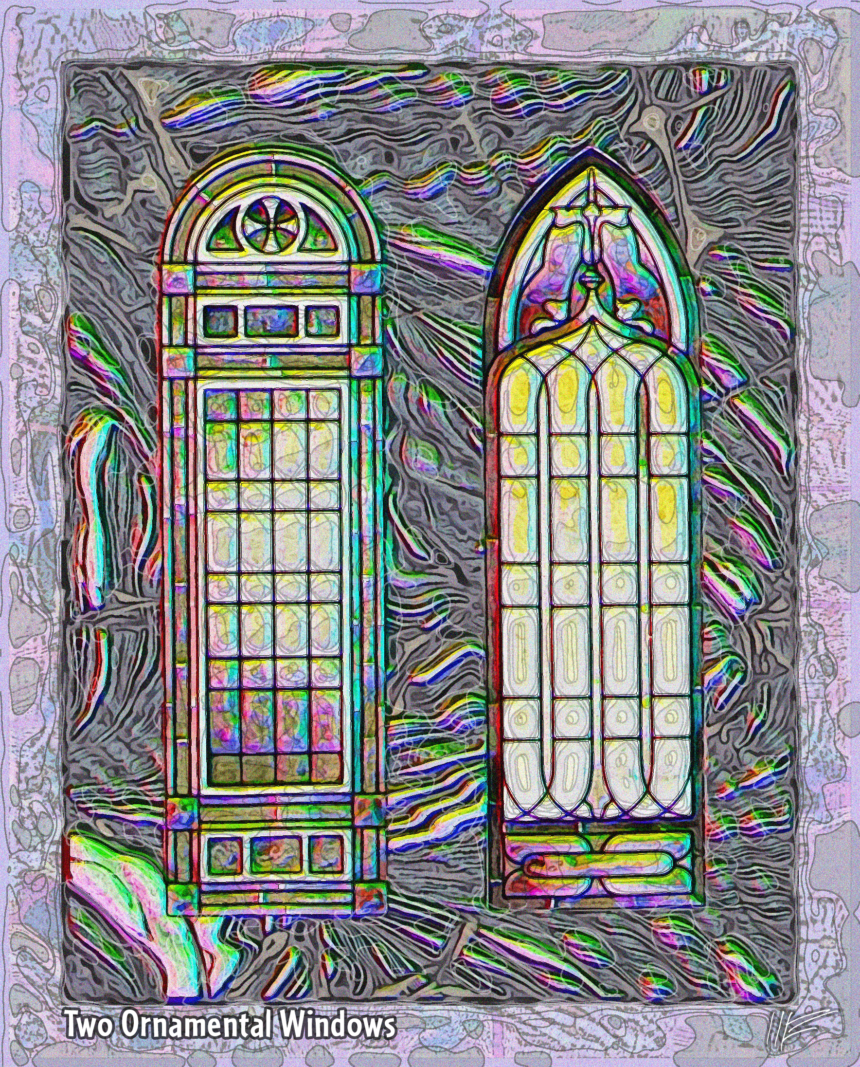
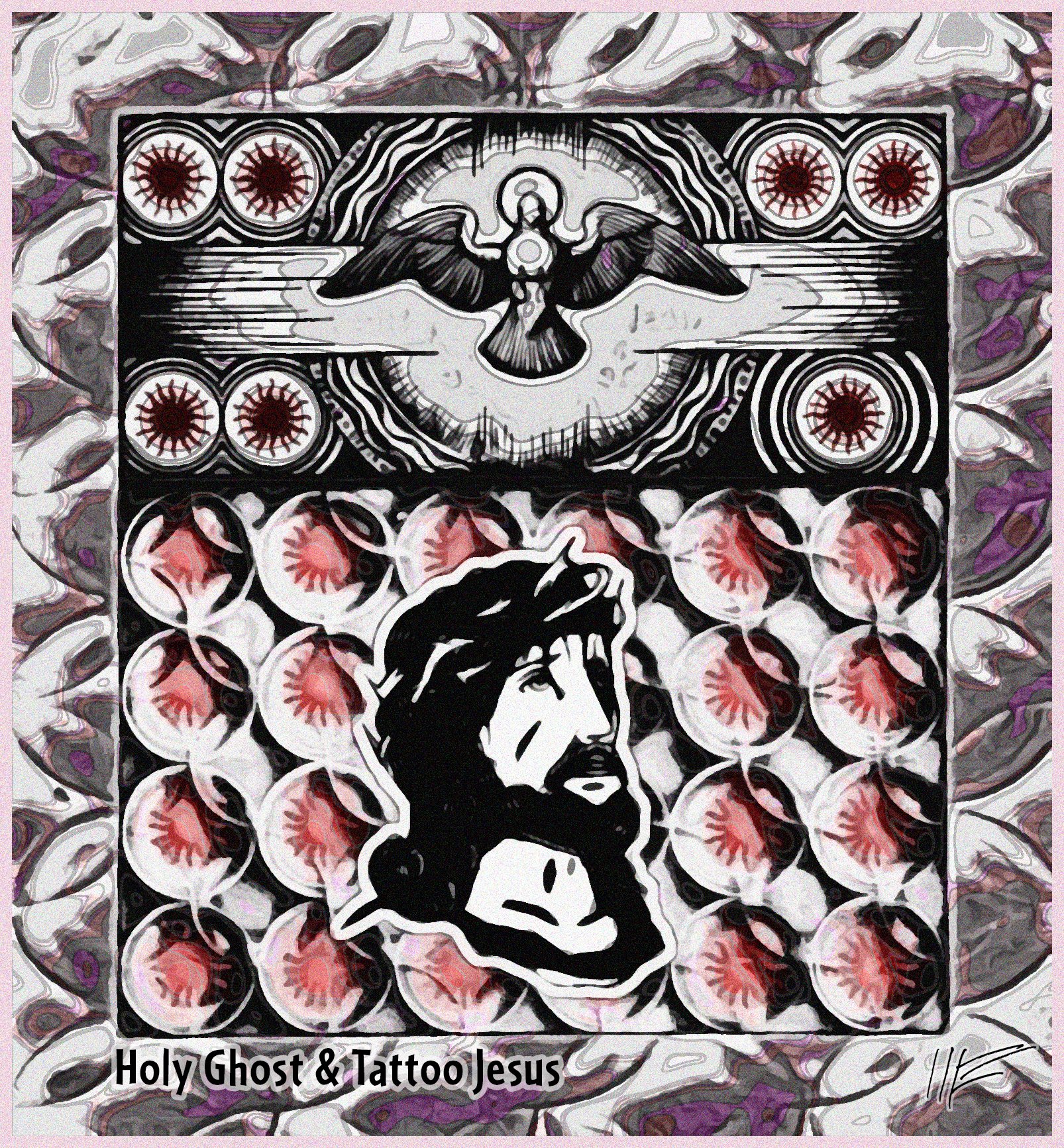
Left, from a 1919 trade catalog Glass for Every Industry (Link 1), a photo of men handling a large sheet of plate glass. In the middle, two decorative windows from the same catalog overlaid on marblized paper from an endpaper. On right, in top section, a chapter heading from the 1943 Devotion to the Holy Ghost by a Benedictine convent (Link 2) and in bottom section, a drawing of pressed lens glass, used in transoms because it is a "universal diffuser of light," overlaid with one of Woodcutter's Old-School Tattoo dingbat font, letter "C", showing the suffering Jesus wearing a crown of thorns.
My fine-arts friends object to the text captions, saying they distracts from the visual impact of the pieces. But I say this: if the fact that you know that (1) these are based on illustrations from a glass factory catalog from a hundred years ago means you can't appreciate (2) the weird reflections, textures, colorations, and iconographic coincidences in these pieces, then you have to expand your concept of art.
Source:
Link 1:: archive.org/details/GlassForEveryIndustry_169
Link 2:: archive.org/details/devotiontoholygh00unse
July 22, 2014
Tattoo 3 Hollywood Glamour Acoustic Ceiling Panel & Light Fixtures More Marketing of Anxiety The Marketing of Anxiety Greece Trip: Hallucination in Piraeus, Our Teacher, Rails Herszaft Depiction of Dolomite Legend Hoherman Portrait of Woman with Child Kisling Portrait of Woman Guterman Portraits of Women Village Scene, Europe before the Holocaust Composition from Metallurgy Balzac Nightmare Familiar Flightless Fowl Street Vendor and Song Horrible Synchronicity Bad Moon on the Rising The Lighthouse at the End of the World Strong Man and Gymnast Physiognomic Portrait Fourth Day:Patriotic Dairy Scene
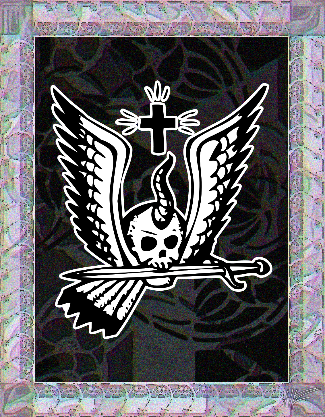
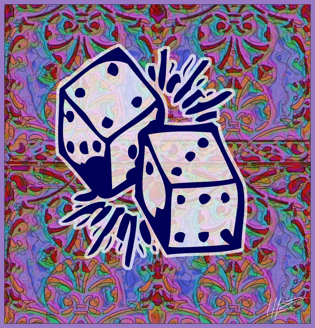
Combination of stencils from a 1920 catalog Stencil catalogs: cut stencils for the use of practical men (Link1). I turned the stencil into a step-and-repeat pattern, then overlaid that with an anchor tattoo from one of Woodcutter's Old-School-Tattoo dingbat collections, letter "$", then a bloodthirsty skull with cross, letter "2", and lucky dice, letter "L".
Source:
Link1: archive.org/details/StencilCatalogsCutStencilsForTheUseOfPracticalMen
July 16, 2014
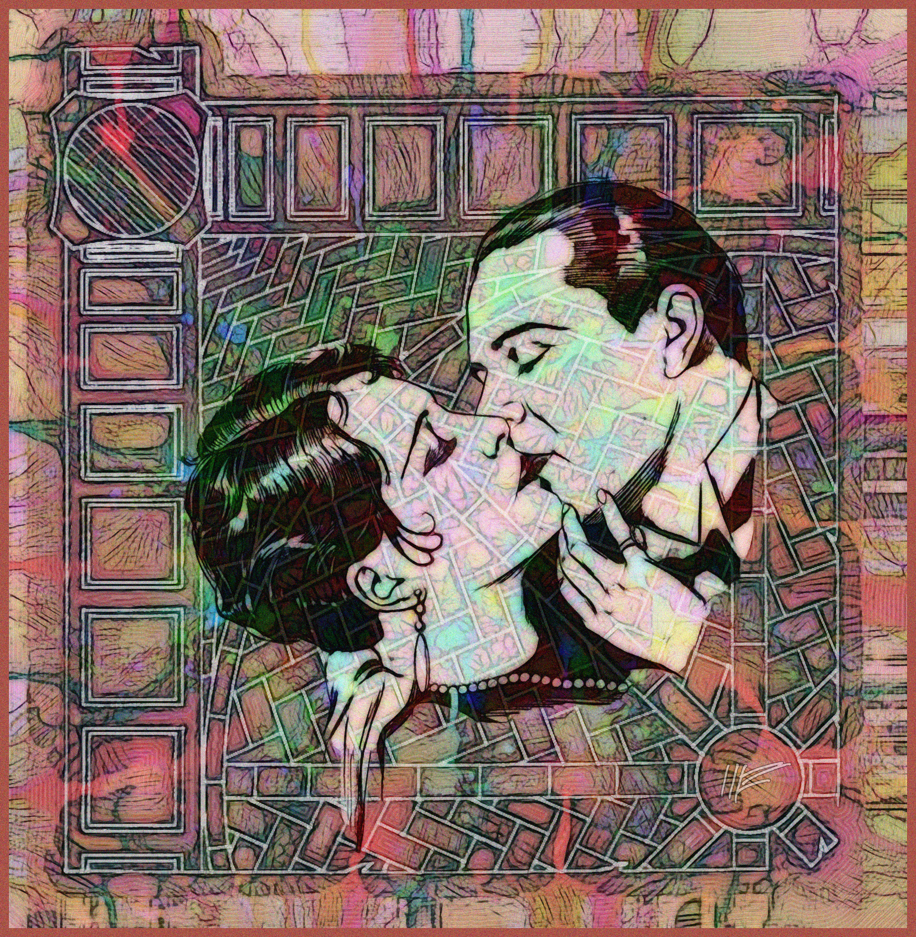
From the June 1927 Variety a romantic illustration showing actress Billie Dove embracing Ben Lyon in the 1927 movie The Tender Hour (1). That image is superimposed on a drawing of the herringbone pattern used for the medieval vaulting for a Connecticut church, as shown in Acousti-Celotex's Colorful decoration with good acoustics (2).
Next to that, a composition from the same sources: some sort of Baby Snookums contest in a Variety ad (1) and a ceiling tile herringbone treatment from a Massachusetts church (2).
To the right of that, from a 1940 Silver Screen(3), the young Lucille Ball, back when she was a chorus girl/dancer. She later became a leading comedienne and studio executive.
And on the far right, an image from a movie poster showing Ann Sheridan from a 1939 Showmen's Trade Review (4), inset into a theatre scene from the 1922 The control of lighting in theaters (5).
For maximum effect with my images, click on the image until it is full-size, which may be larger than your computer screen.
Sources:
Link1: archive.org/details/variety87-1927-06
Link2: archive.org/details/ColorfulDecorationWithGoodAcoustics
Link3 archive.org/details/silverscreen10unse_0
Link4 archive.org/details/showmenstraderev30lewi_1
Link5 archive.org/details/TheControlOfLightingInTheaters
June 23-26, 2014
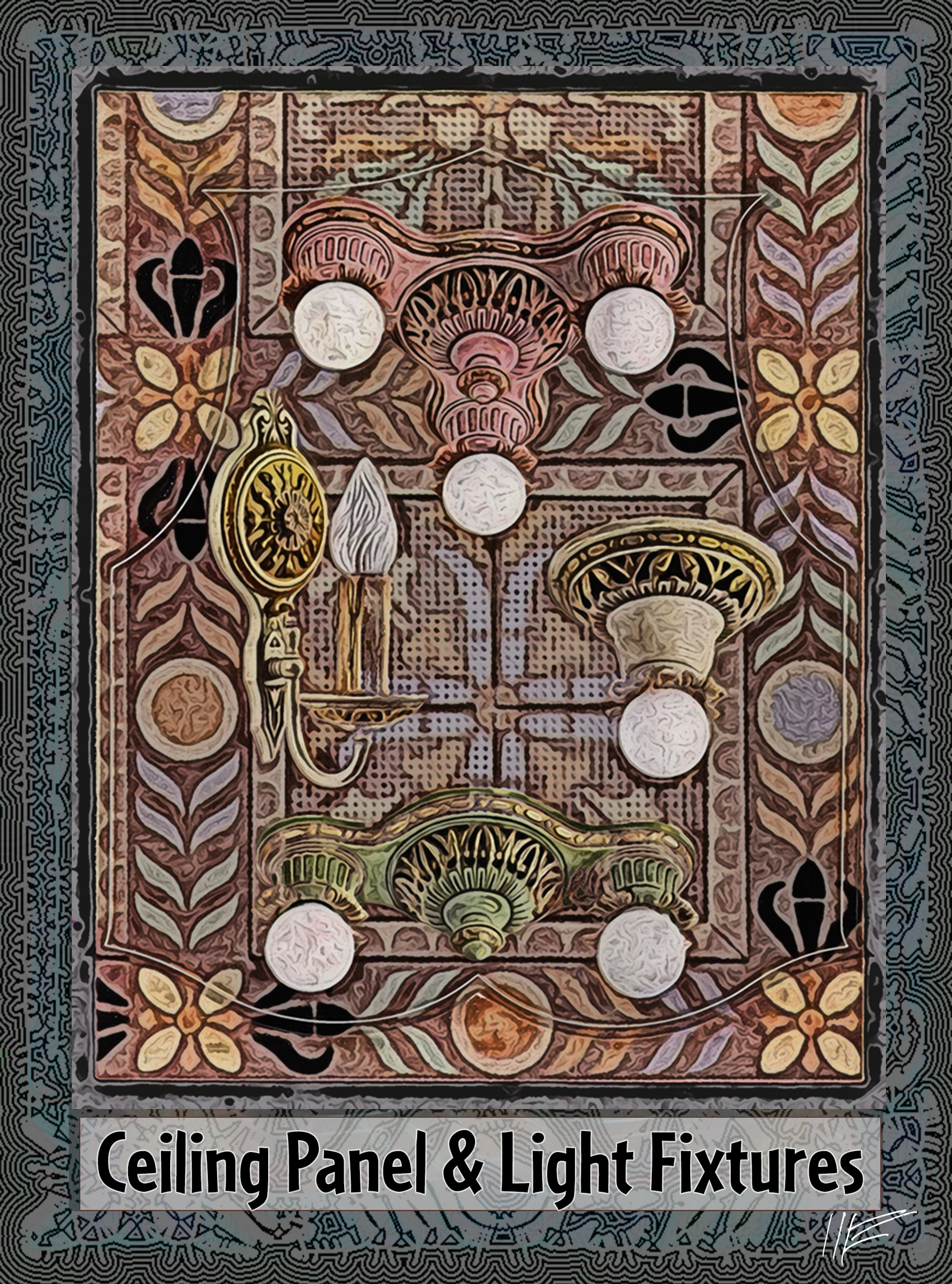
A composition of two illustrations from building equipment catalogs: (1) an undated (but probably approx. 1915) illustration of light fixtures from Distinctive lighting equipment by Cleveland's Kayline Co. and (2) an illustration of patterned acoustic ceiling tile from another undated catalog, Colorful decoration with good acoustics, by Chicago's Acousti-Celotex Co. Note two treatments: one with text, one without. Fine artists on the Greece trip were very critical of my use of text; somehow, once something was identified as, for instance, ceiling tile and light fixtures, they couldn't see the inherent beauty of the pattern and colors. It wasn't Art. I didn't think much of this point of view, but I may have to adapt to it if I start selling. Also, there is a difference in framing between the two images -- a whole other issue.
For maximum effect with my images, click on the image until it is full-size, which may be larger than your computer screen.
Sources:
Link1: archive.org/details/DistinctiveLightingEquipment
Link2: archive.org/details/ColorfulDecorationWithGoodAcoustics
Monday, June 23, 2014
Two more photographic images from ads in the 1940 Silver Screen, marketing products catering to women's social anxiety. In the top illustration, a glamorous young woman pleadingly asks a friend Then why have I never married? in an advertisement for Listerine for Halitosis. In the bottom illustration a young wife sobs at her piano under the withering glare of her husband. Headline: Voted the Ideal Couple. But her husband knew of her "ONE NEGLECT." Lysol could have helped her. on the subject of "personal intimate cleanliness." Lysol? WTF? See this article on the cynical marketing of dangerous products like Lysol for douches and birth control.
For maximum effect with my images, click on the image until it is full-size, which may be larger than your computer screen.
Sources:
Link1 archive.org/details/silverscreen10unse_0
Monday, June 16, 2014
Three illustrations from ads in the 1940 Silver Screen, marketing products catering to women's social anxiety. The first two are for Mum deodorant. Left, a girl ponders her isolation at a party. (Headline: "Wake up, Wallflower! Mum after your bath would have saved your Charm!") Middle: a girl stares out from behind a curtain at others socializing. (Headline: "Just a Pretty Stranger -- in her own Home Town"). Right: Two women compare symptoms. (Headline: "What if it is "THAT TIME" OF MONTH? Keep going and keep comfortable with the help of Midol?"
For maximum effect with my images, click on the image until it is full-size, which may be larger than your computer screen.
Sources:
Link1 archive.org/details/silverscreen10unse_0
Monday, June 16, 2014

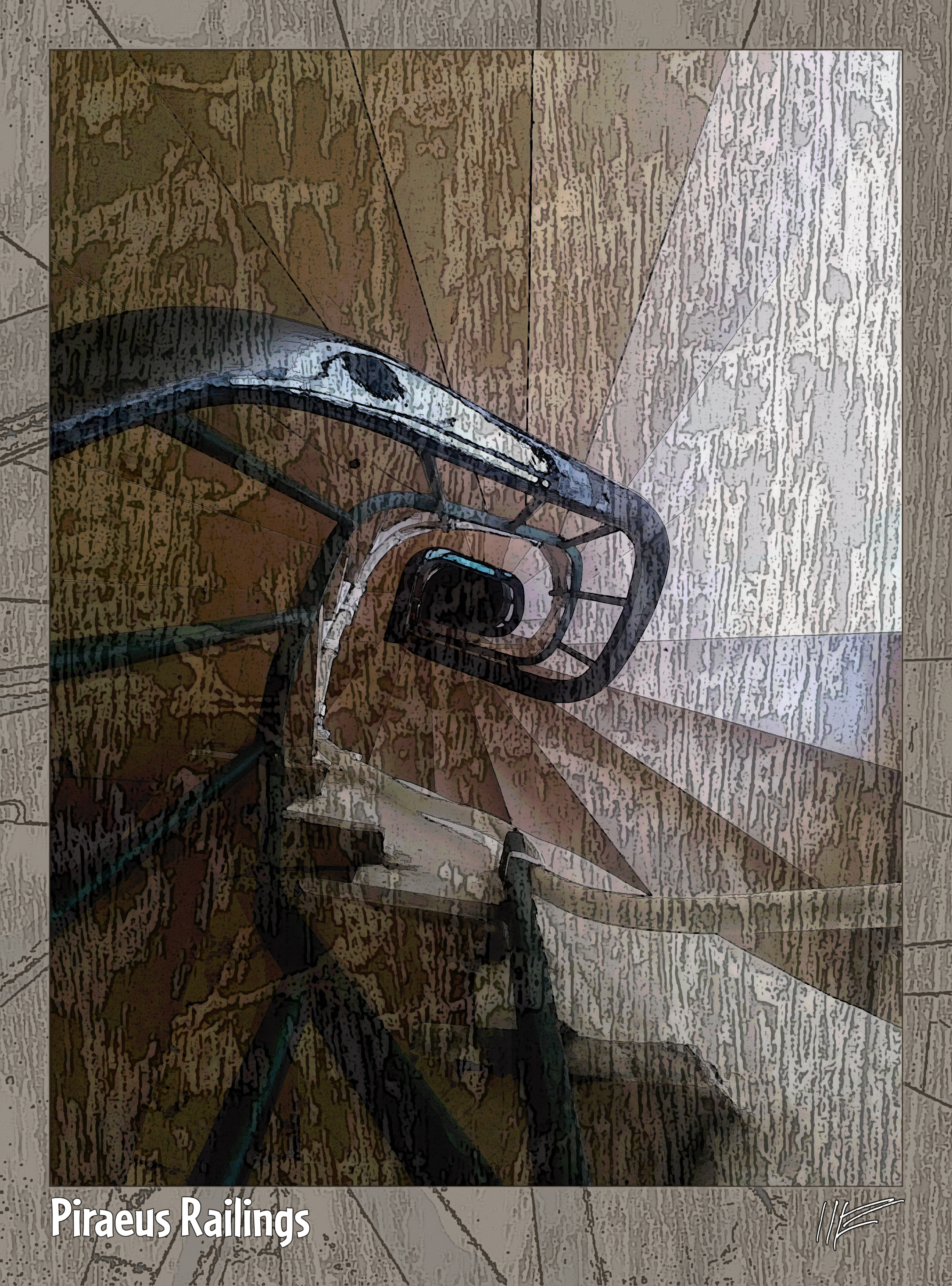
(Not Public Domain.) Toward the end of our trip to Greece, Janice and I landed from a quiet ferry trip into the busy port town of Piraeus. The effect on me was hallucinogenic. This has happened to me a couple times, where my sense of sight turned psychedelic and trippy. Once was after my heart operation. Anyway, as we got off the ferry, I saw an urban jangle of impossibly dense signage. I was able to maintain contact with reality, handling luggage and directions, etc., but my visual memory took a snapshot of whirling signs. This image is my attempt to depict that memory.
Next to that is a picture of the painting teacher on that trip to Paros, Alice Meyer-Wallace.
And finally, also from Piraeus, a composite photo of two railings: background is the carved and weathered wooden rail on a highway overpass, foreground is the rail and steps of the circular stairway in our Hotel Delfina.
For maximum effect with my images, click on the image until it is full-size, which may be larger than your computer screen.
Saturday, June 14, 2014
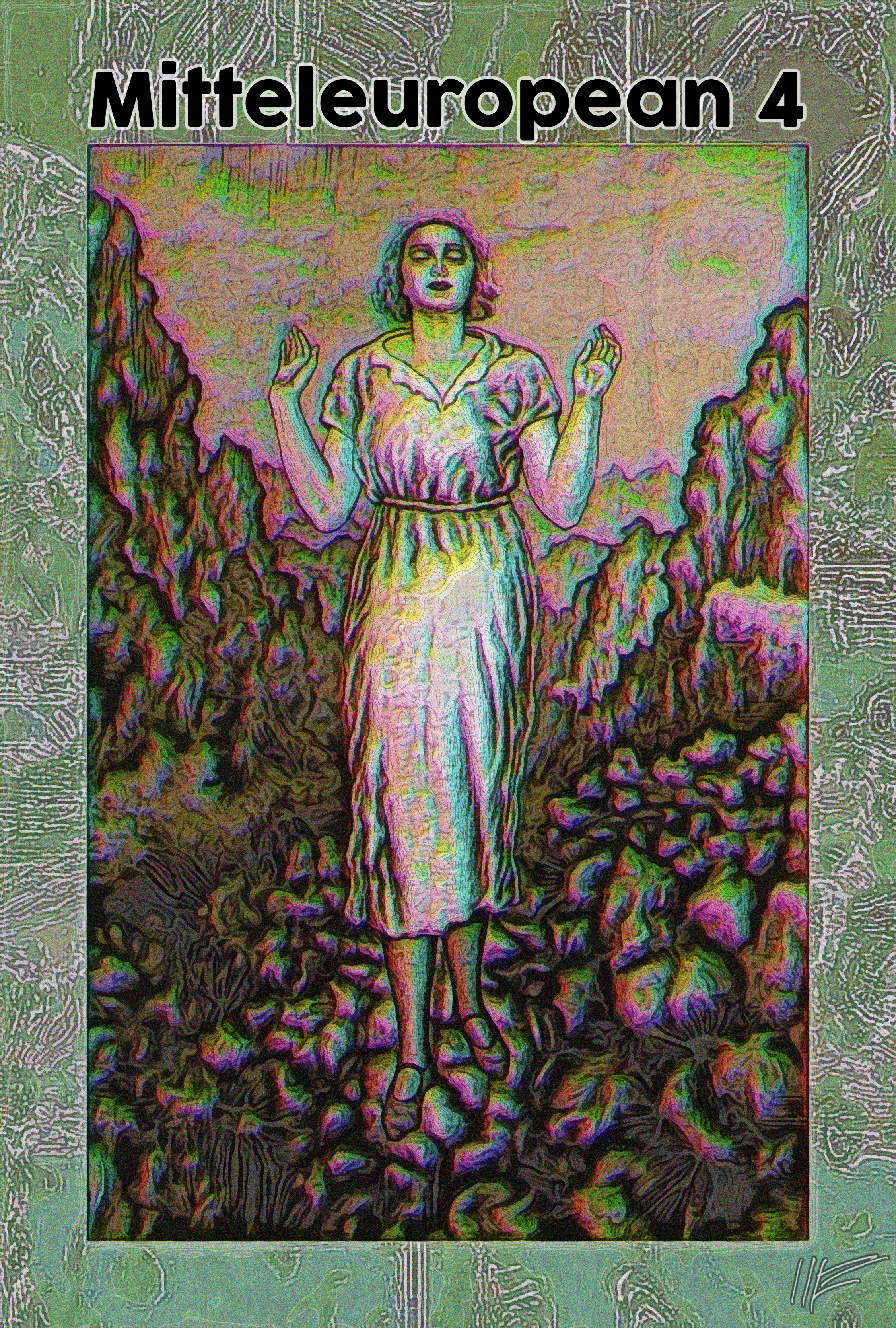
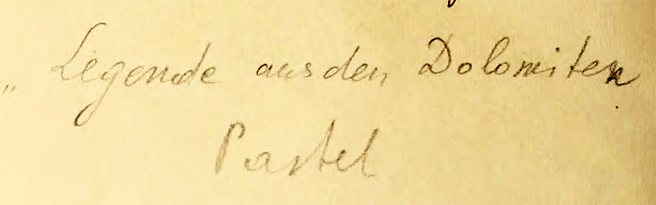
Polish painter Adam Herszaft painted this character from a European legend of the Dolomite Mountain region of Northeastern Italy. Another reworking of a small art card from the Otto Schneid collection at the University of Toronto (Link1). The notation on the back of the card is shown on right. Is the last word "pastel"? It doesn't look like pastel to me. Herszaft died in Treblinka in 1942.
For maximum effect with my images, click on the image until it is full-size, which may be larger than your computer screen.
Sources:
Link1 https://archive.org/details/ottoschneid16_8
Thursday, May 8, 2014
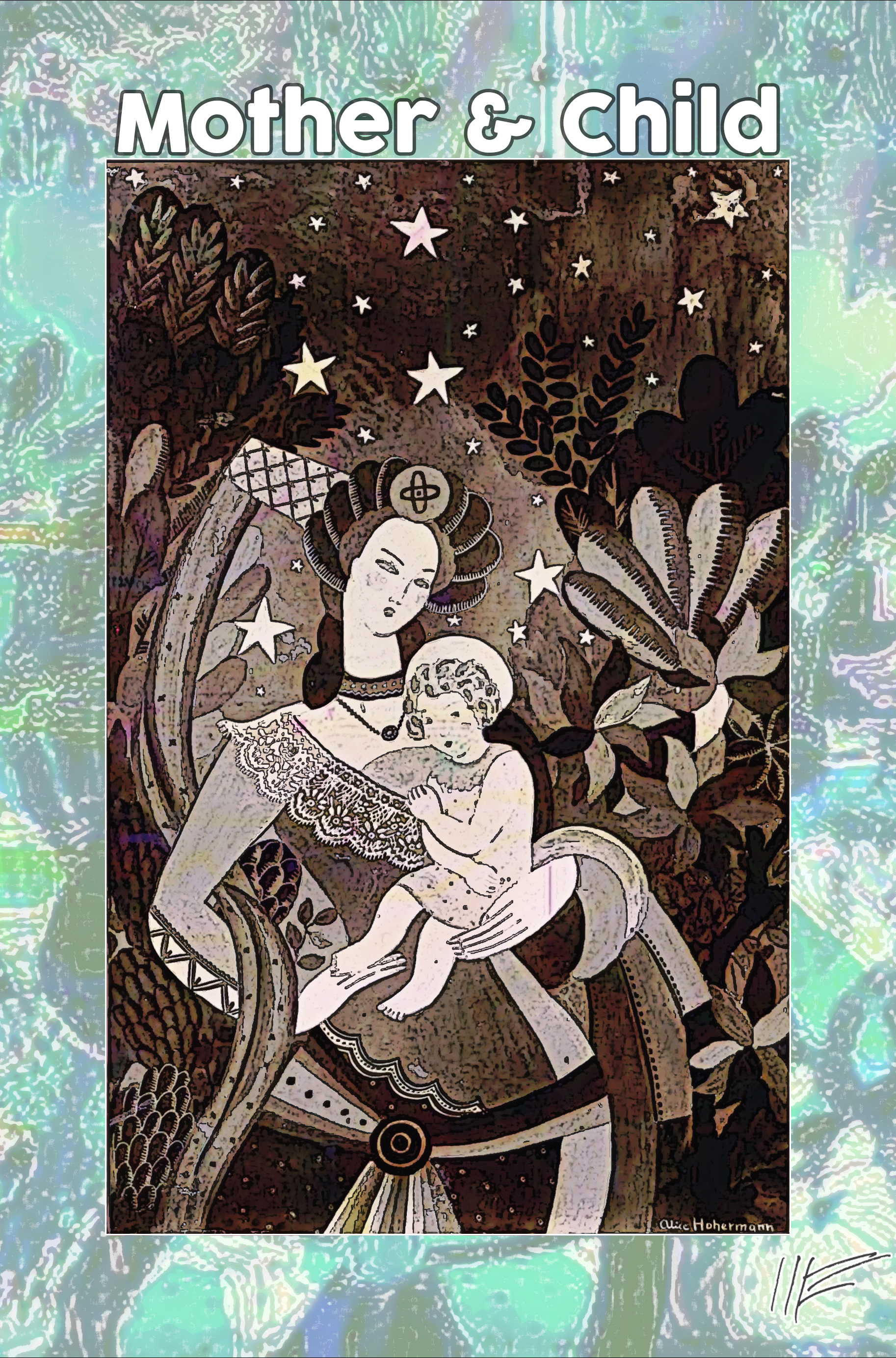
Anoher Mitteleuropean artist from the 1930's, Alice Hoherman, a painter who worked in a touching children's-book style. Here she paints what, judging from the apparent halo on the child, seems to be a picture of Mary and Jesus (Link1) in a luxuriant garden. Again, this is from the Otto Schneid collection of small reproductions of paintings by Jewish artists in Europe "before 1939." Some of her other paintings, (such as this one) also had biblical themes. Hoherman died in 1943 in Auschwitz. Again, this is from the University of Toronto Otto Schneid archive.
For maximum effect with my images, click on the image until it is full-size, which may be larger than your computer screen.
Sources:
Link1 archive.org/details/ottoschneid16_10
Thursday, May 8, 2014
Still from the Otto Schneid collection of small reproductions of paintings by Jewish artists in Europe "before 1939", here is a painting by Moise Kisling, a Polish artist who survived WWII by moving to the United States, then moved back to France after the War ended. Kisling fought in both World War I and World War II.
For maximum effect with my images, click on the image until it is full-size, which may be larger than your computer screen.
Sources:
Link1 archive.org/details/ottoschneid17_5_6
Wednesday, May 7, 2014
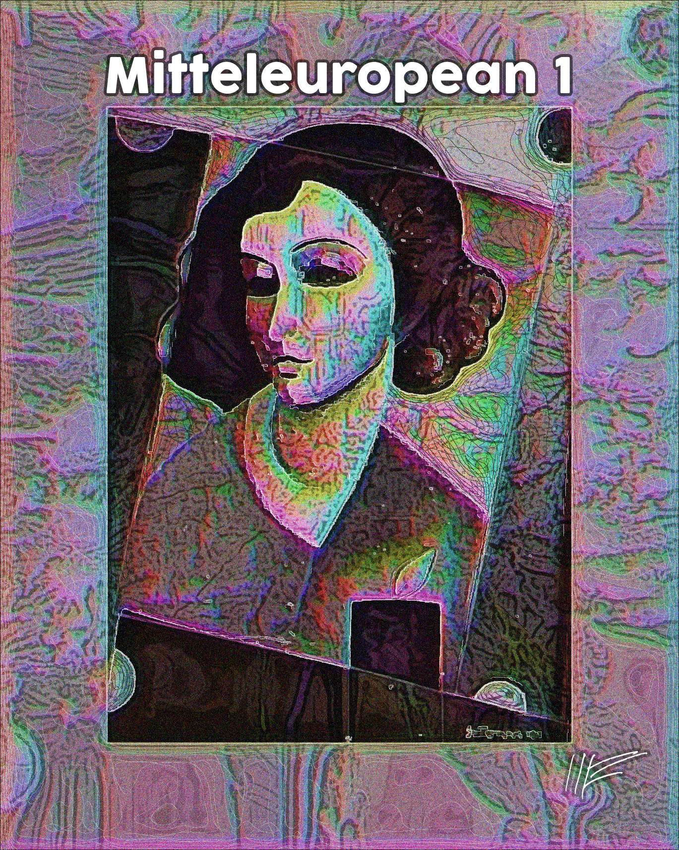
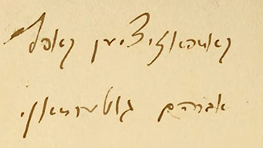
Again from the Otto Schneid collection of small reproductions of paintings by Jewish artists in Europe "before 1939", here are two more paintings by Abram Guterman (Link1). Why am I using the term mitteleuropean so often? Because it stands for a once-plausible theory of a united Europe organized as a "cosmopolitan multi-national cultural and intellectual ideal." The ideal degenerated into ignorant Nazi racial narcissism. The concept is controversial as can be seen in this Wikipedia discussion of the idea. In the painting, I like Guterman's unusual slanted framing, the touch of cubism, and his unusual use of dots. There is a notation on the back of the first painting (in the center), but I can't read it. On the right, another Guterman portrait. The font is Cocogoose by ZetaFonts.
For maximum effect with my images, click on the image until it is full-size, which may be larger than your computer screen.
Sources:
Link1 archive.org/details/ottoschneid16_4
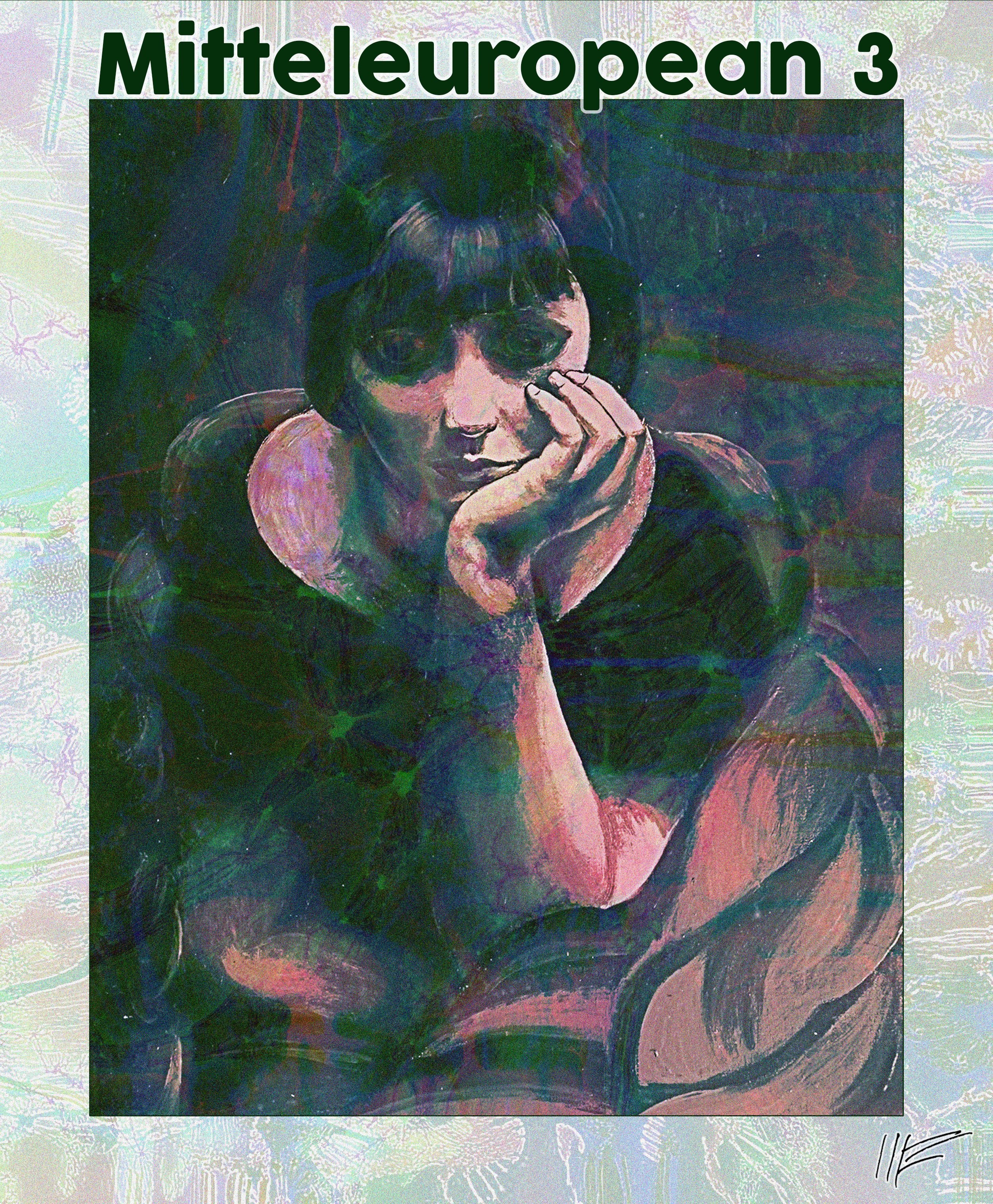
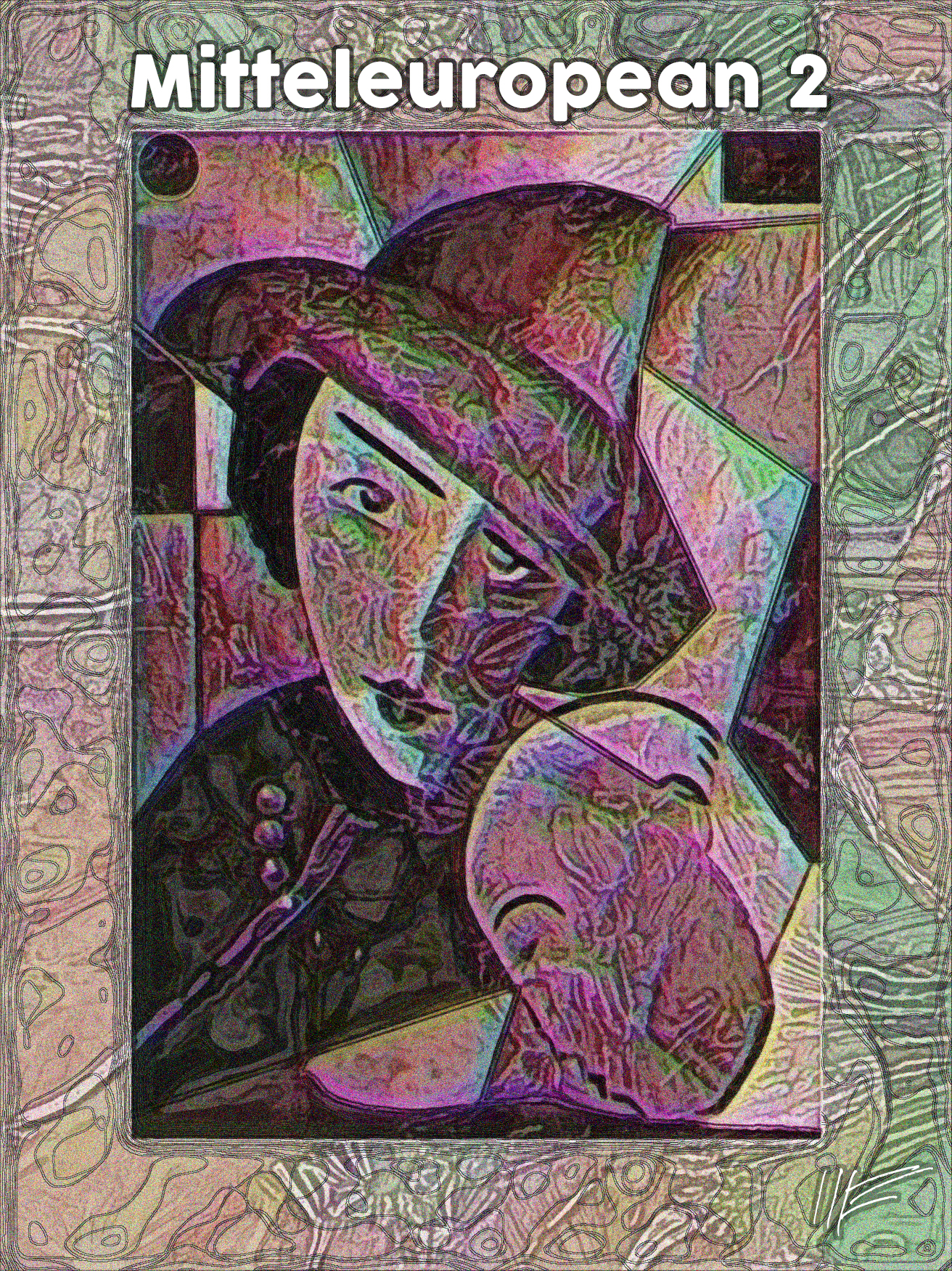
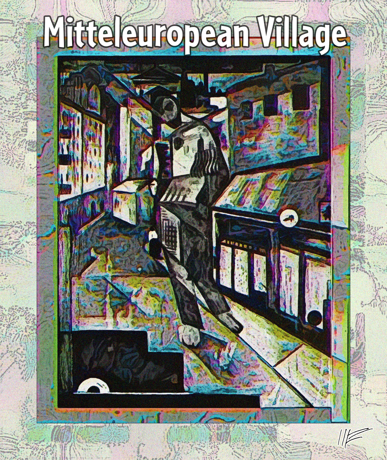
Tuesday, May 6, 2014
Returning to the Otto Schneid collection of postcard-sized reproductions of paintings by Jewish artists in Europe "before 1939", this is a village scene painted (Link1) by Abram Guterman. A very complicated scene, with a large male figure in the foreground blending invisibly into the shop fronts. From the small B&W photo in the Schneid collection, the exact dimensions of the picture are not clear; the photograph may have been taken by propping it up against another picture. Plus, my usual framing devices.
For maximum effect with my images, click on the image until it is full-size, which may be larger than your computer screen.
Sources:
Link1 archive.org/details/ottoschneid16_4
Tuesday, May 6, 2014
An abstract design composed of three illustrations from the 1851 The Practical Metal-Worker's Assistant: Containing the arts of working all metals and alloys, forging of iron and steel, hardening and tempering, melting and mixing, casting and founding, works in sheet metal, the processes dependent on the ductility of the metals, soldering, and the most improved processes, and tools employed by metal-workers, with the application of the art of electro-metallurgy to manufacturing processes (Link1). Barely visible, in the center, in pink, is a printed calico pattern composed of 205 metal wires. Behind that is a doubled illustration showing how to make the dies used to cast screws of three different dimensions. And in front of that is a drawing of an early machine used to cut multiple screws from one original. The image may not be as pleasing as some of my reworking of old portraits, but take a close look at the detail.
For maximum effect with my images, click on the image until it is full-size, which may be larger than your computer screen.
Sources:
Link1 archive.org/details/lescontesdrolati01balz
Friday, May 2, 2014
In a frontispiece illustration titled Punition in a 1900 volume of Honore Balzac's Les Contes Drolatiques (Link1). The illustration is by
Albert Robida. What a curious and awful image, showing a young woman in a crown beset by all sorts of awful demons. Four of her companions are also tortured -- can you find them? The caption says it is punishment, but for what? I don't know which Balzac story the image illustrates. Drolatiques means "humorous" in English. The English droll is somewhat different, meaning "amusing in an odd way; whimsically humorous; waggish." A friend points out that while the four companions look genuinely terrified, the queen in her crown merely looks annoyed.
For maximum effect with my images, click on the image until it is full-size, which may be larger than your computer screen.
Sources:
Link1 archive.org/details/lescontesdrolati01balz
Thurday, May 1, 2014
From the 1885 Poultry Culture: How to Raise, Manage, Mate and Judge Thoroughbred Fowls (Link1) a pair of chickens of the popular American breed known as Wyandotte.
For maximum effect with my images, click on the image until it is full-size, which may be larger than your computer screen.
Sources:
Link1 archive.org/details/poultrycultureho00felc_0
Tuesday, April 29, 2014
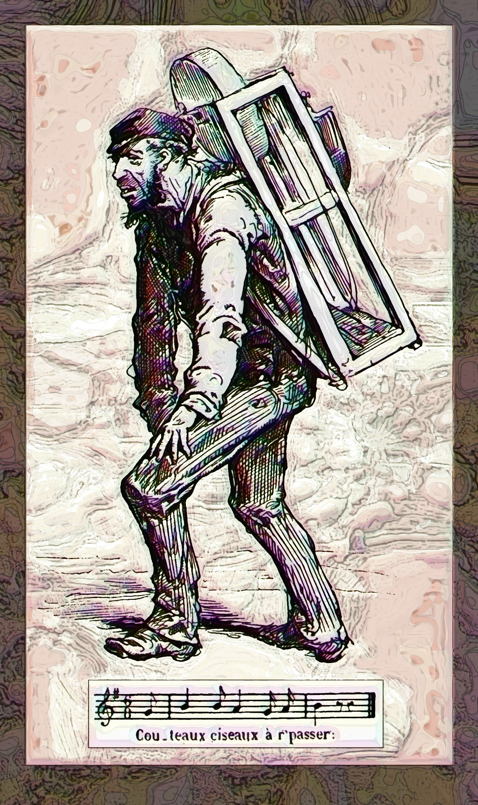
From the 1874 La Comédie de Notre Temps (Link1), a collection of pen and ink studies of Parisian street life by prolific illustrator Bertall, a picture of a roaming vendor who went from street to street offering to sharpen knives and scissors. The song/call he made as he wandered is below his picture, something like "Knives, Scissors Passing By." The article (it begins on p. 244) shows a number of street vendors and their associated songs, from cheese-sellers to glass merchants, each with an associated song or cadence.
For maximum effect with my images, click on the image until it is full-size, which may be larger than your computer screen.
Sources:
Link1 archive.org/details/gri_33125013853748
Tuesday, April 29, 2014
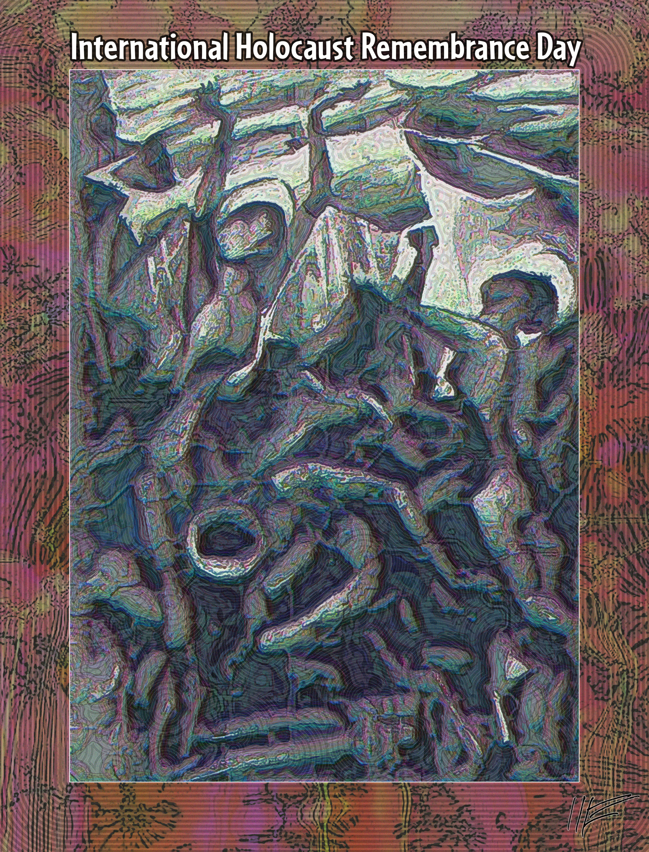
By coincidence, my graphic exploration of the University of Toronto's art card collection of 20th century Jewish-European historian Otto Schneid coincides with a United Nations holiday, International Holocaust Remembrance Day, which is celebrated today, an occasion to remember what Wikipedia calls the "6 million Jews, 1 million Gypsies (Roma and Sinti), [and] up to 9,000 homosexual men [killed] by the Nazi regime and its collaborators." From my point of view, I mourn the civility, lives, and culture destroyed under the thug narcissism of National Socialism. Casualties, according to Wikipedia, mounted to 2.5% of world population. I also mourn the soldiers on both sides (my father was one of them) and the German women brutalized by Soviet troops. Here is a 1927 painting called Hiob (Job) (Link1) by Lou Albert-Lasard, which seems to communicate the suffering and despair of wrong-headed war. See related images on April 8.
For maximum effect with my images, click on the image until it is full-size, which may be larger than your computer screen.
Sources:
Link1 archive.org/details/ottoschneid21_2
Sunday, April 27, 2014
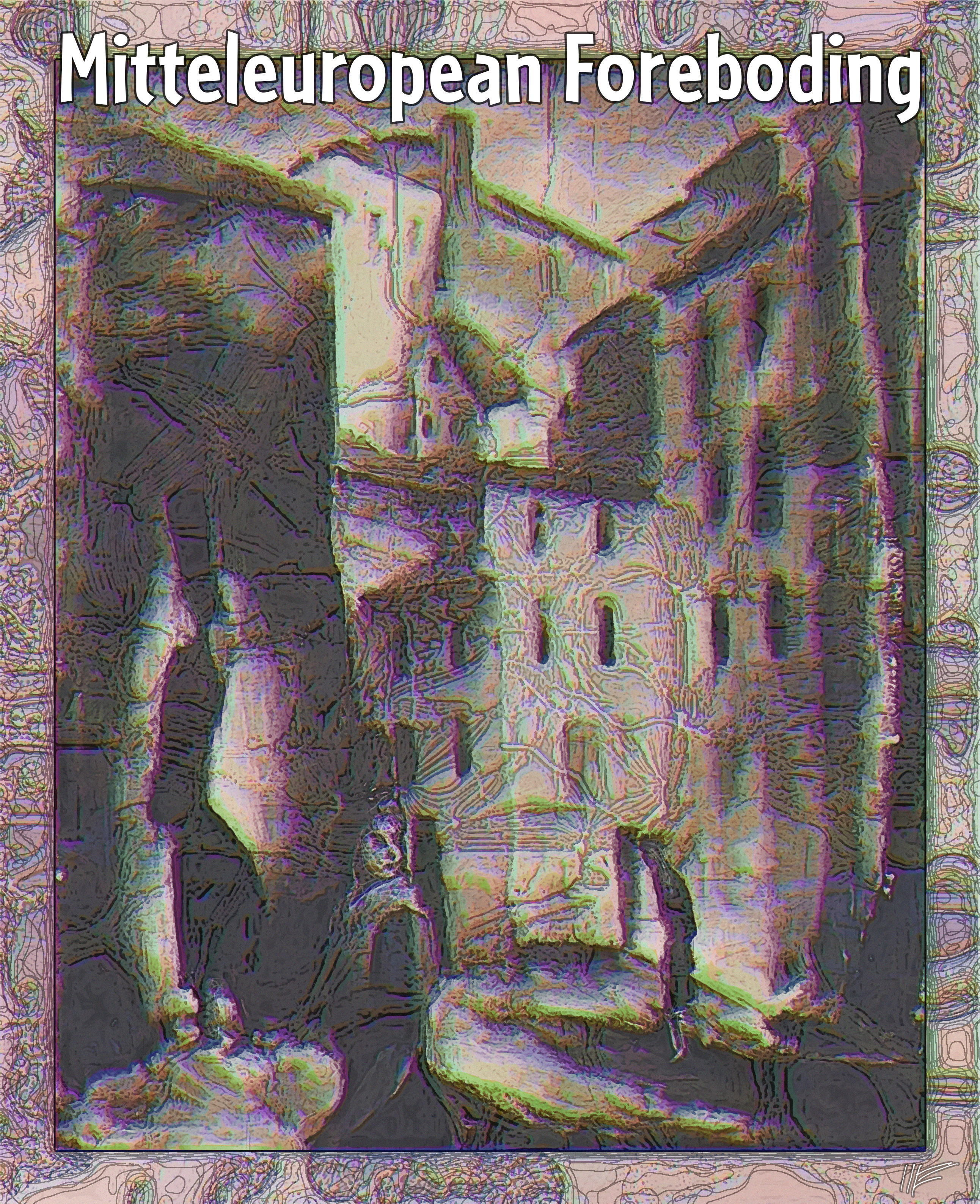
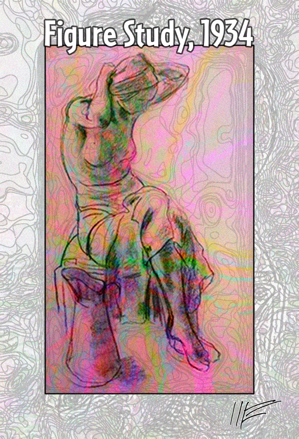
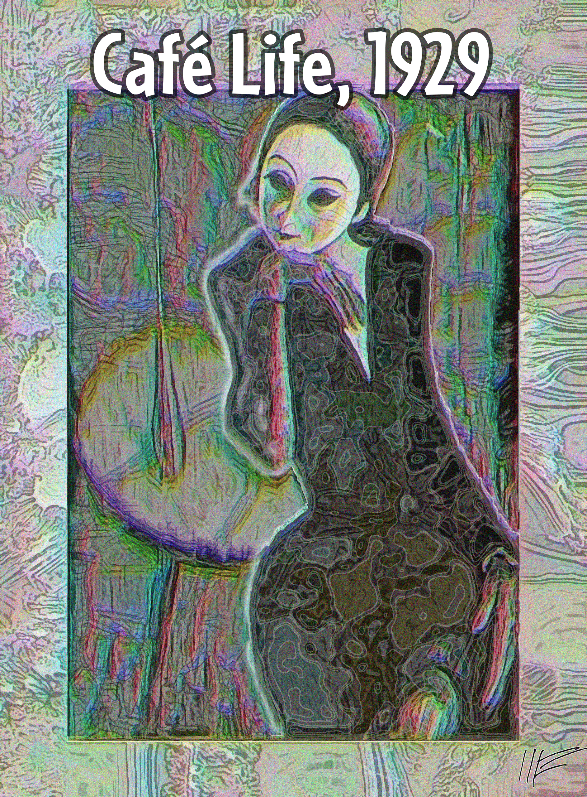
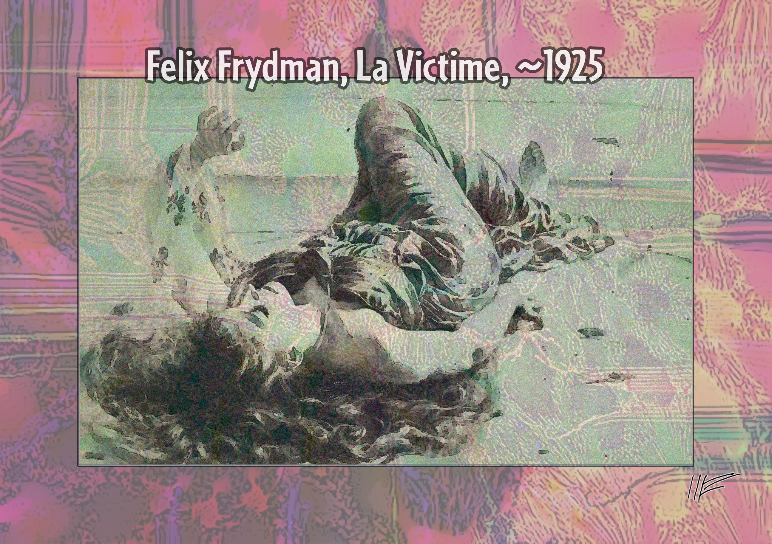
Turning again to the University of Toronto scans of the art card collection of 20th century Jewish-European Otto Schneid, a 1927 painting (Link1) by Lou Albert-Lasard showing in the foreground a nervous girl surrounded by two ambiguous figures on a city street distorted in the Expressionist manner. Albert-Lasard was a lover of German poet Rainer Maria Rilke.
The second image shows what seems to be a 1934 classroom figure study by Leopold Gottlieb (Link2).
The third image shows a stylish woman seated at a table, in a painting (Link3) by Feliks Frydman, who does not appear in any index of the time. The fourth image, also by Frydman, shows a woman lying down and is entitled, rather eplicitly, La Victime.
The series attempts to communicate my feelings given what we now know happened
to the civilized and sophisticated people in Europe during the World War II years, when so many young women perished or suffered, between the concentration camps, the bombings, and the depradations of the various various invading armies.
For maximum effect with my images, click on the image until it is full-size, which may be larger than your computer screen.
Sources:
Link1 archive.org/details/ottoschneid21_2
Link2 archive.org/details/ottoschneid15_22_24
Link3 archive.org/details/ottoschneid15_15
Saturday, April 26, 2014
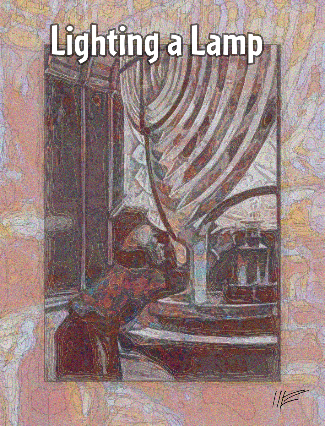
Bundled along with another Jules Vernes story, this is an illustration from the 1905 Le Phare du bout du monde (Link1). It shows a lighthouse keeper lighting a fixed flame placed behind a Fresnel Lens.
For maximum effect with my images, click on the image until it is full-size, which may be larger than your computer screen.
Sources:
Link1 gallica.bnf.fr/ark:/12148/bpt6k6566970p
Wednesday, April 23, 2014
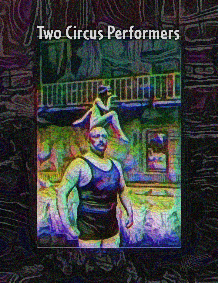
From the French public domain site Gallica, a collage of two 1921 photographs of members of the Cirque Molier: (1) strongman Léon Verhaert, stage name Hercules (Link1) and (2) young dancer/gymnast Lysiane Allarty (Link2).
For maximum effect with my images, click on the image until it is full-size, which may be larger than your computer screen.
Sources:
Link1 gallica.bnf.fr/ark:/12148/btv1b53067622g
Link2 gallica.bnf.fr/ark:/12148/bpt6k10417215
Tuesday, April 22, 2014
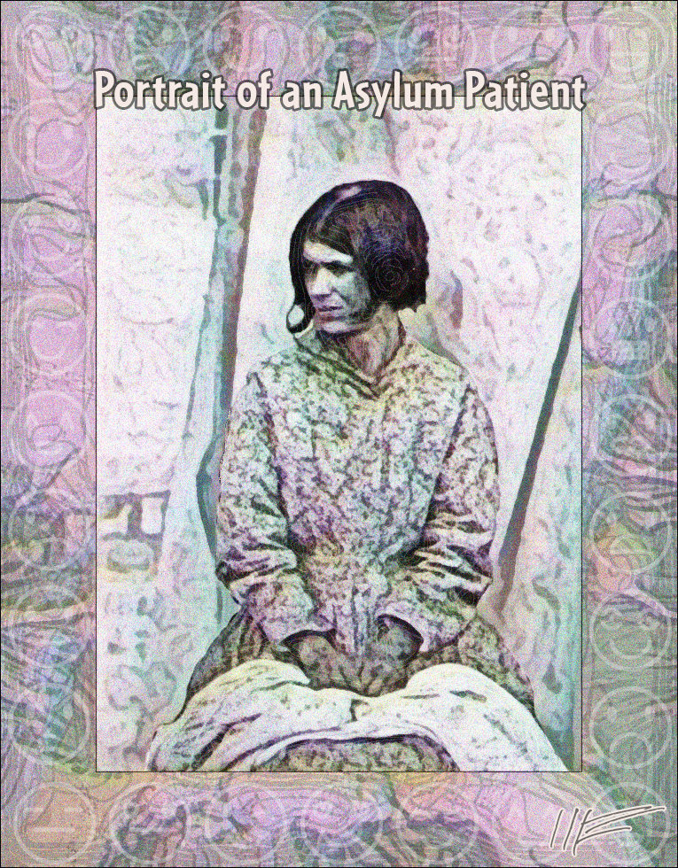
From the Flickr Collection of England's National Media Museum of West Yorkshire, an 1855 photo (Link1) by a doctor aimed at demonstrating some long-discredited theory that facial features are useful in identifying mental conditions. The woman is from an asylum in Surrey. Rather than diagnosis from facial expression, this portrait probably is best summed up by a commenter on Flickr: "A harassed woman in the wrong place at the wrong time." Around the edges, very faintly, are "emoticon" face icons from Rostros y emociones, a font by Rodrigo Gonzalez of Southype.
For maximum effect with my images, click on the image until it is full-size, which may be larger than your computer screen.
Sources:
Link1 flickr.com/photos/nationalmediamuseum/8408235610
Monday, April 21, 2014
From the Finnish Museum of Photography, one of a series of photographs by I.K. Inha taken for the 1900 World's Fair. This one (Link1) shows three women working in a dairy, presumably making cheese. The text (in Cafeteria Bold) shows three sources of free online graphic filters I am experimenting with. Some others are:
For maximum effect with my images, click on the image until it is full-size, which may be larger than your computer screen.
Sources:
Link1 www.flickr.com/photos/valokuvataiteenmuseo/13401374423/
Sunday, April 13, 2014
Third Day: Composer's Widow
From the Finnish Museum of Photography, a photograph of Aino Sibelius, the widow of Romantic composer Jean Sibelius in the couple's country home in Ainola.
For maximum effect with my images, click on the image until it is full-size, which may be larger than your computer screen.
Sources:
Link1 www.flickr.com/photos/valokuvataiteenmuseo/11064376754/
Saturday, April 12, 2014
Second Day
From a new contributor on the Flickr Commons, the Finnish Museum of Photography, a portion of a studio photograph (approx. 1910's) of Actress Elli Tompurl (Link1), dramatically lit and holding a crumpled letter.
For maximum effect with my images, click on the image until it is full-size, which may be larger than your computer screen.
Sources:
Link1 www.flickr.com/photos/valokuvataiteenmuseo/11187909925/
Friday, April 11, 2014
Psychologically Significant Period Ahoy!
I don't know how to put it. Some combination of factors -- leaving the Co-op Board, Spring, vivid dreams, a sense of my lifetime running out -- has me feeling that the next two weeks are going to be BIG. Some realignment of self. Reboot. Bob 2.0. To signify this magical sense of looming significance, here's a calendar of those 15 days laid over an image. The image is composed of a picture of an orchid from the 1885 Lindenia: Iconographie des Orchidées (Link1). The orchid is laid over a grocery advertising illustration of a smiling boy from a 1939 The Australian Women's Weekly (Link2). The font is Calendar Normal by Thomas Harvey. Second version is a more print-friendly version. Third picture is the cover from the same issue of the the Australian women's weekly (Link2).
For maximum effect with my images, click on the image until it is full-size, which may be larger than your computer screen.
Sources:
Link1 archive.org/details/HistoirenaturelIVGeof
Link2 archive.org/details/The_Australian_Womens_Weekly_30_12_1939
Thursday, April 10, 2014
More Applebaum/Apfelbaum Portraits
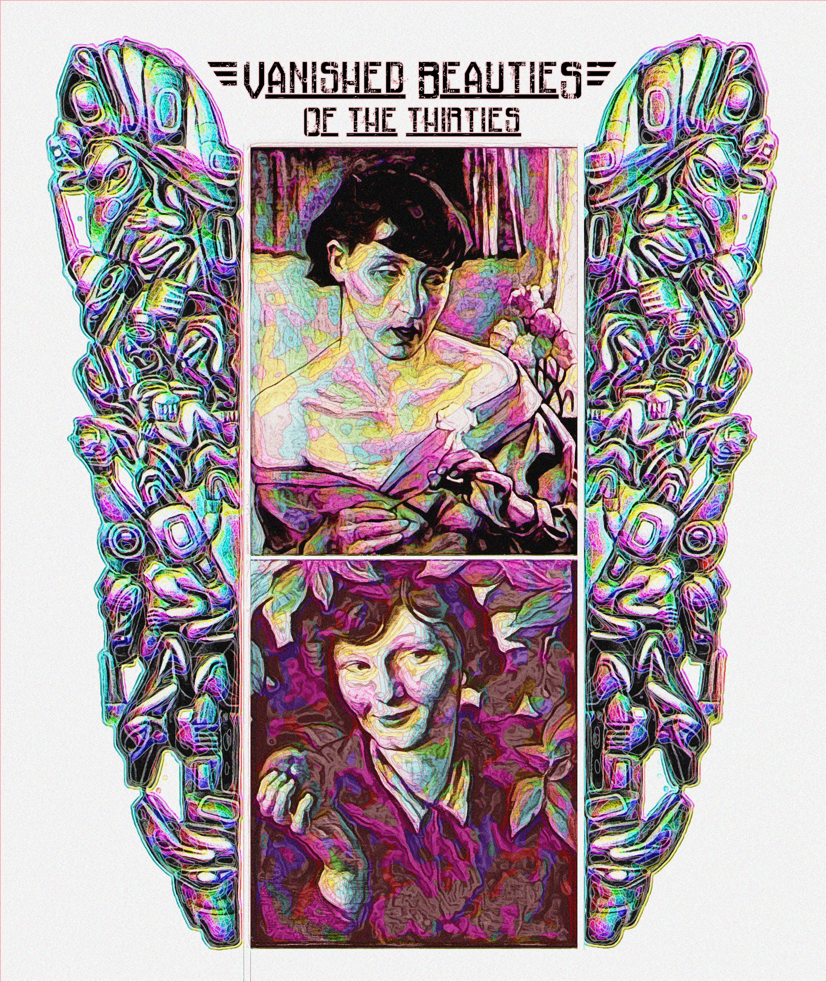
Attribution is uncertain, but these seem to be more portraits by Maurycy Applebaum from the small black-and-white cards in the University of Toronto Otto Schneid archives (Link1). What's odd is that if you Google Images under "Maurycy Applebaum" or "Maurycy Apfelbaum," the images that come up are considerably less interesting than these (in my opinion). Not sure what's going on. The framing device on right and left is a Native American ("babeen") pipe from the 1857 Pipes and tobacco: An Ethnographic Sketch (Link2). The font is Railway to Hells by ImageX, named after a rock and roll song by Blue Oyster Cult.
For maximum effect with my images, click on the image until it is full-size, which may be larger than your computer screen.
Sources:
Link1 archive.org/details/ottoschneid14_4_5
Link2 archive.org/details/pipestobaccoethn00wils
Tuesday, April 8, 2014
Jewish Artists in the Holocaust
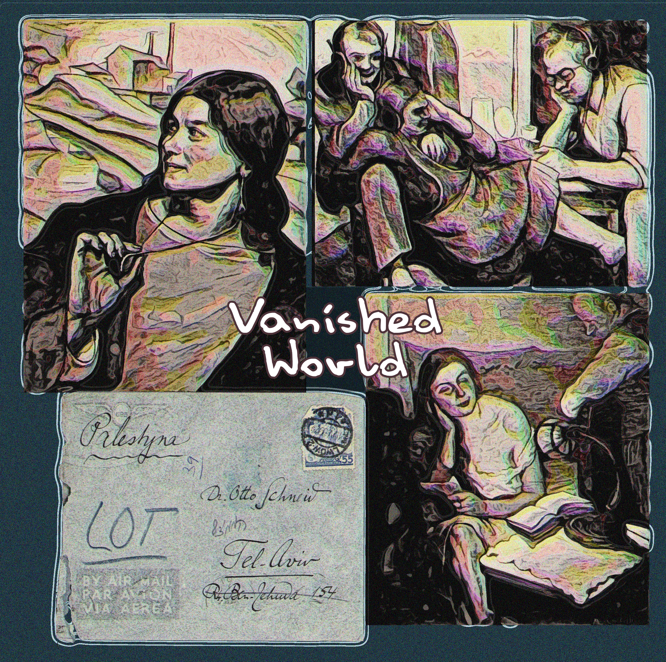
Recently, the University of Toronto uploaded scans of the archives of Otto Schneid, a European writer (1900-1974) who had the misfortune to start writing a scholarly study of 20th-century Jewish artists during the 1930's -- just as Adolf Hitler was coming to power. A study of Schneid by Barry Walfish is available as a PDF online. Schneid finally finished his monograph Die Juden und Die Kunst in Vienna in 1938, viewing it as an antidote to Hitler's traveling exhibitions of Jewish "degenerate" art. The book was ready for printing but the Nazis confiscated the plates. Schneid fled with just a suitcase to Poland, then Palestine, then Israel. He died in Toronto. One of the University of Toronto Schneid collections is titled Photographs and Cards of Art Before 1939 - Applebaum, Maurycy (Link1). Applebaum (sometimes spelled Apfelbaum, 1887-1931) apparently did these three paintings, casually photographed propped on chairs in black and white. I like them because they show daily life in a lost world of cosmopolitan European pre-war sophisticates. Clockwise from top left: a spirited young woman traveling on the road holds an amulet; three close friends put on headphones to listen to the latest radio news; and a couple share an intimate conversation. In context, there is a sad glamour here. The envelope in the lower left depicts a letter sent to Schneid in Tel Aviv from "Palestyn."
The font used here is Danny by the Polish font designers at Artcity.
For maximum effect with my images, click on the image until it is full-size, which may be larger than your computer screen.
Sources:
Link1 http://archive.org/details/ottoschneid14_4_5
Tuesday, April 8, 2014
19th Century Enthusiasm for Tobacco I
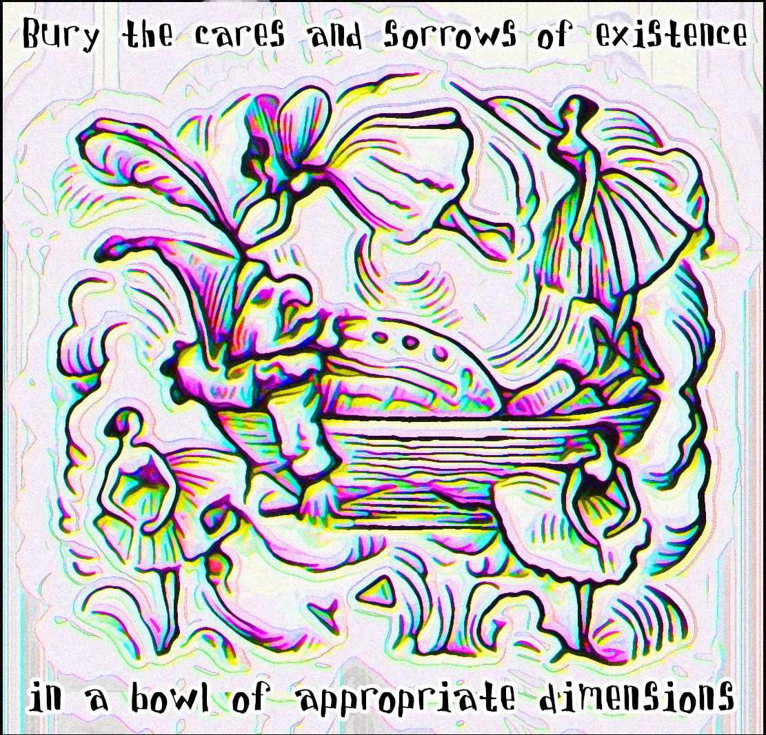
An illustration from the 1845 A Pipe of Tobacco: With Whiffs and Clouds (Link1), a book of poems, prose, and engravings dedicated to the pleasures of tobacco smoking. Among its claims, "Since 1586 [when Walter Raleigh introduced the plant in England], all our greatest discoveries and inventions have occurred, thus proving that smoking engenders thinking, and that great benefit to society must therefrom result." I suspect we'll see much the same enthusiasm when marijuana is finally legalized in this country, which has already happened in two states -- but not here. The font is Davis, by Divide by Zero. the nom de plume of Computer Science PhD student Tom Murphy.
Keen-eyed observers may have noted that the fonts I am experimenting with are all in alphabetical order. That's ecause I'm going through an old CD of shareware fonts. I think I will experiment with departing from that pattern and start finding new shareware fonts. These are more interesting because the websites of the designers display very street-wise (or should I say net-wide?) set of tastes.
For maximum effect with my images, click on the image until it is full-size, which may be larger than your computer screen.
Sources:
Link1 archive.org/details/pipeoftobaccowit00blan
Monday, April 7, 2014
Game of Thrones

A line from George R.R. Martin's masterwork A Game of Thrones, spoken by the girl's "dancing master" or swordplay instructor. (See it here in the TV version.) The words are displayed against an engraving of a winter cabbage from the 1906 Germain Seed Company's 21st Annual Catalogue of Seeds & Plants (Link1). The black-and-white illustration is recolored by various computer techniques. The font is Crystal Radio Kit, modeled after the old Radio Shack logo by talented type designer Ray Larabie.
For maximum effect with my images, click on the image until it is full-size, which may be larger than your computer screen.
Sources:
Link1 archive.org/details/21stannualcatalo1906germ
Saturday, April 5, 2014
Thoughts on Mortality
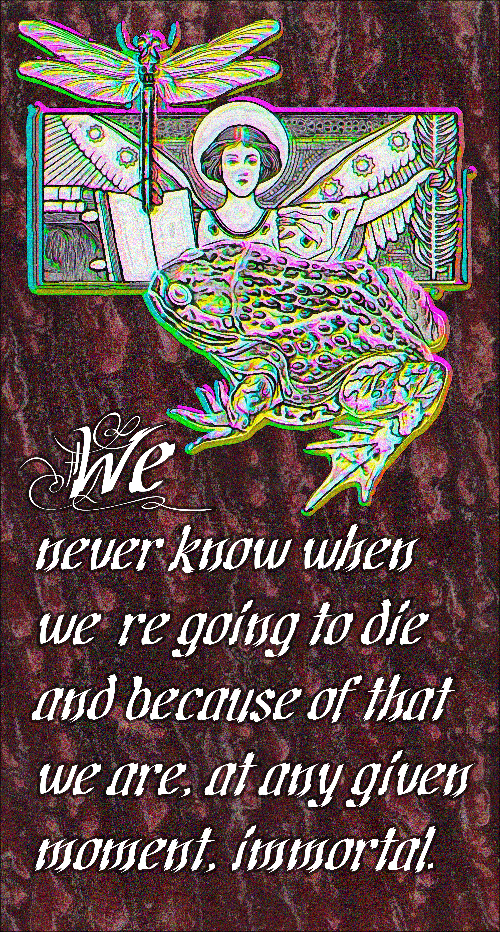
A line from an article in the latest London Review of Books, by author Geoff Dyer who says it's a line from Andrei Tarkovky's movie Solaris, based on the writings of Stanislaw Lem. The drawing of an angelic figure is from the 1902 La Colonna del Cereo Pasquale di Gaeta: Contributo alla Storia dell'arte Medioevale (Link1). The dragonfly and frog are from the 1844 Historia Fisica y Politica de Chile Segun Documentos Adquiridos en esta Republica durante doce Años de Residencia en ella y Publicada Bajo los Auspicios del Supremo Gobierno (Link2).
The font is Cretino by Canadian designer Ray Larabie.
For maximum effect with my images, click on the image until it is full-size, which may be larger than your computer screen.
Sources:
Link1 archive.org/details/gri_33125013853862
Link2 archive.org/details/gri_33125014101840
Thursday, April 3, 2014
iPad Selfie

A departure from the current series of public domain image + poetry selection + new font images. Here is a self-portrait in a local coffee shop, taken with a new iPad. It has minor distortion/finishing in iPad's Art Studio app, then further processing in Photoshop, PaintShop Pro, and Gimp on my computer. Had a busy time learning the iPad features. And I may not even keep the iPad -- I may pass it on to another artist I know.
Notice the unforgettable troll-like look I am cultivating for my eighth decade. What a saint Janice is to face this mug every morning! Considering promoting this image to head up this page and the Technical Notes page. The distorted image reflects my fear of death and aging.
For maximum effect with my images, click on the image until it is full-size, which may be larger than your computer screen.
Sources:
NA
Wednesday, April 2, 2014
Charles Wright on Divinity
The closing line from a poem by prize-winning poet Charles Wright on the Poetry Daily website. More lines from the poem, keyed on a traditional gospel song Just A Closer Walk with Thee:
But not too close, man, just not too close.The font is the science-fictionish Cosmic Age by Shy Fonts.
Between the divine and the divine
lies a lavish shadow...
Biblical Division of Labor
Two more images by Edward Burne-Jones from the book The Beginning of the World (Link1). The font is Colourbars, a "a swoopy headliner with a boyish slant," from Larabie Fonts. Canadian designer Ray Larabie lives in Japan and has a Facebook page.
For maximum effect with my images, click on the image until it is full-size, which may be larger than your computer screen.
Sources:
Link1 http://archive.org/details/gri_33125011094717
Monday, March 31, 2014
Dramatic Opening
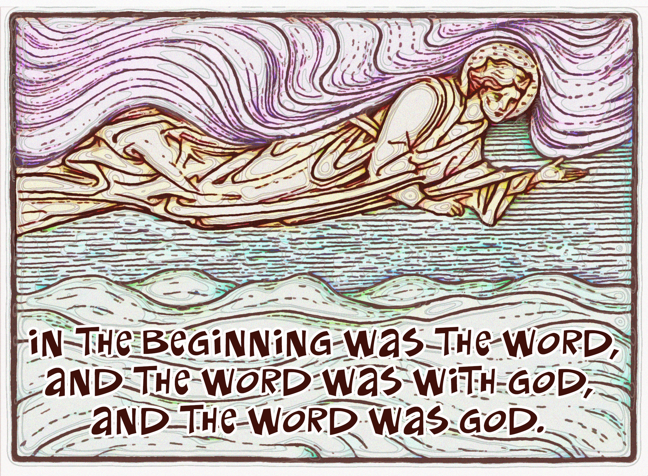
In 1902, the Pre-Raphaelite painter Edward Burne-Jones did a series of twenty illustrations for a proposed -- but never finished -- biblical work. Later, they were published as The Beginning of the World (Link1). The first illustration in the series was keyed on the account of creation in Genesis:
In the beginning God created the heaven and the earth. And the earth was without form, and void; and darkness was upon the face of the deep. And the Spirit of God moved upon the face of the waters. And God said, Let there be light: and there was light. And God saw the light, that it was good: and God divided the light from the darkness.However, I always preferred, as more poetic, the version of creation in John:
In the beginning was the Word, and the Word was with God, and the Word was God. The same was in the beginning with God. All things were made by him; and without him was not any thing made that was made. In him was life; and the life was the light of men.Here, John's version is rendered in informal and not-very-religious Coker Two font, based on the printing of Mad Magazine cartoonist Paul Coker. The technical challenge in this piece was adding color to Burne-Jones black-and-white illustration.
Collect Call & Water Works
Another combination work: a (1) selection from a poem, (2) a public domain image, and (3) a new font. Whew! The lines of poetry are from a poem called Collect Call by Ash Bowen, from a book of poetry called The Even Years of Marriage. (I ran across the poem on the Poetry Daily website.) The poetry is superimposed on a Philadelphia Library Company stereograph of the Fairmount Water Works (Link1). The font is ChunkoBlocko by the now defunct Omega Font Labs.
For maximum effect with my images, click on the image until it is full-size, which may be larger than your computer screen.
Sources:
Link1 /www.flickr.com/photos/library-company-of-philadelphia/9103348622/
Sunday, March 30, 2014
Darkness, Corset, and Confusion
Sometimes an artist just goes weird. Here, I take an image from the Philadelphia Library Company, a "trade card" advertising corsets (Link1), shown in the original at right. The text on the trade card says: "Adjustable duplex corset. The best corset in the world. Perfect in shape, and the most comfortable and durable corset known. Double bone, double steel, double seams. Warranted not to rip. Ask for it!" I then make it unrecognizable with various distortions, and finally overlay a selection of poetry from Imagist John Gould Fletcher. The lines are from the middle of a poem In the City of Night (Link2), dedicated by Fletcher to the memory of Edgar Allen Poe, published as the Poem of the Day from the Academy of American Poets. The poem's darkness and alienation resonates with a certain despair I have in community affairs. The font is Cherry Coke by Liverpool-based Future Fonts' Jonathan Edwards.
.
For maximum effect with my images, click on the image until it is full-size, which may be larger than your computer screen.
Sources:
Link1 www.flickr.com/photos/library-company-of-philadelphia/6669221697/
Link2 www.poets.org/viewmedia.php/prmMID/23936
Saturday, March 29, 2014
Decades-old Philadelphia Street Photo
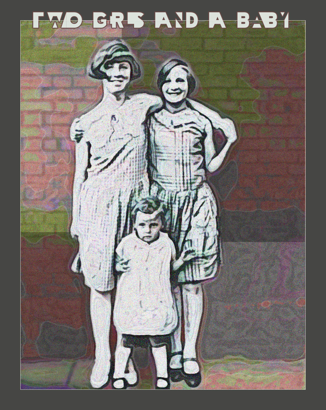
Another group has joined the Flickr Commons, a local Philadelphia institution, The Library Company of Philadelphia. Its collection contains the work of Philly photographer John Frank Keith (1883-1947), who took street photos in South Philly and Kensington from about 1910 to 1940. Here is an undated silver-gelatin print (Link1) of two cheerful girls and their infant charge. I am still experimenting with Cheatin Regular font, difficult to read -- but it adds an interesting compositional element. This one says "Two Girls and a Baby."
.
For maximum effect with my images, click on the image until it is full-size, which may be larger than your computer screen.
Sources:
Link1 www.flickr.com/photos/library-company-of-philadelphia/3636091413
Saturday, March 29, 2014
Tasmanian Artist
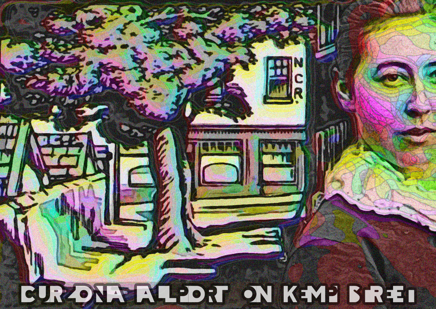
Again from the Tasmanian archives, there is a set of images from the Allport Family (family tree shown) who settled there in 1831. One of the Allports was Curzona, 1860-1949, shown on the right (Link1). Curzona, "determined to be an artist from an early age," moved with her mother to Europe to study Art and then returned to Tasmania. To the left is a 1926 linoleum cut by Curzona, showing a street scene in Hobart, Tasmania (Link2). Font is Cheatin Regular, a 1998 font by Matthew Welch.
For maximum effect with my images, click on the image until it is full-size, which may be larger than your computer screen.
Sources:
Link1 www.flickr.com/photos/tasmanianarchiveandheritageoffice/8595612313
Link2 www.flickr.com/photos/tasmanianarchiveandheritageoffice/8537181755
Thursday, March 27, 2014
Imperial Humiliation in Ancient Iran
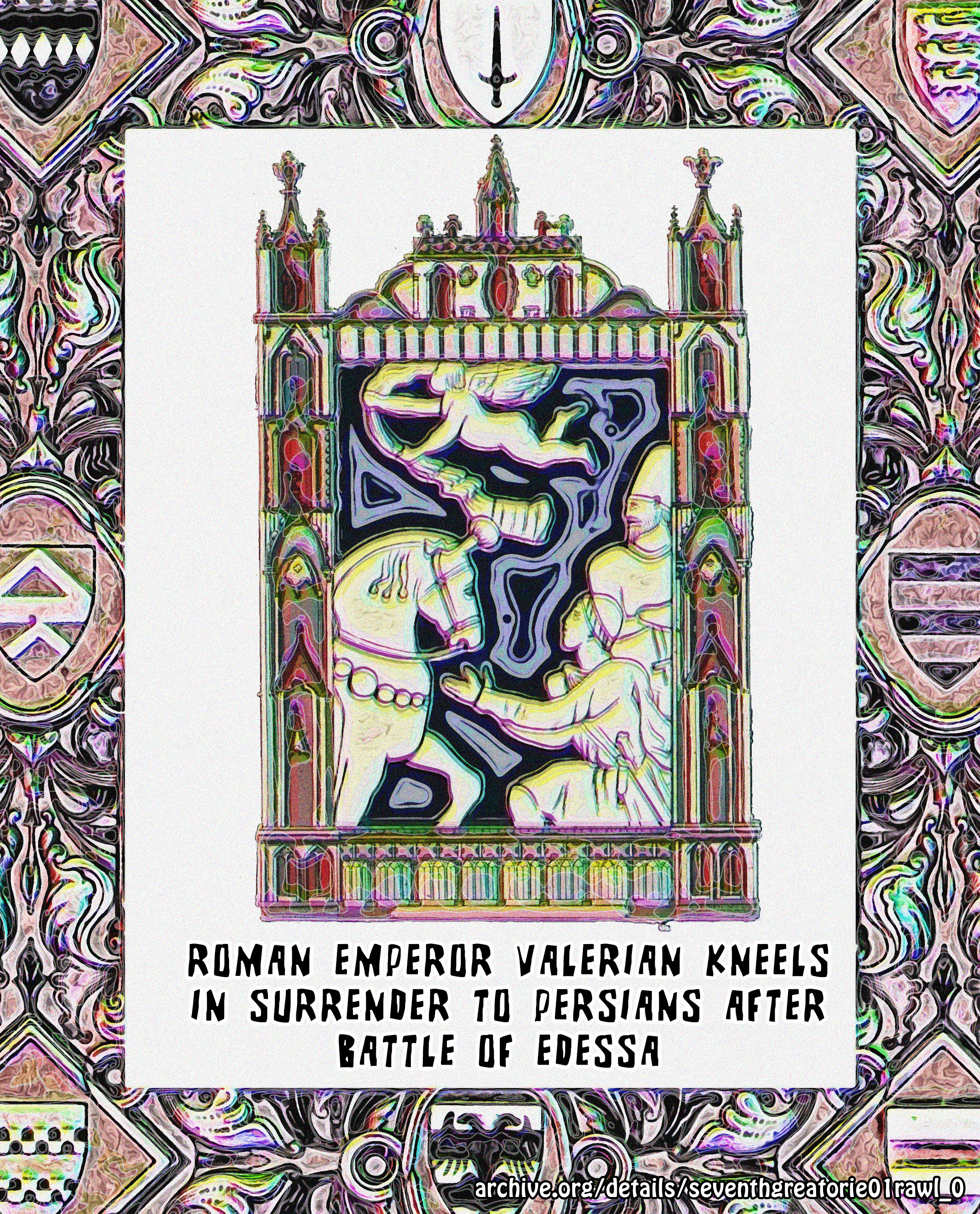
From the 1882 The Seventh Great Oriental Monarchy: or, The Geography, History, and Antiquities of the Sassanian or New Persian Empire (Link1), a drawing captioned "Valerian Doing Homage to Cyriades" is in the center of this image. It shows the Roman Emperor Valerian the Elder, known for his persecution of Christians, who was captured in battle by the Persians.
One modern source explains:
"Valerian died in captivity either through execution or some other agent. Ancient sources claim Shapur humiliated the emperor. For example, the Persians used him as a stool to mount their steeds. After some time, Valerian attempted to pay a ransom for his freedom. In response, Shapur had the Roman flayed alive. Then, Valerian’s skin was stuffed and mounted. Years later, the Romans recaptured the macabre trophy and cremated it. Some modern scholars dispute the ancient sources. They claim that the ancients invented the grotesque death for propaganda purposes. Some used the story to attack the Persians. Others wished to demonstrate what happens to those that persecute Christians... Some modern researchers think Shapur sent Valerian to live in comfort befitting his station."The picture of Valerian on his knees is framed by decorative material from two other books. Right next to the Valerian picture is a decorative element from an 1838 The Book of Common Prayer and Administration of the Sacraments (Link2). The outer border is from an 1845 The English Crusaders (Link3).
Ruined European Church Scenes
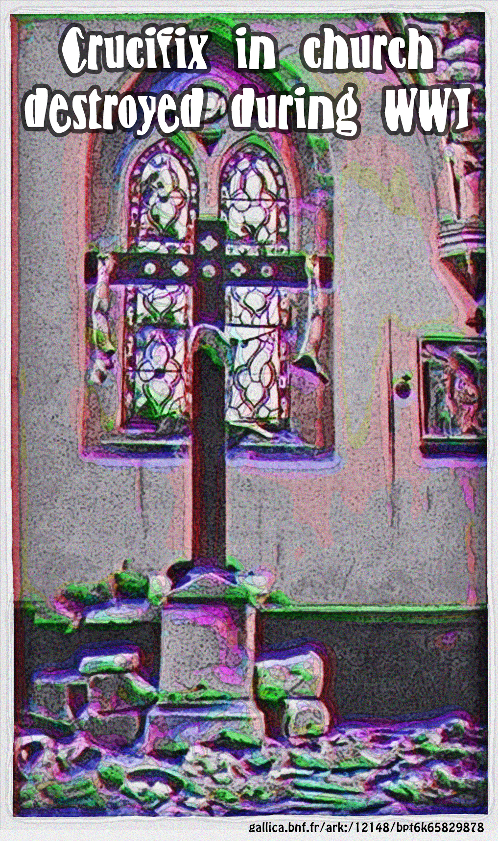

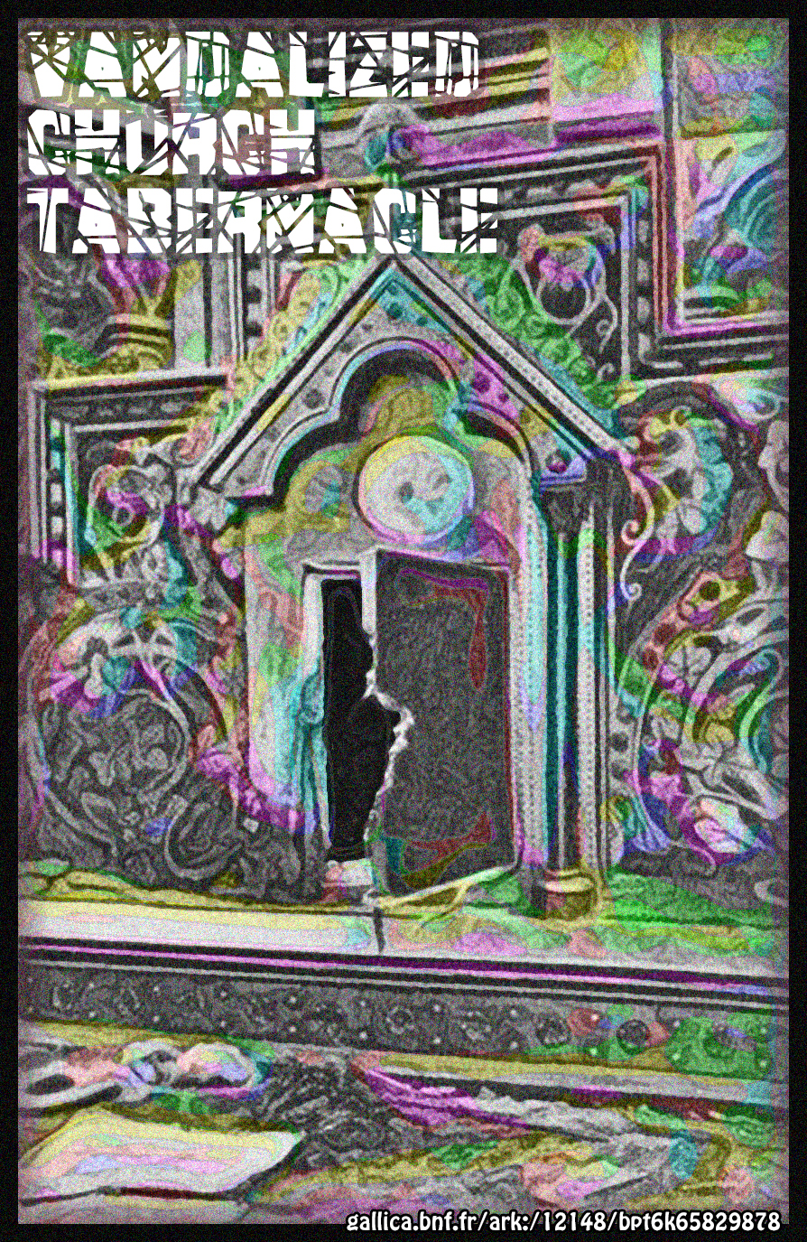
The French national archive recently uploaded scans of a 1915 French book La Guerre Allemande et le Catholicisme (Link1), a compilation of photographs of war damage edited by a French Cardinal This was back when World War One was apparently known (by the French) as "The German War." Some of the photos are excellent. Here are three of them. Consider them this baptized but "lapsed" Catholic's digital Easter Duty -- and St. Patrick's Day card.
Left: in a bombed-out church, the broken ("quartered") arms of a plaster Jesus dangle from the arms of a crucifix. The font is the 1999 BM-Fish Eye by Ben Nathan.
Center: From the same source, a dead man (the text labels him l'innocente victime and le cadavre carbonise) sprawled a few feet from a burned-out altar. Judging from his leggings, he may have been a soldier. The font is the 1999 Bogusflow, from Spork Plug Typography by Rev. Josh Wilhelm. (It's not clear what denomination the Rev. belongs to, but if you look at the comic strips on his blog, he is not all about angels and pearly gates, but is in touch with the dark side of life.)
Right: The Tabernacle -- the fixed, locked box on the altar in which the Holy Communion wafers considered to represent Christ are stored -- of a war-damaged and looted church. The text calls this picture Le Tabernacle Cambriole (or burgled). The font is the 1998 Brad by Mike Lecky, who is also known as Superfunk.
Using text again, which my fine-art friends may object to. Also, haven't mastered French accent marks yet.
For maximum effect with my images, click on the image until it is full-size, which may be larger than your computer screen.
Sources:
Link1 gallica.bnf.fr/ark:/12148/bpt6k65829878
Sunday, March 16, 2014
Little Bo Peep Costume from Canadian Mining Town
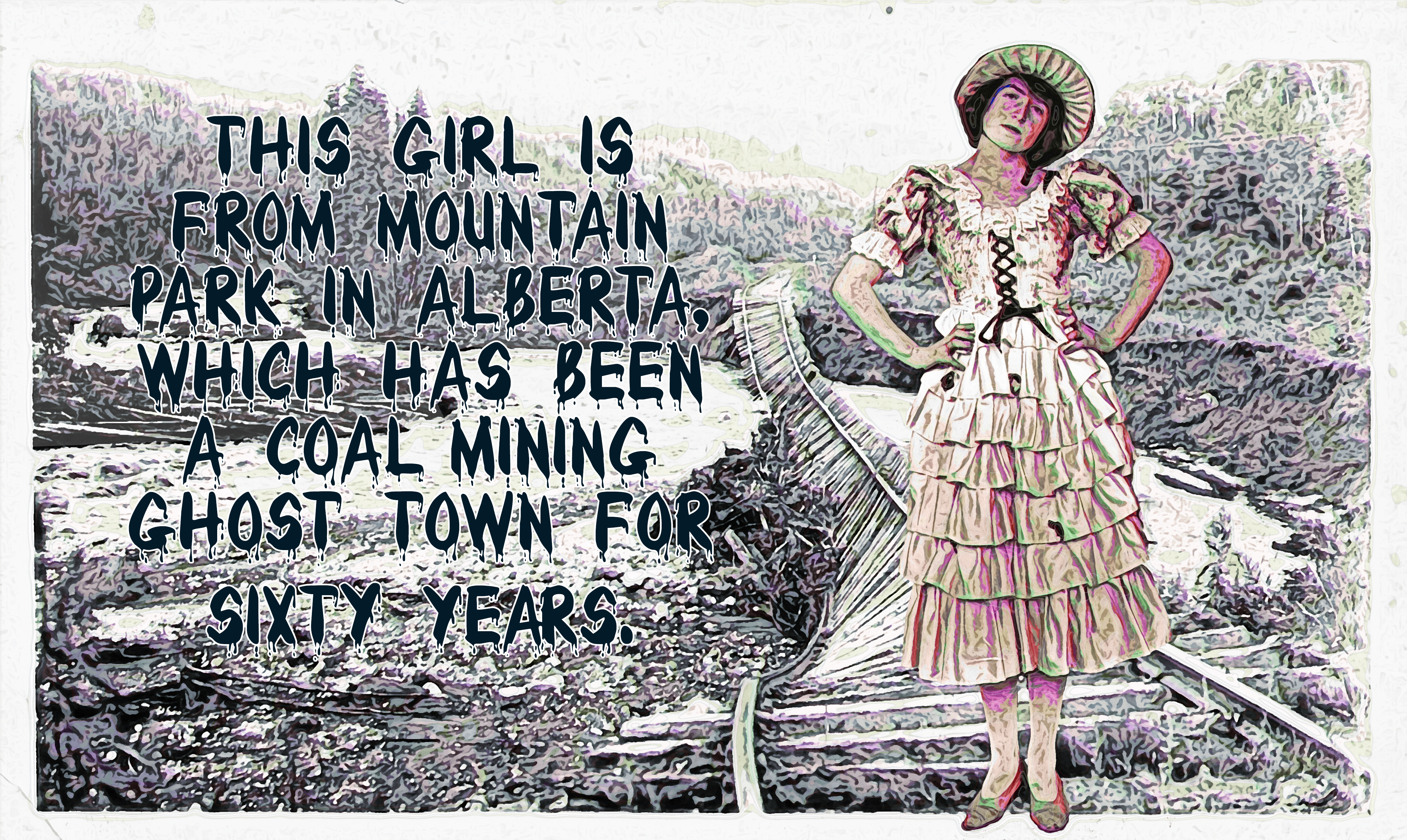
Mountain Park has been an Alberta, Canada mining ghost town for half a century. Here's a 1920's photo from there labelled Girl in Costume (Link1). It is superimposed on a 1918 photo Athabasca River Flood (Link2). The type was released in 1984 and is called Bloody Font, by
J. Fordyce.
For maximum effect with my images, click on the image until it is full-size, which may be larger than your computer screen.
Sources:
Link1 flickr.com/photos/alberta_archives/12241613175
Link1 www.flickr.com/photos/alberta_archives/10860919843/
Friday, March 14, 2014
Homefront Cookery, Nails, and Porcelain Light Fixure
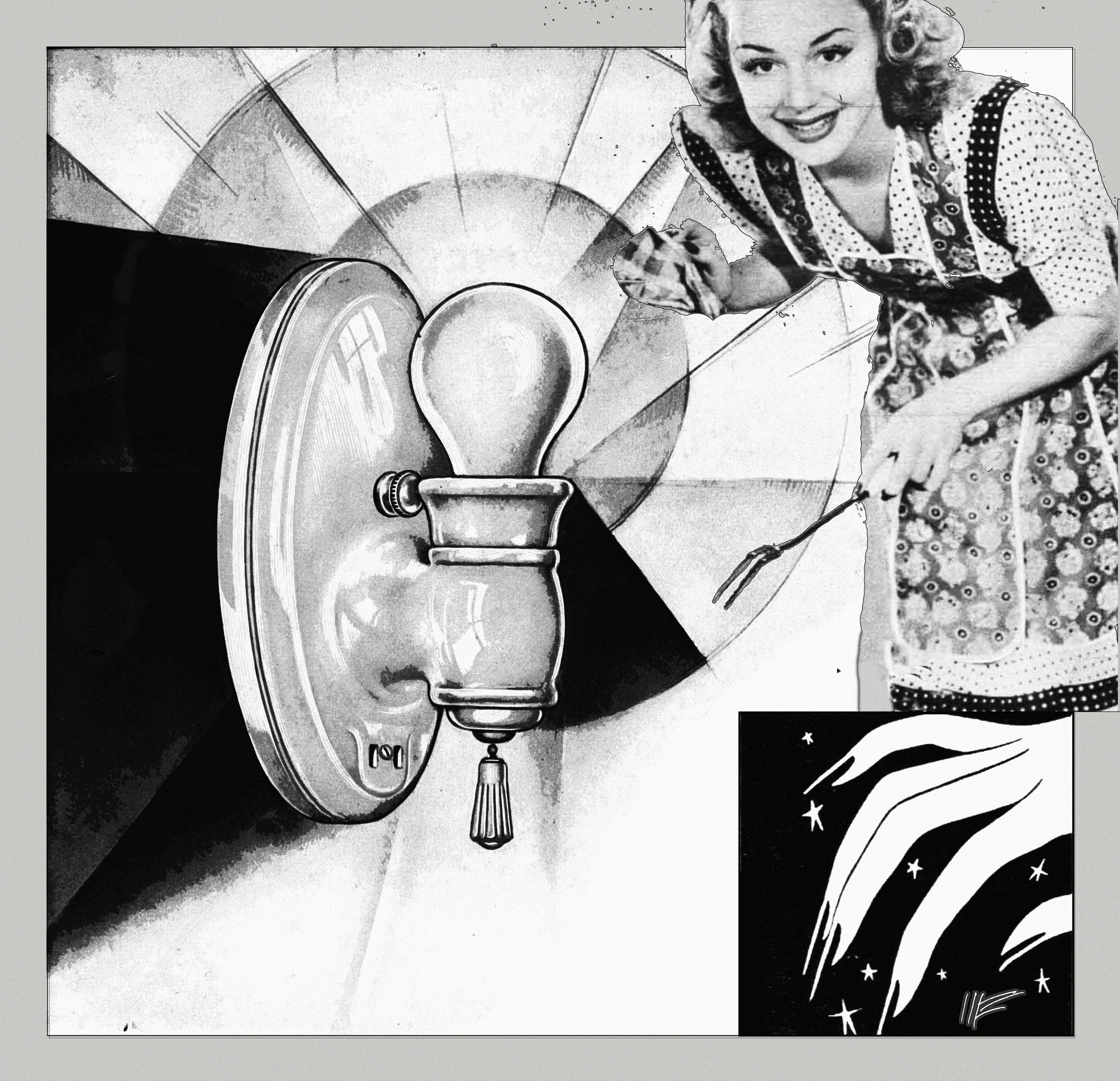
From a 1943 issue of Movie and Radio Guide Week (Link1), two pictures: (1) in a publicity photo, Hollywood actress Anne Shirley, in apron, cooks a turkey for Thanksgiving, and (2) scary-long nails an advertisement for Seal-Cote nail polish. Then, from a 1929 Pass & Seymour trade catalog, Porcelain and Electrical Supplies (Link2), a drawing of a wall lighting fixture, with stylized light rays. Stepping back from color, in this one, as well as texture.
For maximum effect with my images, click on the image until it is full-size, which may be larger than your computer screen.
Sources:
Link1 archive.org/details/movie-and-radio-guide-1943-11
Link2 archive.org/details/PassSeymourIncPorcelainandedlectricalsupplies0001
Tuesday, March 11, 2014
Plumber Wicker Shower Bubbles
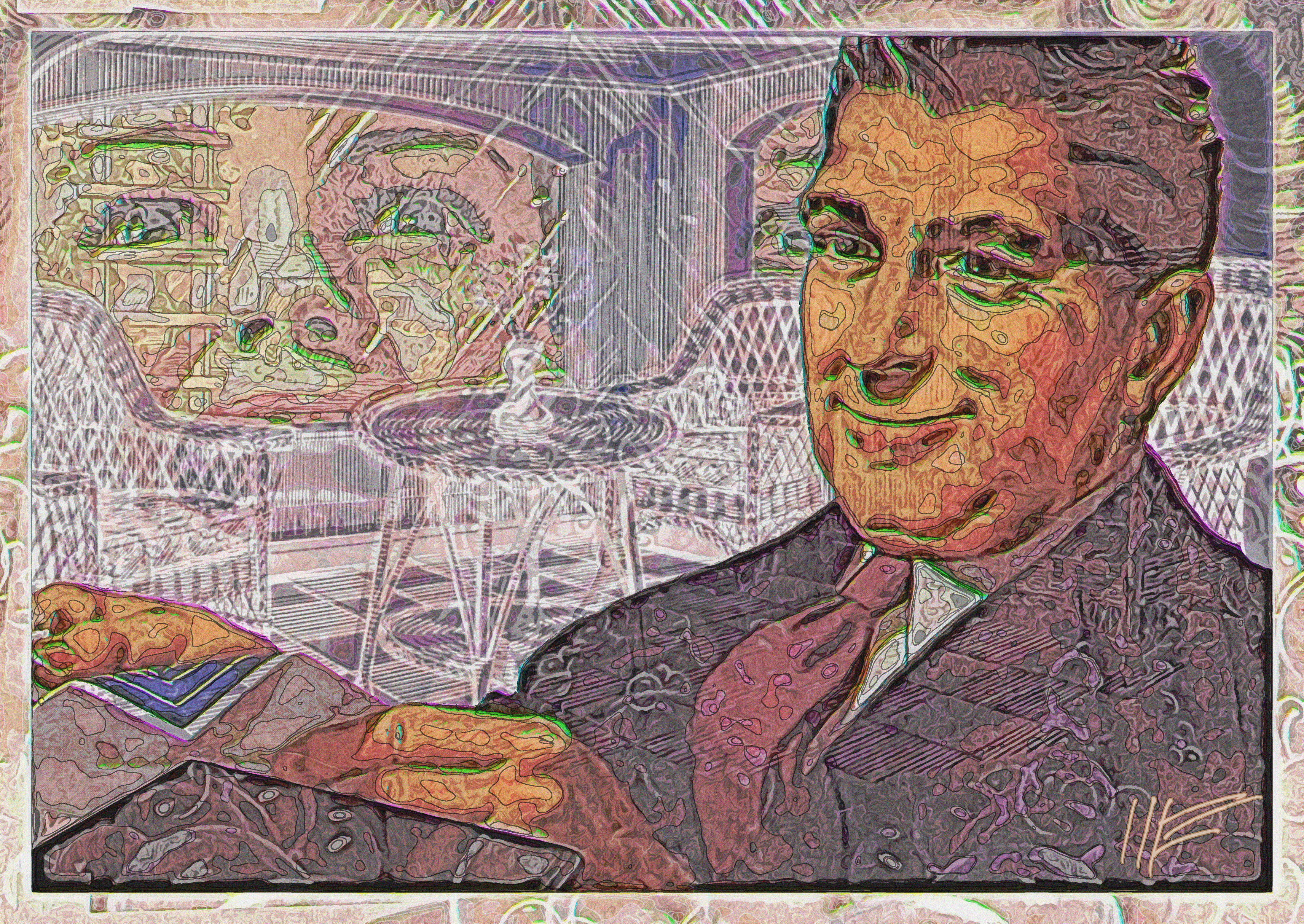
An illustration of a Master Plumber showing blueprints to a client, from American Standard's 1945 Plan Beauty For Your Home With American-Standard Plumbing Fixtures (Link1). In the background, a beaming woman revels among bubbles in her new shower, from the same catalog; and a wicker furniture setting, from a catalog by the Grand Central Wicker Shop (Link2). The catalog is undated, but the price of two wicker chairs, one wicker rocker, three seat cushions, and one 22-inch wicker table (shown in background) -- was $24.75. Their motto: "In Reed, We Lead." Texturizing is somewhat reduced in this piece.
For maximum effect with my images, click on the image until it is full-size, which may be larger than your computer screen.
Sources:
Link1 archive.org/details/AmericanRadiatorStandardSanitaryCorpPlanbeauty0001
Link2 https://archive.org/details/GrandCentralWickerShopCatalog0001
Tuesday, March 11, 2014
Playing Card Queen on Ivory and Watermarks
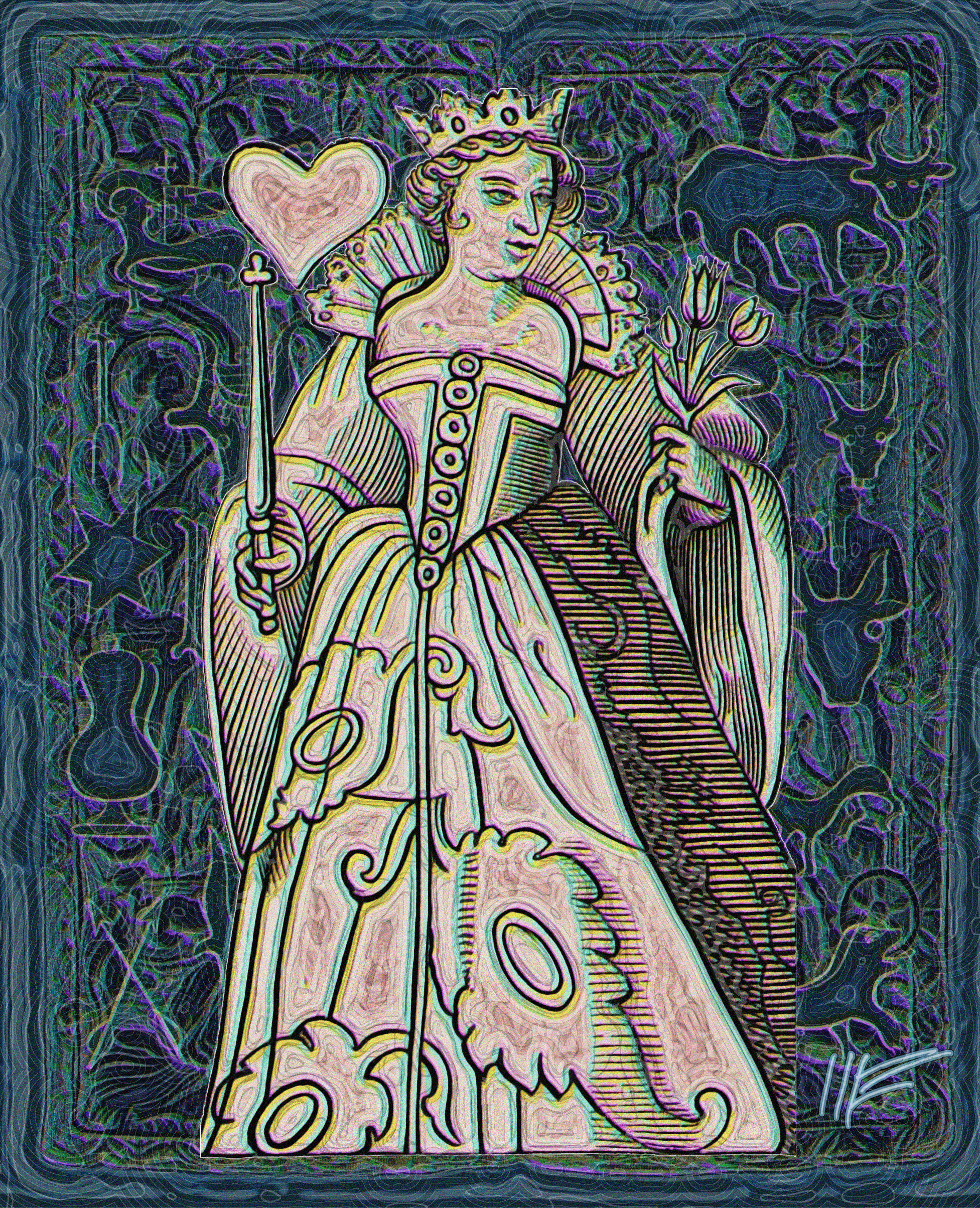
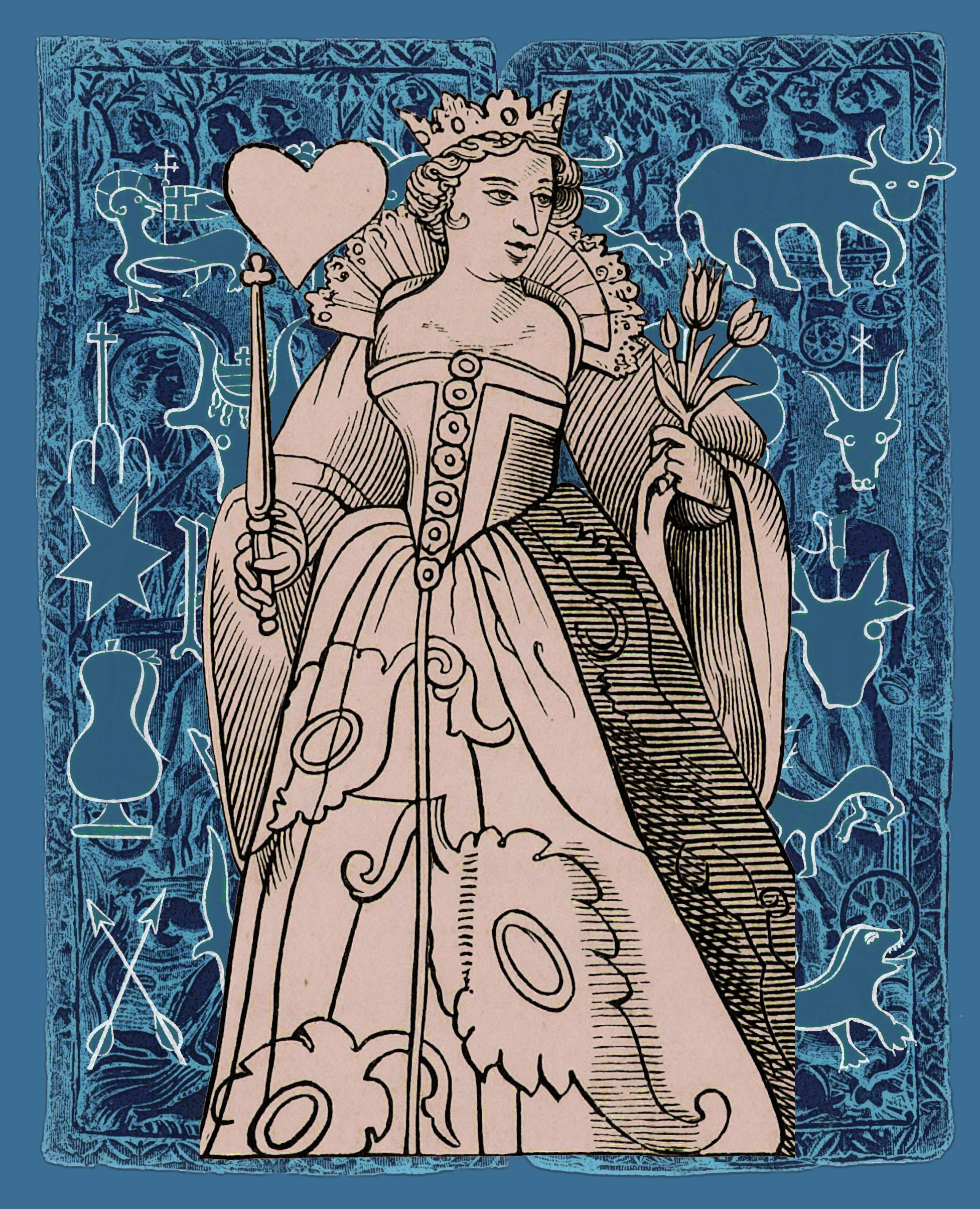
From the 1870 The Arts in the Middle Ages, and at the Period of the Renaissance (Link1), the Queen of Hearts, a playing card design from 16th century, superimposed on a series of paper watermarks from old-time papermakers and a design from an ivory diptych. Presenting two versions: on the left, my usual textured version, on the right an untextured version. Not sure which one I prefer. Texturing requires twice the work.
For maximum effect with my images, click on the image until it is full-size, which may be larger than your computer screen.
Sources:
Link1 http://archive.org/details/gri_33125012263063
Friday, March 7, 2014
Medieval St. Catherine by Master of Dotted Background
All images from a single book, the 1870 The Arts in the Middle Ages, and at the Period of the Renaissance (Link1). It's a Getty Research Institute high-quality scan. Here, an engraving from the 16th century, of the martyr Catherine of Alexandria, done in an unusual style by someone sometimes called Bernard Milnet, sometimes called "The Master of Dotted Backgrounds." If you click on the image to enlarge it, you'll see this unusual and demanding style of woodblock carving -- breaking up the pure black ink areas with numerous white dots. This was before Albrecht Durer and other engravers perfected cross-hatching as a method of shading the pure black. The background is labeled "Paving Tiles of the 14th and 15th Century."
For maximum effect with my images, click on the image until it is full-size, which may be larger than your computer screen.
Sources:
Link1 http://archive.org/details/gri_33125012263063
Thursday, March 6, 2014
Polish Surgeon on Mucha Deco and Chromatograph
Illustration from the cover of a 1969 edition of Wiejska Mlodziez (Link1), showing a Polish medical worker in surgical garb, working under operating room lights. I place this against the flowery background of one of Alphonse Mucha's ethereal beauties on a Gallica span of an 1898 poster by the printer F. Champenois (Link2). And then, behind that, the curious checkerboard of an illustration from the British Museum, from an 1864 book The Chromatographic Chronicle of English History (Link3). Encouraged by this image; the difference in method is that I determined to start out with some negative space.
For maximum effect with my images, click on the image until it is full-size, which may be larger than your computer screen.
Sources:
Link1 archive.org/details/WiejskaMlodziez31969ZSRR
Link2 gallica.bnf.fr/ark:/12148/btv1b90051807
Link3 www.flickr.com/photos/britishlibrary/11066010656/in/set-72157638544764936
Wednesday, March 5, 2014
Two Treatments of Same Material
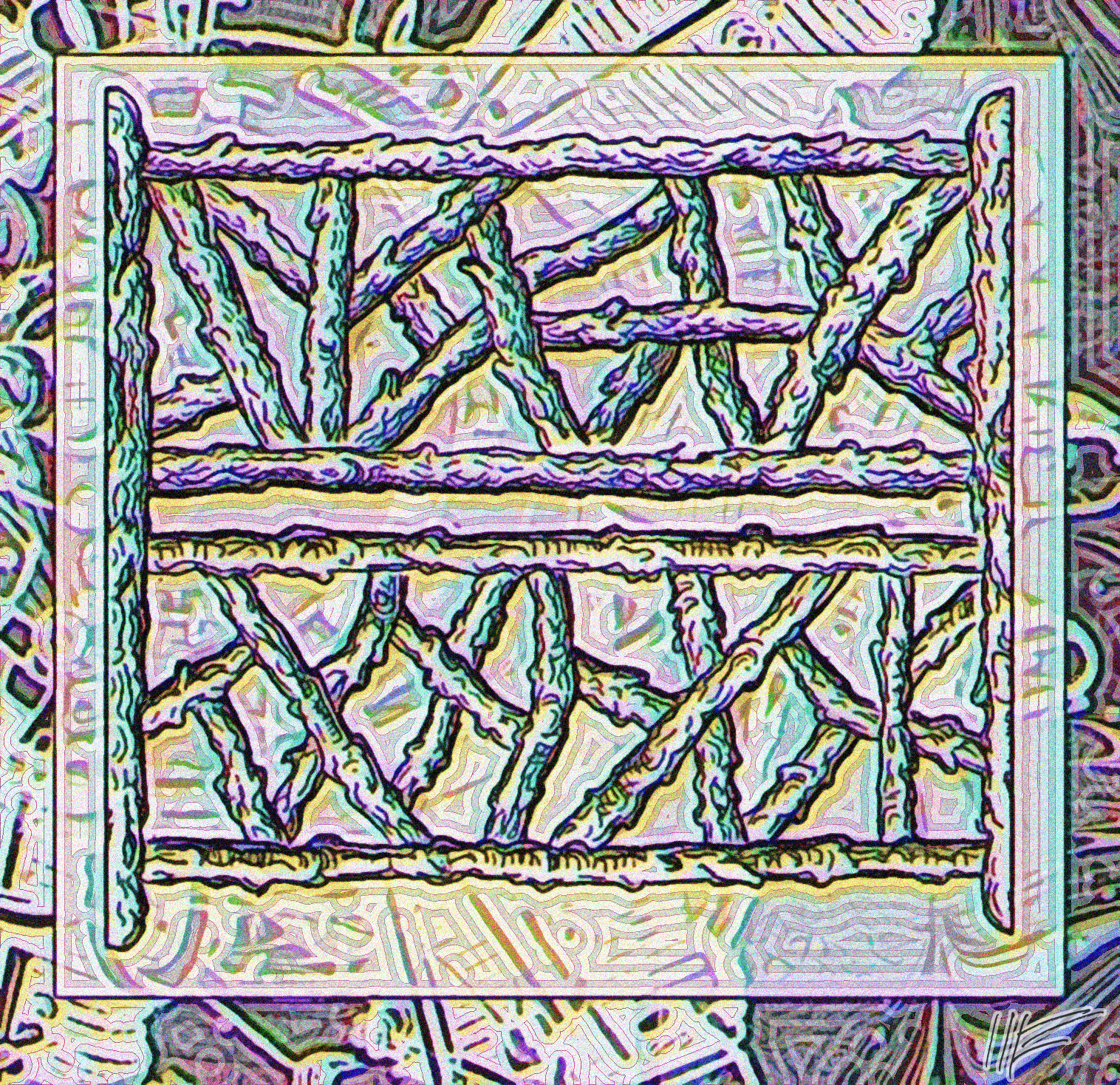 nbsp;
nbsp;
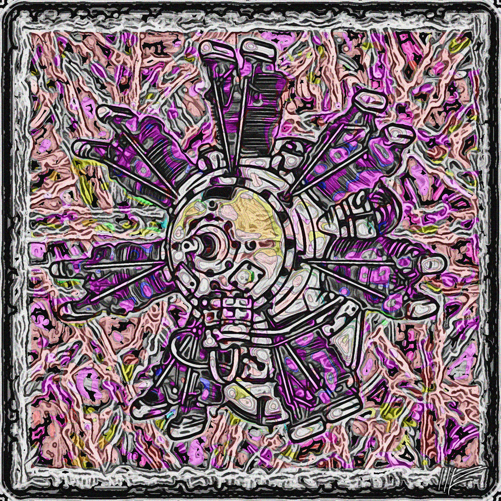
Two combinations of the same three images. One image is a drawing from an advertisement in an early 20th century Italian aviation magazine (Link1), showing a Lynx Major engine from Armstrong Siddsley Motors of Coventry, England. The second image is a drawing of a log fence from the 1880 Rural School Architecture (Link1). The third image is a marblized endpaper from the 1791 L'Etruria Pittrice, Ovvero, Storia della Pittura Roscana, Dedotta dai Suoi Monumenti che Si Esibiscono in Stampa dal Secolo X (Link3).
Here are the originals:
For maximum effect with my images, click on the image until it is full-size, which may be larger than your computer screen.
Sources:
Link1 archive.org/details/xcollection1999
Link2 archive.org/details/RuralSchoolArchitecture
Link3 archive.org/details/gri_33125009314002
Saturday, March 1, 2014
Shaggy Donkey in Title Page, Lightly Empatterned
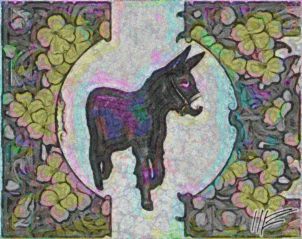
A picture of a Poitu Donkey from the Gallica scan of the 1942 Chevaux de Culture, ânes, Mulets [Translation: Farm Horses, Asses and Mules, I think. The subtitle is Comment choisir et produire l'animal qui convient... comment utiliser votre cheval pour en tirer le plus longtemps possible le meilleur rendement which translates, I think, to "How to choose and breed draft animals, how to use your horse to carry a load the longest time possible at the best value."] (Link1). It is framed by a title page from another Gallica book, the 1895 Un Homme d'Oeuvres (Link2), and finally given a light patterning from an endpaper of the 1864 Les Trotteurs (Link3). Not pleased with result, it will probably be sent to the Rejects page soon, but the experiments with empatterning are useful -- and the little donkey sure was cute! I think I need a Poitu Donkey as a therapy animal to combat depression.
For maximum effect with my images, click on the image until it is full-size, which may be larger than your computer screen.
Sources:
Link1 gallica.bnf.fr/ark:/12148/bpt6k6579492r
Link2 gallica.bnf.fr/ark:/12148/bpt6k65795515
Link3 gallica.bnf.fr/ark:/12148/bpt6k65794987
Tuesday, February 25, 2014
SciFi Collage and The First Hitchcock Blonde
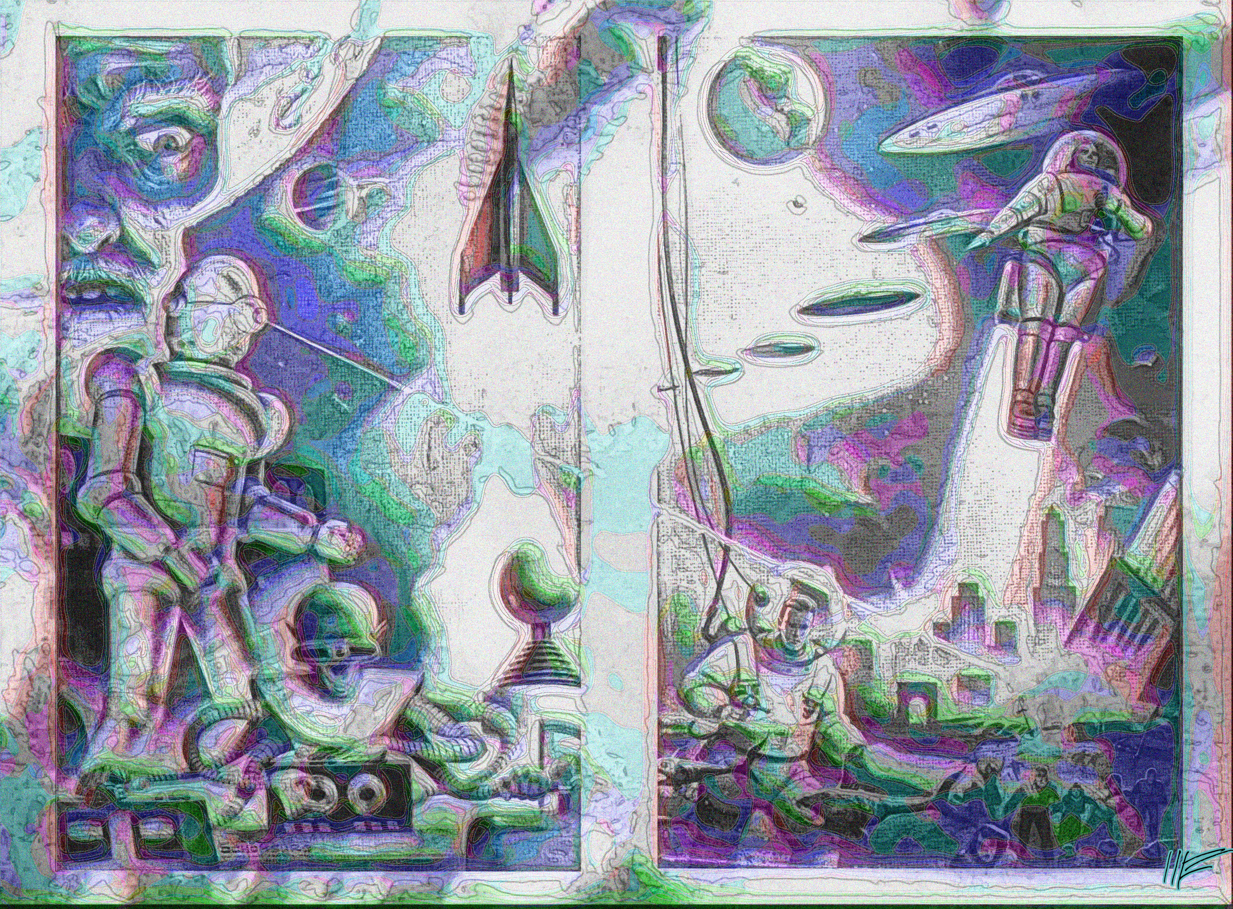
In the foreground, an illustration from the 1958 science fiction novel Year When Stardust Fell (Link1) -- "A myserious fall-out paralyzes civilization". It is superimposed on a tiny detail of a pinup photo of Madeleine Carroll from the 1940 Movie and Radio Guide Week (Link2). Her eye is visible in the top center and her lips in the top right.
For maximum effect with my images, click on the image until it is full-size, which may be larger than your computer screen.
Sources:
Link1 archive.org/details/Year_When_Stardust_Fell_1958.Winston_cape1736
Link2 archive.org/details/movie-and-radio-guide-1940-03-01
Tuesday, February 25, 2014
Shells and Early Dishwasher
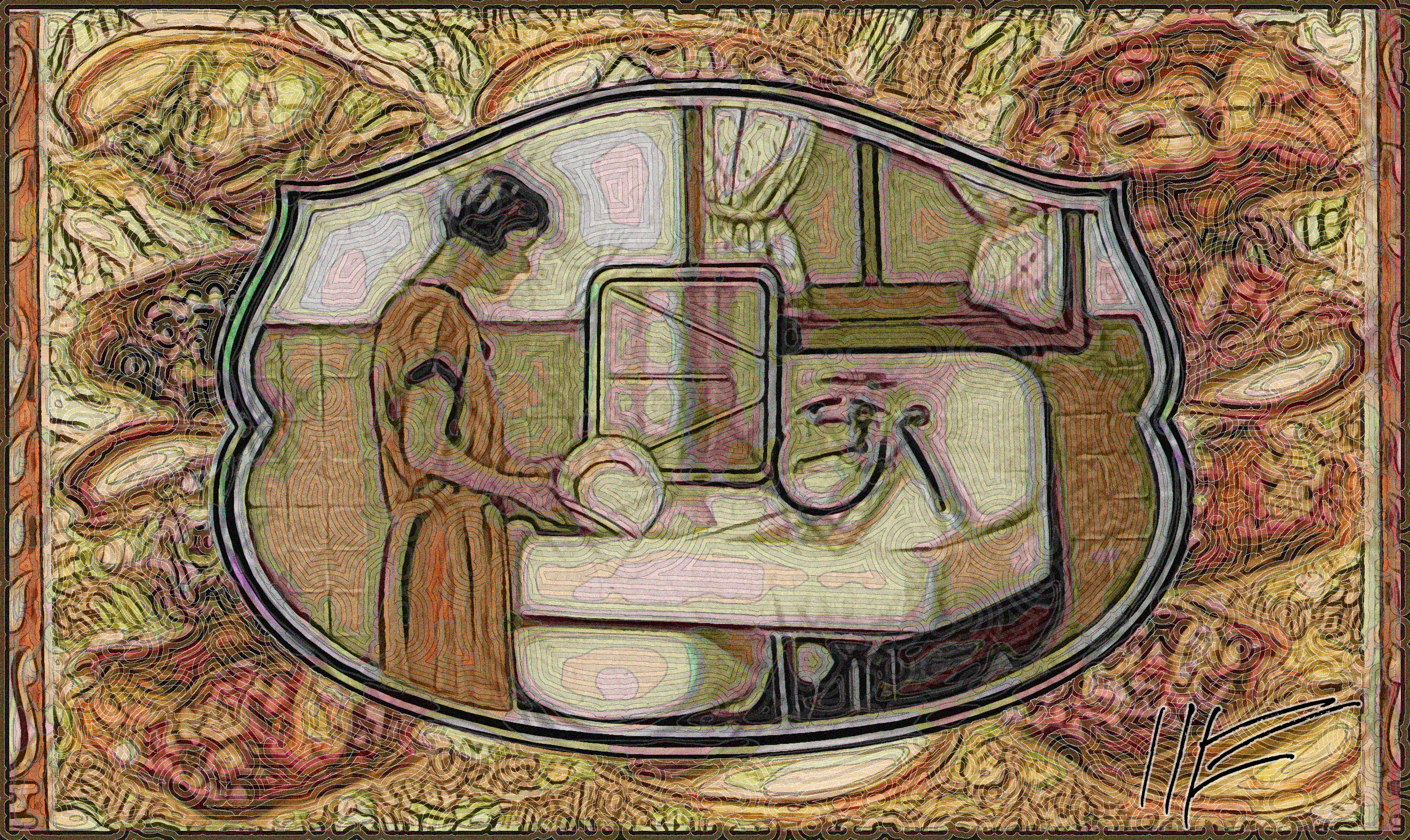
One more, a background from the 1847 Thesaurus Conchyliorum, or, Monographs of genera of shells (Link1), and in the foreground a happy housewife from a 1926 brochure, The Kohler Electric Sink, shown finishing up the dishes washed by an early version of the electric dishwasher.
For maximum effect with my images, click on the image until it is full-size, which may be larger than your computer screen.
Sources:
Link1 archive.org/details/thesaurusconchy11847sowe
Link2 archive.org/details/KohlerCoTheKohlerElectricSink0001
Saturday, February 22, 2014
Republishing the following from the 2013 www.philly-bob.net in honor of the massive Ukrainian street protests
FLASHBACK: Ukrainian Heroines
Illustrations from an 1878 children's book Maroussia: A Maid of the Ukraine (Link1), telling a Ukrainian legend. It is a charming story of a little girl who gives her life to rescue The Envoy, a George Washington-type national hero, during a period of political turmoil (when the Ukraine was invaded by Russia, and was considering whether to ally with Poland or go independent). In the first picture, the girl's mother does a masterful job of stalling Cossacks who want to arrest the Envoy, a guest at their house. One pistol-wielding Cossack breaks a window to demand that the mother open the door or he will burn the house down. Cunning, the fearless mother plays stupid -- Oh my goodness, I lost the key, I know it's in here somewhere. I'm so confused. Think Edith Bunker in All in the Family. The delaying tactic gives the Envoy time to escape. The little girl on the left, whose hand is being grasped by her mother, is the heroine Maroussia. After the Envoy is gone and mother lets the Cossacks in, Maroussia slips outside and leads the Envoy through the battle-scarred steppes to his destination. That journey, their adventures together, and the stories they tell each other, form the legend's key narrative. I'm reading the English translation.
In the second picture: during their journey, the plucky 11-year-old heroine hides the Envoy in an oxen wagon loaded with hay to smuggle the fugitive past the cossacks hunting him. But when the cossacks stop the wagon and begin to question her, quick-witted Maroussia charms her way out of it. The soldier guarding the wagon ask Maroussia where her parents are, but she turns it around, asking the soldier about his family, getting him to tell her about his own daughter, who is about the same age as Maroussia. Distracted, he doesn't search the wagon, doesn't find the Envoy hiding in the hay.
The third picture shows Maroussia and the Envoy arriving at a camp, their journey done.
After the Envoy is safely delivered, Maroussia is killed by a Tartar's stray bullet and is laid out on a funeral bier, where she is mourned by all. Not a dry eye in the house.
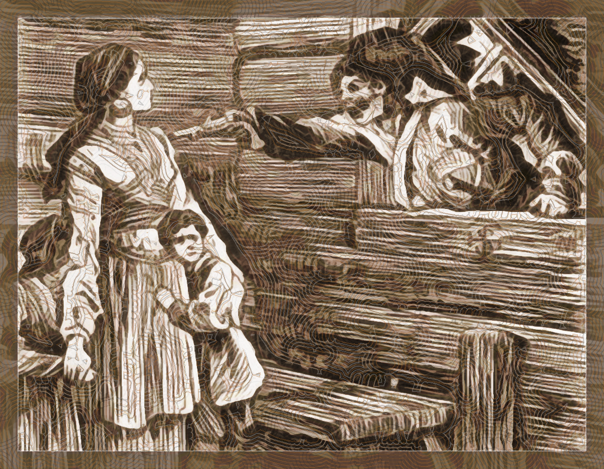
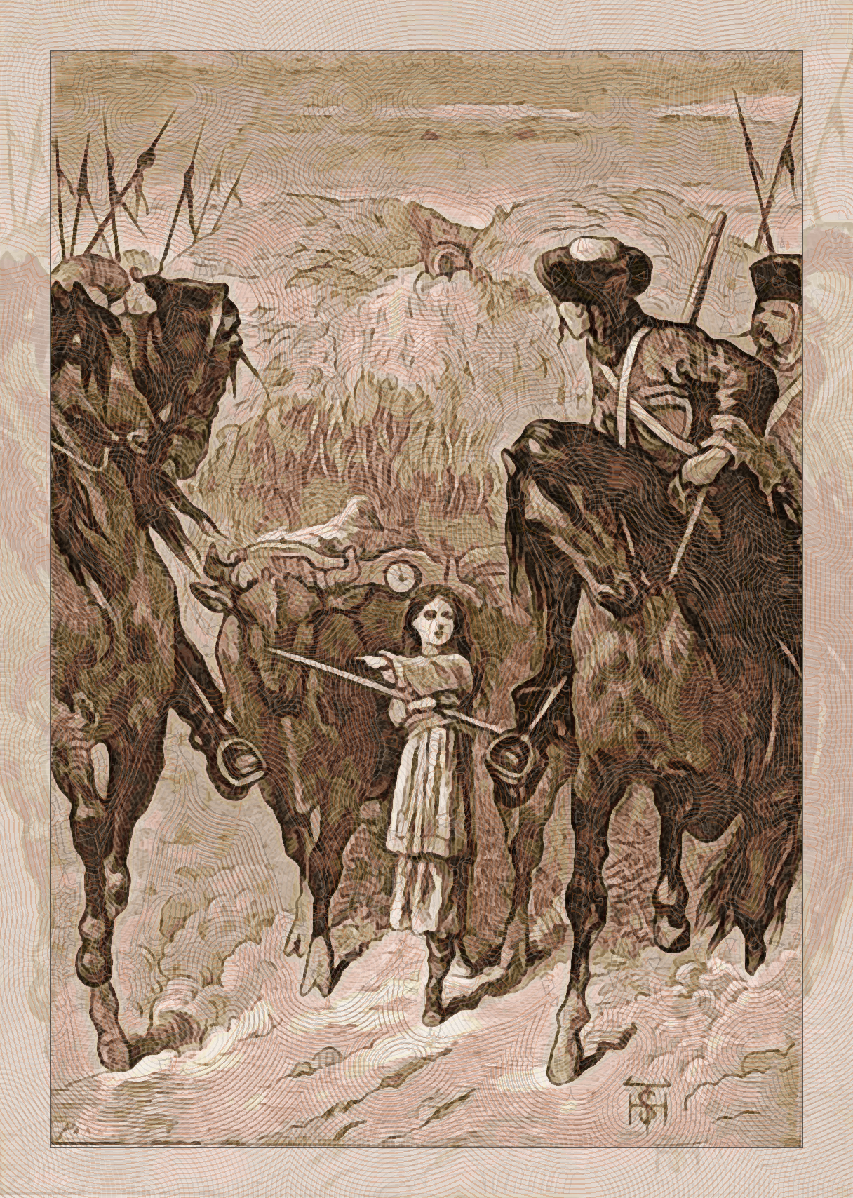
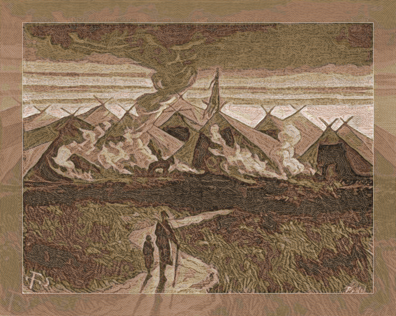
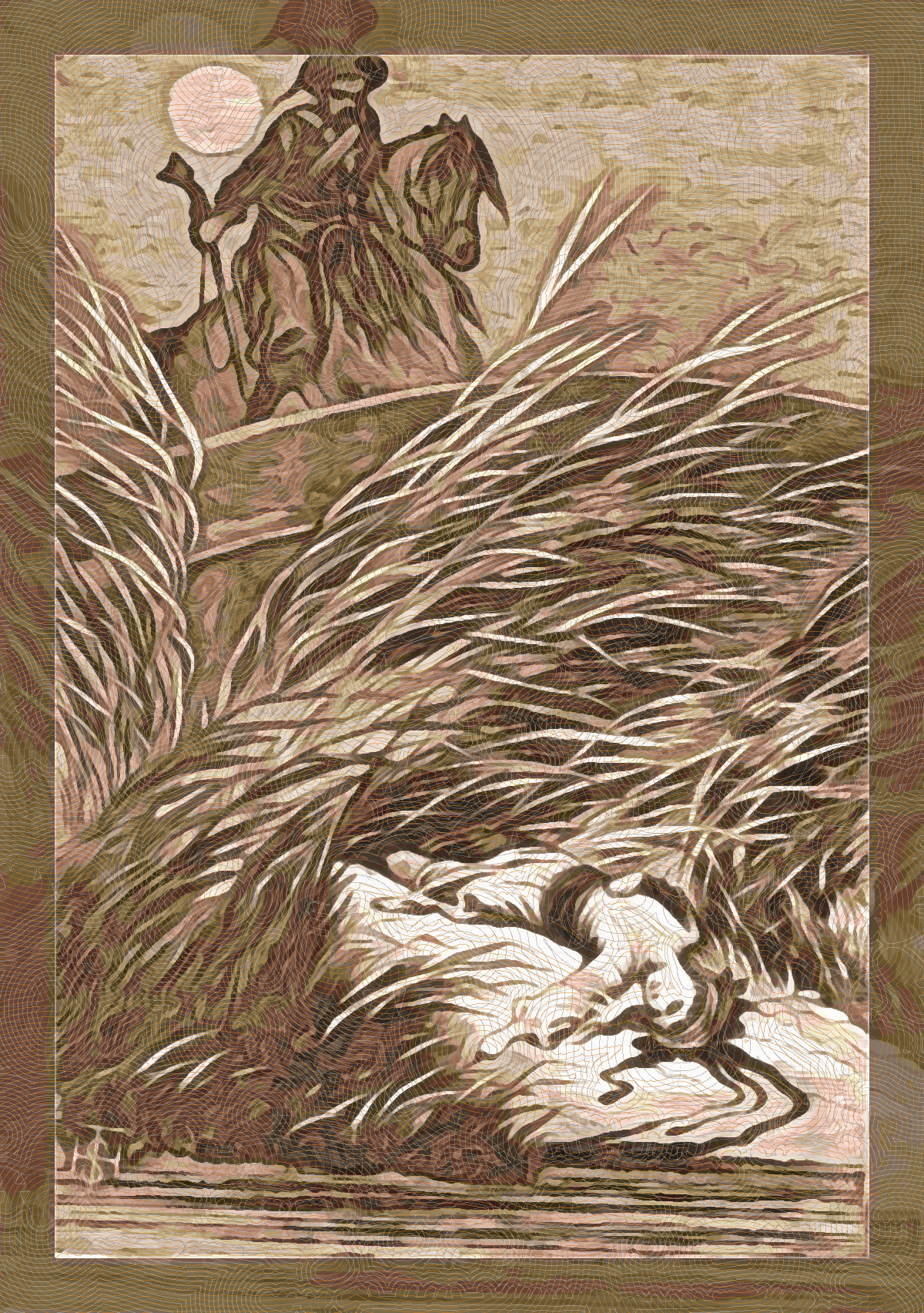
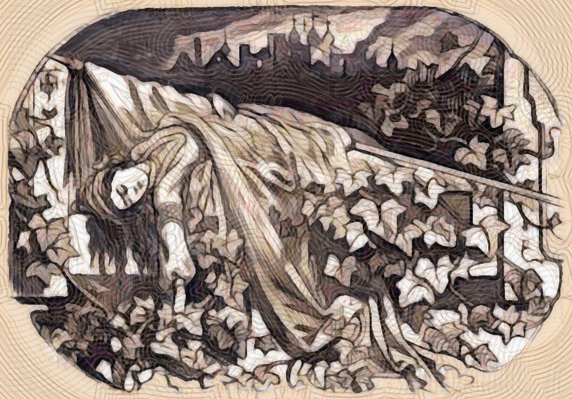
For maximum effect with my images, click on the image until it is full-size, which may be larger than your computer screen.
Sources:
Link1: http://gallica.bnf.fr/ark:/12148/bpt6k65518515
Mountain Scene 'Empatterned' on Marblized Paper
Still continuing my experiments in melding foreground image with background pattern. Foreground image is an illustration an 1893 Sierra Club Bulletin (Link1), showing an Alaskan mountain chain. The background is a veiny marblized endpaper from the 1848 Zeitschrift der Deutschen Geologischen Gesellschaft (Link2). Scans are from the Biodiversity Heritage Library.
For maximum effect with my images, click on the image until it is full-size, which may be larger than your computer screen.
Sources:
Link1 archive.org/details/sierraclubb1119201922sier
Link2 archive.org/details/zeitschriftderd491897deut
Thursday, February 20, 2014
Leaf Beetle 'Empatterned' on Endpaper
Continuing my experiments in melding foreground image with background pattern. Foreground image is an illustration from the 1919 Coleoptera. Chrysomelidæ (Link1), showing one of the 35,000 species of leaf beetles. This one is called Agusta Formosa. The background is simply the swirling, faded end-paper from another book, the 1766 Hand-Buch oder kurze Anweisung wie man Naturalien-Sammlungen mit Nutzen betrachten soll (Link2). Fascinated lately by how the Photoshop "Reverse Image" command seems to take a wide palette of colors and condenses them into a narrower palette of blues -- which I find quite pleasing. The background here was produced by such a reversal. Also, added a date just below my logo. Scans are from the Biodiversity Heritage Library.
For maximum effect with my images, click on the image until it is full-size, which may be larger than your computer screen.
Sources:
Link1 archive.org/details/coleopterachryso21919maul
Link2 archive.org/details/handbuchoderkurz00rudo
Wednesday, February 19, 2014
The World of Art, Taste and Beauty, Paris, 1923
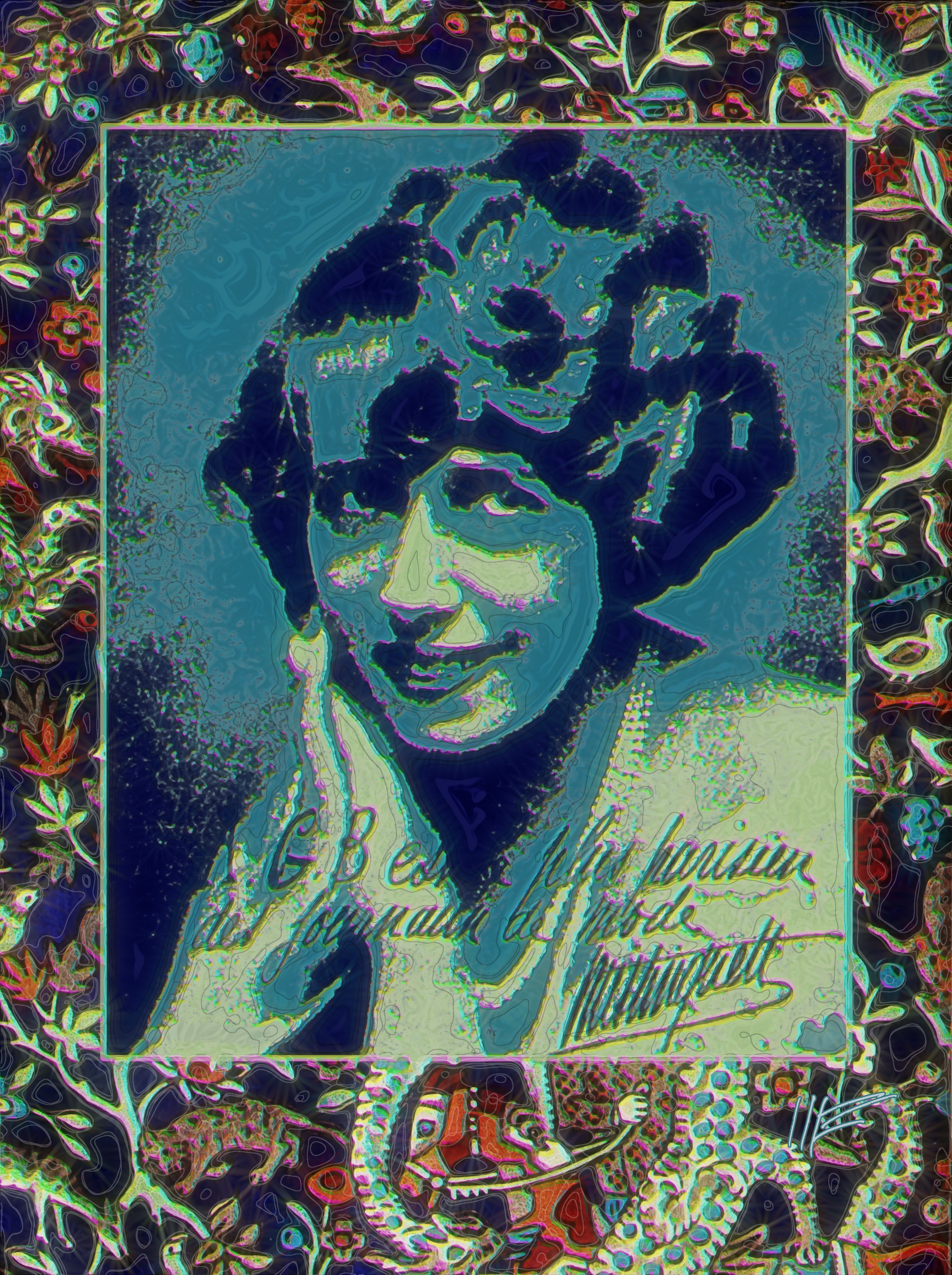
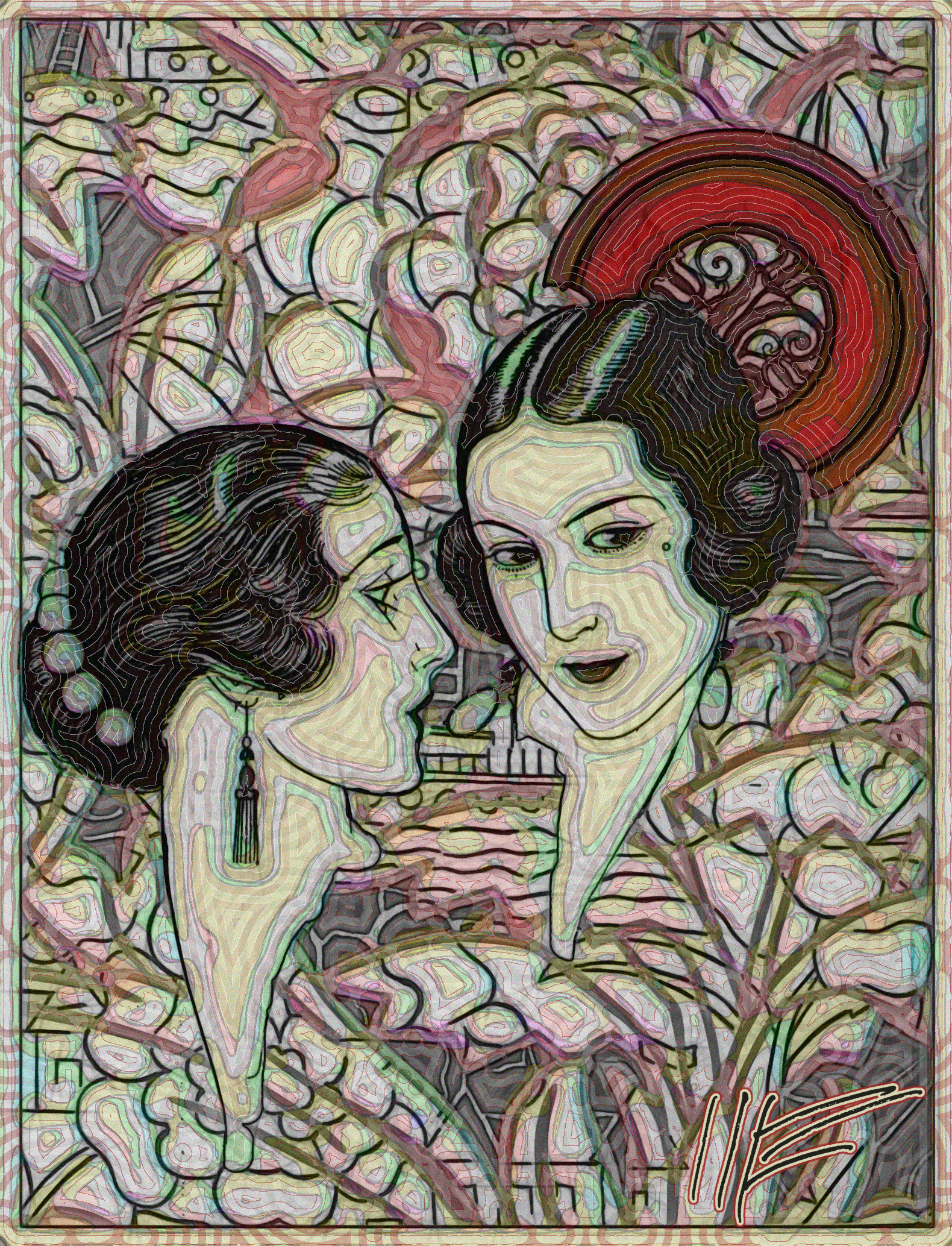
The California State Library uploaded scans of the French fashion magazine Art Gout Beaute (Link1) to the Americana Collection of Internet Archives. The magazine is known popularly as "A.G.B." The background of the image on the left is a collage of various fabric patterns displayed in A.G.B.. The white image appearing several times in the foreground is an advertisement for a decorative comb -- not the simple toothed plastic comb of today, but more of a tiara, used to hold the hair in place. Part of it is shown alone at bottom left, and it is twice shown in use, above, with a woman in a sleeveless gown placing it in her piled hair. The image in the center uses another fabric pattern as a "frame" and a publicity photo of the Parisian singer and actress Mistinguett, inscribed (by her), "A.G.B. est le plus parisien des journaux des mode" (A.G.B. is the most Parisian of newspapers.) You can hear Mistinguett singing in 1928 here. A.G.B's Art Deco pages are pure eye-candy, like another French fashion magazine of a decade earlier Gazette du Bon Ton. The image on the far right, another combination of fabric pattern and an advertising illustration for a decorative comb, from a December 1922 issue of A.G.B.
There is a company that sell prints from this magazine commercially. (What's odd is that the illustration this company chooses to sell in the marketplace are entirely different from my selection of A.G.B. images.) The rich ladies with swan-like necks and willowy arms are a bit of a cliche, but the patterns and illustrations are often wonderful. The Art Deco style is what my generation of Boomers and Pre-Boomers displayed on dorm walls in our college days -- and the taste (gout) remains. Incidentally, there is a show at the Plastic Club called Small Worlds, limited to pieces no larger than 13" -- and I'm considering the left and far right images for my entry... Lazy wet/snow day today, never got out, and I'm avoiding the chore of learning how to use my new cell phone (a Google Nexus 5).
For maximum effect with my images, click on the image until it is full-size, which may be larger than your computer screen.
Sources:
Link1 http://archive.org/details/artgoutmar1923unse
Saturday, February 15, 2014
Secrets Entrusted to a Few
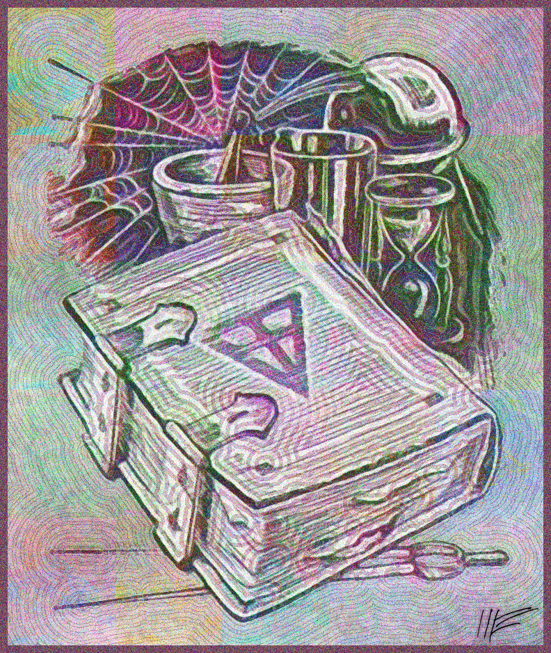
For years, this drawing of an old book surrounded by early scientific instruments -- and a spiderweb -- appeared in advertisements for the Rosicrucians, advertising their book The Mastery of Life. This version is taken from a 1959 Galaxy science fiction magazine (Link1). The Rosicrucians are still around (see their current website) and the Mastery book is now available in PDF form. I know next to nothing about the subject -- but the esoteric traditions they teach are said to be drawn from Sufi and Freemasonry, two traditions I have some respect for. (My grandfather was a Mason.) In 2014 the Rosicrucians published their fourth manifesto (in four centuries) asking, sensibly, "How indeed can you want all human beings to be happy,
without concerning yourself with the conservation of the planet on which they live?" and laying out a program of enlightened humanism -- not spiritualism. The original teachings may be a bit woo-woo for my taste, but the modern organization seems much more enlightened than I expected. I figure (with the Process Theologians) that religion and spirituality is an evolving human construct. The more we move away from selfish local dogmas, with bloodthirsty local gods, toward a concept of a Deity with loving concern for all of humanity, the better off we will be. In a way, it's like God, like life, is not changeless, but evolving.
For maximum effect with my images, click on the image until it is full-size, which may be larger than your computer screen.
Sources:
Link1: archive.org/details/galaxymagazine-1959-12
Sunday, February 9, 2014
Eruption and Zodiac
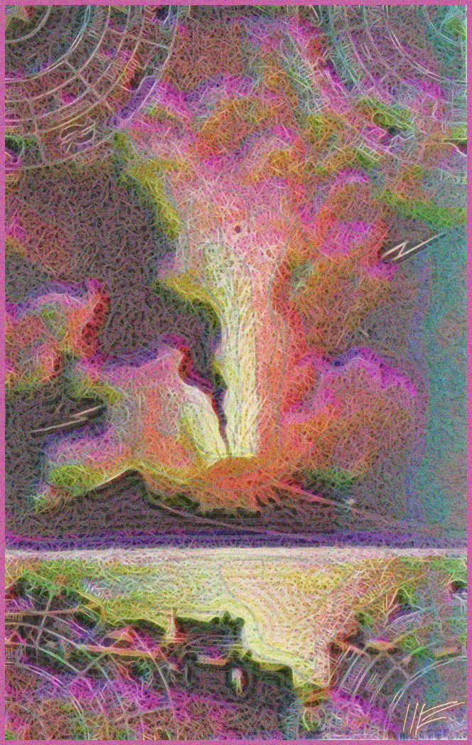
From the French national Gallica site, the frontispiece illustration to the 1864 La Terre et Les Mers, ou Description Physique du Globe [Land and Water, or a Physical Description of the Globe](Link1). It shows, at bottom, a group of citizens gathered at a quay to watch the eruption of Mt. Vesuvius, across a body of water. Superimposed on this image, at each corner, is a quarter of a compass globe showing zodiac signs, from the same volume. The purple tint is produced by my digital treatment.
For maximum effect with my images, click on the image until it is full-size, which may be larger than your computer screen.
Sources:
Link1: gallica.bnf.fr/ark:/12148/bpt6k65769239
Saturday, February 8, 2014
Long Day for Reef Kincaid
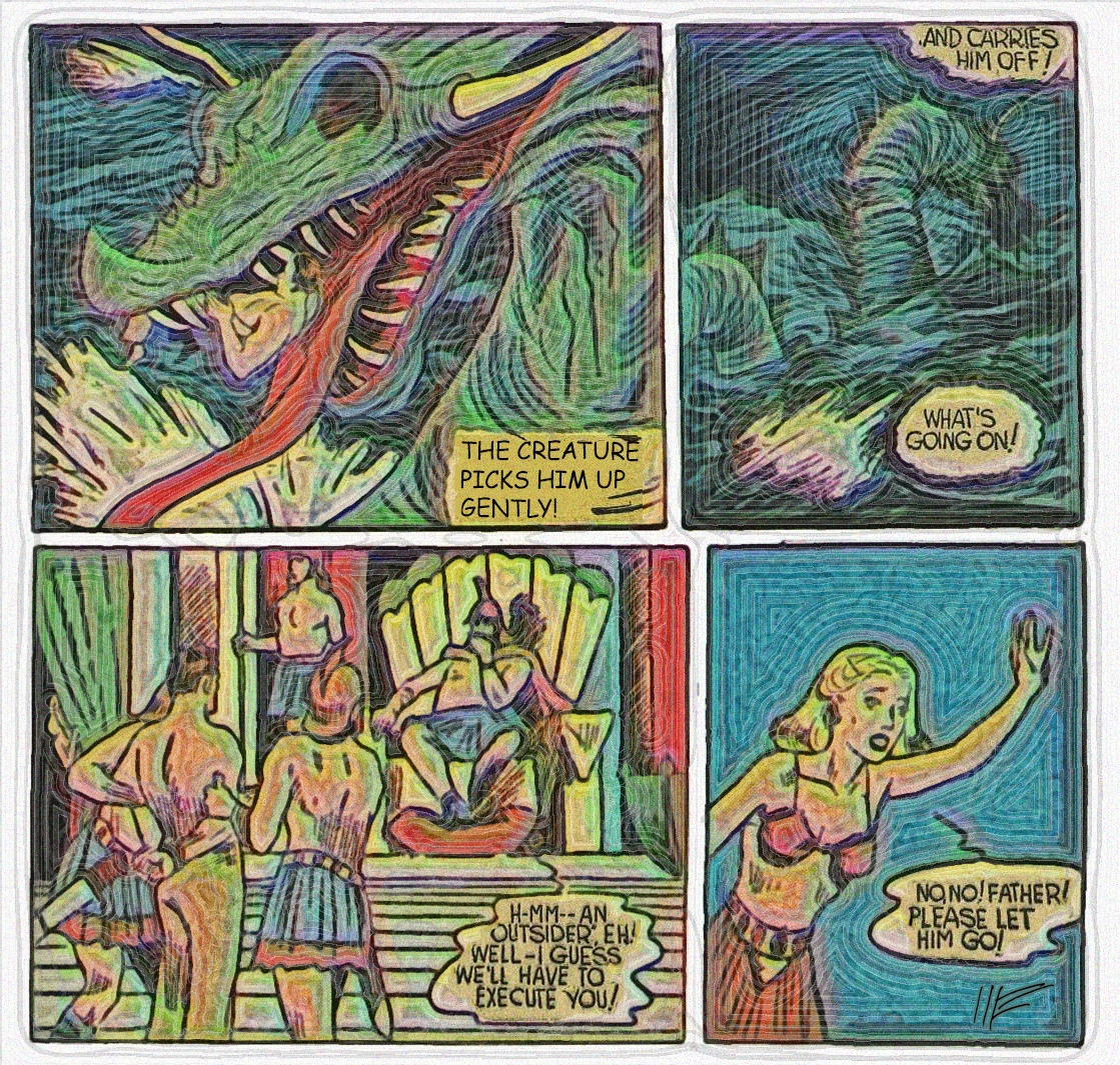
Also from the Internet Archives Comics Collection, a collage of pictures from Centaur Comics' 1942 Amazing Man Comics #22 (Link1). Hero Reef Kincaid, an adventurer and soldier of fortune, takes his 40-foot schooner into a storm to investigate reports of a mysterious sea serpent. Hia boat is swamped and he is captured by the sea serpent, who drags him into the undersea kingdom of Atlantia. The emperor of Atlantia orders Kincaid's execution, but the emperor's beautiful daughter begs her father to spare his life. She gives Kincaid a tour of the city -- but her Atlantian fiance grows jealous and sets out to murder Kincaid. The story is marked "to be continued" -- but it never was.
For maximum effect with my images, click on the image until it is full-size, which may be larger than your computer screen.
Sources:
Link1: archive.org/details/AmazingManComics022
Friday, February 7, 2014
Hazel of Hollywood
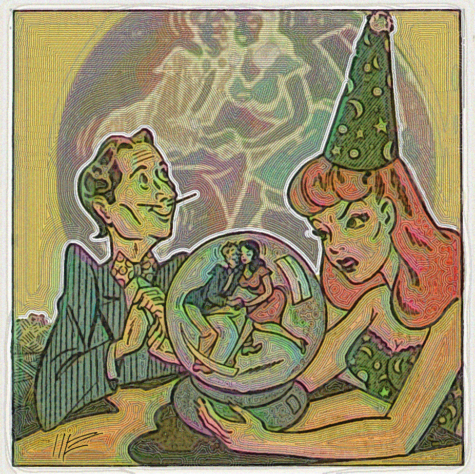
From the Internet Archives Comics Collection, a 1947 Ace Comic titled Four Favorites (Link1), the title frame for a Hazel of Hollywood story, showing a red-headed forties Hollywood bombshell and her studio executive boyfriend (with the pencil-thin mustache and zoot-suit). It's a trivial story in which a meddling fortune-teller threatens to break the pair up. The confident outline drawing is impressive.
For maximum effect with my images, click on the image until it is full-size, which may be larger than your computer screen.
Sources:
Link1: archive.org/details/four-favorites-comics-32
Friday, February 7, 2014
Farm Daughter Announces Lunch
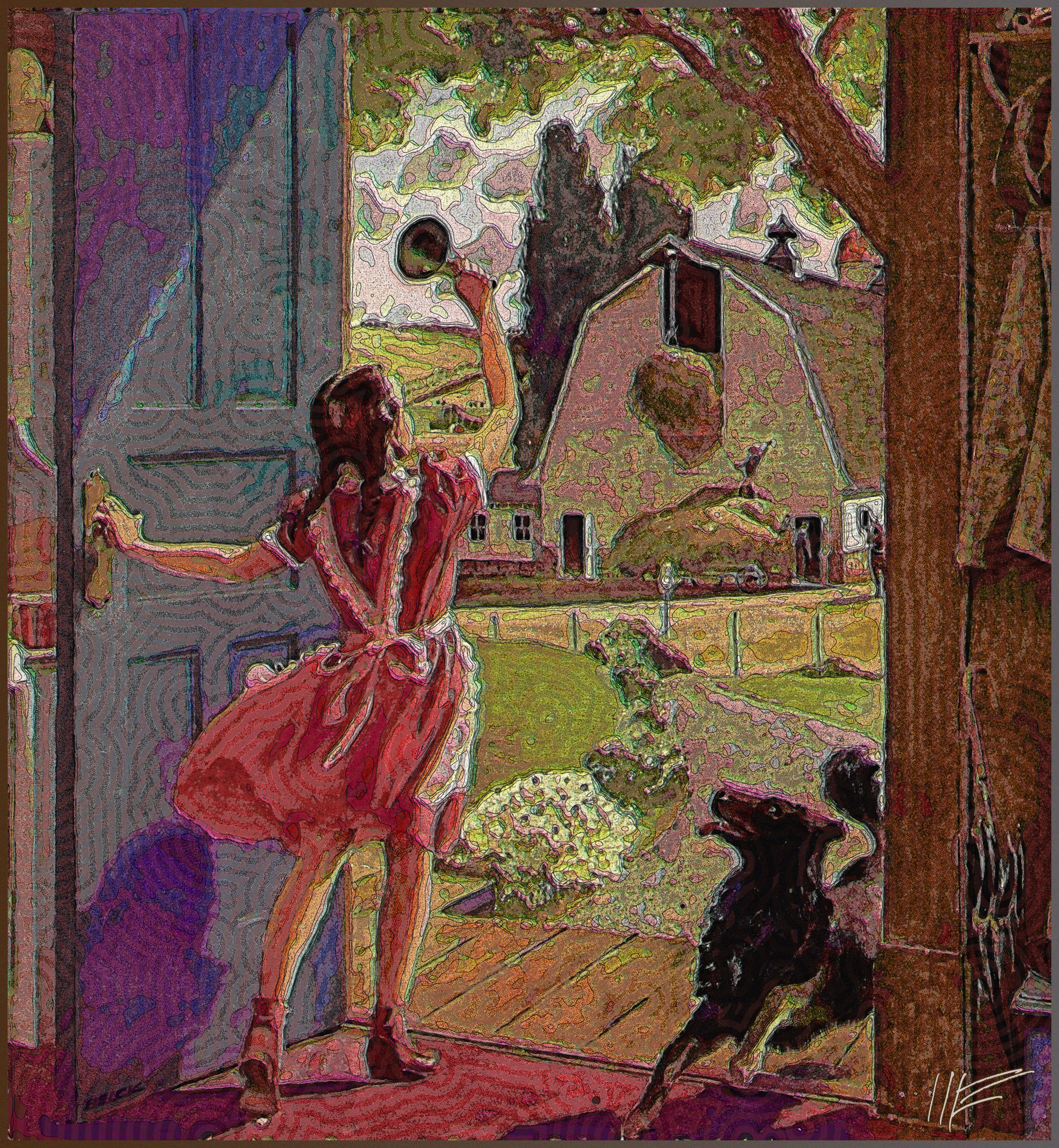
Last one from the Building Technology Heritage Library, the cover illustration of the 1942 Farm Idea Book (Link1). It shows a young girl in a gingham dress ringing a hand bell to announce the day's farm-lunch. In the background three or four farmworkers -- either family or hired hands -- look up hungrily from their chores, but the little dog on the porch beats them all inside. The Building Technology Library uses very high-resolution images; this one is 4964 x 5382 pixels!
For maximum effect with my images, click on the image until it is full-size, which may be larger than your computer screen.
Sources:
Link1: archive.org/details/JohnsManvilleTheFarmIdeaBook0001
Thursday, February 6, 2014
Four Glass Blocks
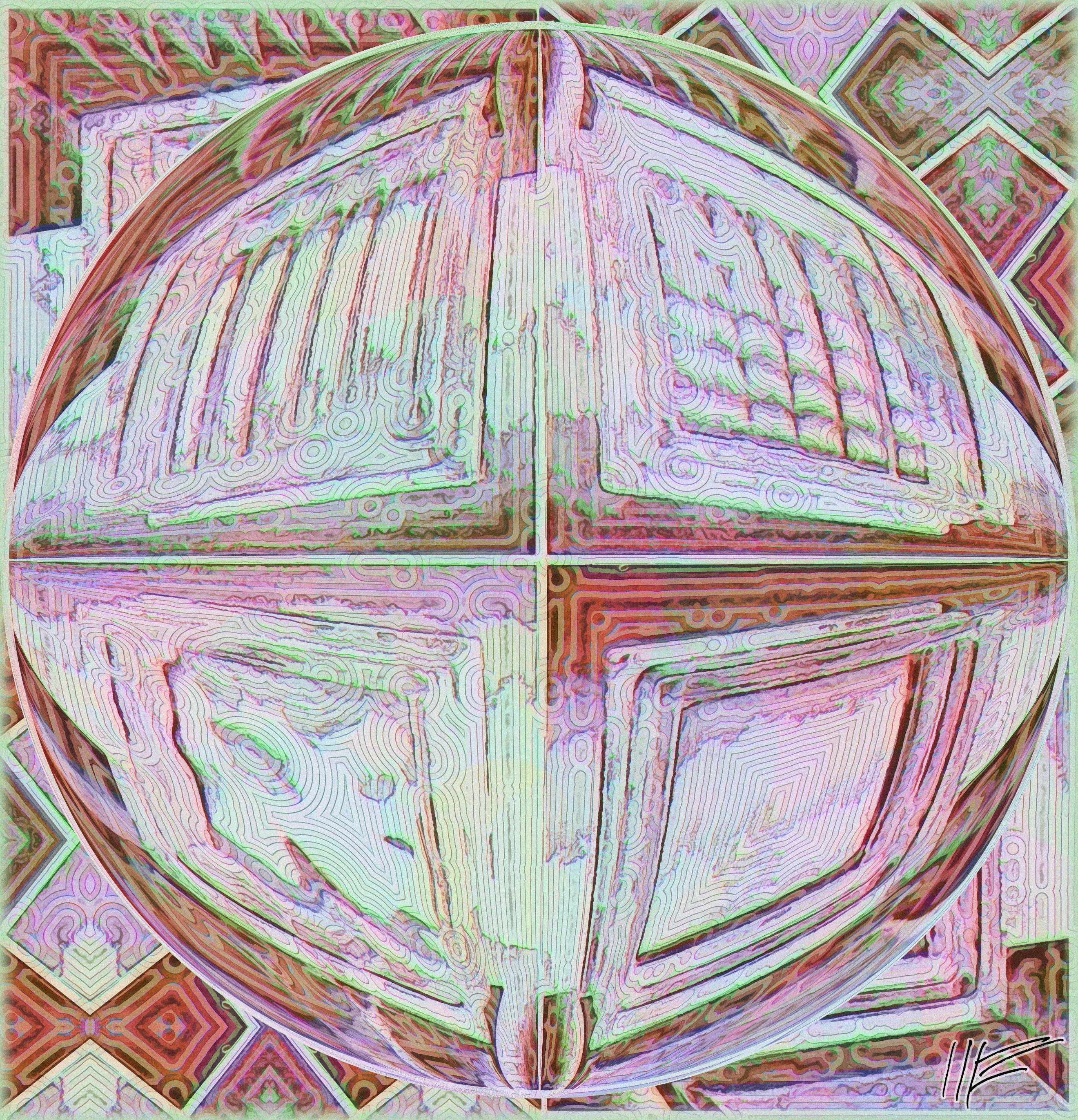
Again from the Building Technology Heritage Library, a composition of four decorative glass block patterns from the 1952 Pittsburgh-Corning Glass Blocks. The designs are, clockwise, from top left, Argus, Vue, Decora, and Argus Parallel Flutes.
For maximum effect with my images, click on the image until it is full-size, which may be larger than your computer screen.
Sources:
Link1: archive.org/details/PittsburghCorningGlassBlocks0001
Wednesday, February 5, 2014
The Dodo: Extinction's Poster Bird
From the Biodiversity Heritage Library, an unusual find. The 1907 Extinct Birds : An Attempt to Unite in One Volume a Short Account of Those Birds which have Become Extinct in Historical Times: That is, Within the Last Six or Seven Hundred Years (Link1) by Walter Rothschild, of the Rothschild banking family. Rothschild classifies the dodo as a pigeon, a judgement that survives today. The dodo became extinct around 1680-1690. Rothschild explains, "The causes of the extermination of this, perhaps the
best known and most talked about of the recently extinct birds, are not far to
seek. The total inability of flight, the heavy slow gait, and the utter fearlessness
from long immunity from enemies, led to a continual slaughter for food by
the sailors and others who came to and dwelt on Mauritius. But the final
cause of the extermination of this and many other birds in the Mascarene
Islands was probably the introduction of pigs, and also of the Ceylon Monkey.
These animals increased enormously in numbers, ran wild in the woods, and
soon destroyed all the eggs and young birds they could find." It's a beautifully printed book.
One wonders how a fabulously wealthy man like Rothschild was able to look around and see the importance of species extinction, while some current fat cats -- I'm thinking of you, Koch Brothers -- spend their money on policies that will only drive more species into extinction.
...In Florida, watching Denver get creamed in Super Bowl. Hope Peyton Manning can make the game exciting...
For maximum effect with my images, click on the image until it is full-size, which may be larger than your computer screen.
Sources:
Link1: archive.org/details/Extinctbirds00Roth
Sunday, February 2, 2014
Lady in Hat
From the Community Library of the Internet Archive, three images from a 1984 issue of the Polish magazine Plomyczek; in the deep background, a linked set of lines and circles in an article on winter sports; before that, an illustration for a children's story with a mitten and a bird; and in the foreground a bare-breasted woman with a hat and a come-hither look.
...Getting ready to leave for Florida trip. Moving a number of images into 2014 Rejects folder.
For maximum effect with my images, click on the image until it is full-size, which may be larger than your computer screen.
Sources:
Link1: archive.org/details/Plomyczek11984
Friday, January 31, 2014
Cobalt Blue Monster

In the foreground, a Frankenstein organism created by assembling various drawings of animal parts in the 1838 Annals and Magazine of Natural History, Including Zoology, Botany,
and Geology (Link1). The resulting chimerical critter (chimera: grotesque monster having disparate parts, especially as depicted in decorative art) is
placed upon a blending of two pen-and-ink illustrations from the 1905 A History of Architecture on the Comparative Method (Link2), specifically one showing English Gothic
architecture and showing the development of arches over the years. Originals were black and white, of course. Blue color was added in one manual step and then as a byproduct of various application of computer filters. Not sure how I feel about this one -- but it sure was fun assembling the pieces -- very relaxing as I got ready for a meeting.
For maximum effect with my images, click on the image until it is full-size, which may be larger than your computer screen.
Sources:
Link1: http://archive.org/details/s7annalsmagazine02londuoft
Link2: archive.org/details/historyofarchite00fletuoft
Wednesday, January 29, 2014
Photographer as Fool
The cover illustration from a 1900 photo catalog, The Art of Photographic Dodging (Link1), showing a photographer dressed in a fool's or harlequin costume. To his left, is one of the catalog's offerings, a celluloid floral border negative. The catalog is from Ilford Papers, a company still doing business supplying inkjet printer paper. The background is an image of a Roman triumphal parade, from a 1641 book, Splendore Dell'Antica e Moderna Roma, turned sideways. Haven't formed the habit yet of including my Signature Logo.
For maximum effect with my images, click on the image until it is full-size, which may be larger than your computer screen.
Sources:
Link1: archive.org/details/gri_33125012911224
Link2: archive.org/details/gri_33125012900797
Sunday, January 26, 2014
Huysmans' 'Alluring Vileness of Debauchery'
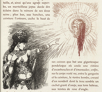
Much of the story of Huysmans Against Nature (Link1) discussed in the last entry is literary and art criticism -- the aesthete protagonist, secluded in his country estate, ponders the relative virtues of writers and artists, ranging all the way from early Latin writers to the most fashionable Parisian painters of the day. One of his favorites was Gustave Moreau; Huysmans went on at great length about Moreau's Apparition, which shows Salome pointing to her vision of the bloody head of John the Baptist. My 2014 interpretation of Lepere's drawing of Salome is on the left; Augusgt Lepere's illustration for the 1913 edition of Against Nature is in the middle; Moreau's original 1876 painting is on the right (Link2). Huysmans wrote at length about Moreau's painting, finally concluding that in Moreau's interpretation, "Salome no longer sprang from biblical traditions, could no longer even be assimilated with the living image of Babylon, the royal Prostitute of the Apocalypse, garbed like her in jewels and purple, and painted like her; for she was not hurled by a fatidical [prophetic] power, by a supreme force, into the alluring vileness of debauchery." (This quote gives the flavor of Huysman's purple prose.) Moreau's painting was the subject of whole exhibition at the Hammer Museum at UCLA. Anyway, Huysmans' eccentric explorations would one day lead him to join a monastery -- quite a journey from decadence. My interpretation of Moreau's work (on the left) is placed upon a background composed of images from the 1891 Fruitland Nurseries Fruit Trees, Evergreens, Roses, etc. for Florida and Coast Belt of Southern States (Link3), specifically palms and roses.
For maximum effect with my images, click on the image until it is full-size, which may be larger than your computer screen.
Sources:
Link1: archive.org/details/gri_33125012235582
Link2: commons.wikimedia.org/wiki/File:The_Apparition_by_Gustave_Moreau,_detail,_1876-1877_-_Fogg_Art_Museum_-_DSC02269.JPG
Link3: https://archive.org/details/fruittreesevergr1891frui
Sunday, January 26, 2014
Decadence Kills A Tortoise
This is a picture illustrating one of the weirdest anecdotes I've ever read. It's from a scan by Los Angeles' Getty Research Institute of the beautifully illustrated 1903A Rebours [Against Nature] (first published 1884) by J.K. Huysmans. The novel is considered the founding novel of the French Decadent Movement. Here's the anecdote illustrated above: this rich young man, enervated (and perhaps syphilitic) from the high life of Paris, moves to a secluded estate to indulge his exquisite sensibilities. He purchases a living tortoise and sends it to a jeweler, ordering him to coat the tortoise's shell in gold, cover it with a rich Oriental pattern, and encrust it with rare gems. The weight of these decorations crushes the tortoise to death. The aesthete notes the death, but expresses no remorse. WTF? The story seems to have something to do with a rebellion against Nauralism. A science fiction blogger offers a sophisticated analysis of the book. Illustrations in this edition are by August Lepere
For maximum effect with my images, click on the image until it is full-size, which may be larger than your computer screen.
Sources:
Link1: archive.org/details/gri_33125012235582
Sunday, January 26, 2014
Mechanical Drawing
Turning to government documents, most of which are in the public domain, here is a diagram from the Bureau of Indian (New Delhi) Standards' 2013 IS 629: Bicycle Hub Assembly, which revises the requirements for building bicycle parts (Link1). I like the technical drawing style; as a young man, my father spent a summer as a pen-and-ink draftsman, drawing plans for a gas station. I took the bicycle hub picture through my usual processing, but then added a polar distortion. I enjoy these highly abstract images, which are very relaxing to work on, with no documentary constraints -- the sky's the limit. Or should I say the imagination is the limit. The background includes another copy of the diagram reversed out and a pattern from a marblized paper book binding, source not recorded.
For maximum effect with my images, click on the image until it is full-size, which may be larger than your computer screen.
Sources:
Link1: archive.org/details/gov.in.is.629.2013
Monday, January 20, 2014
Horrors of World War I
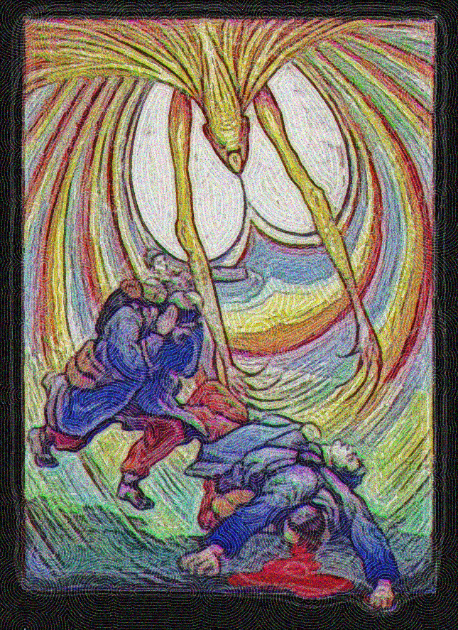
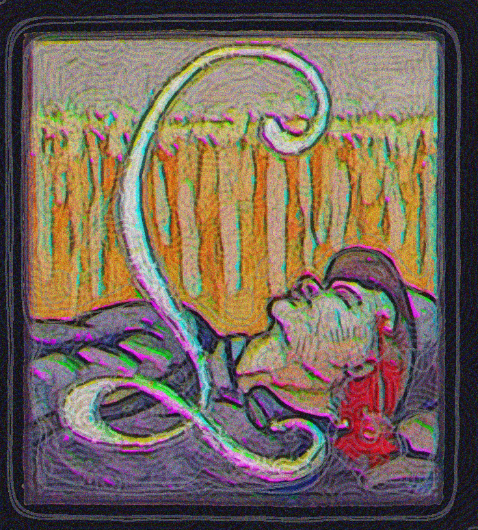
World War I was an awful event. It changed the direction of European culture -- in my view, for the worse. This was 100 years ago, and given copyright law, some sources are just coming into the public domain. Here, from the French national site Gallica, is an illustration from a 1917 illustrated manuscript by Marcel Roche (1890-1959), memorializing his experiences on one day of battle. It is titled 22 Août 1914: Le Combat du Grand-Bailly. Roche wrote and did the illustrations in gouache. He had a friend do calligraphy for the text. The first illustration shows some monstrous imaginary creature reaching out its arms to consume fallen soldiers dressed in the red and blue uniforms of the French army. Roche himself was wounded in that battle. The second illustration shows some poor soul who was apparently killed by a sniper bullet to the head while he was relaxing with a cigar.
For maximum effect with my images, click on the image until it is full-size, which may be larger than your computer screen.
Sources:
Link1: gallica.bnf.fr/ark:/12148/bpt6k990536v
Saturday, January 18, 2014
Rhine Maidens and an Ugly Dwarf
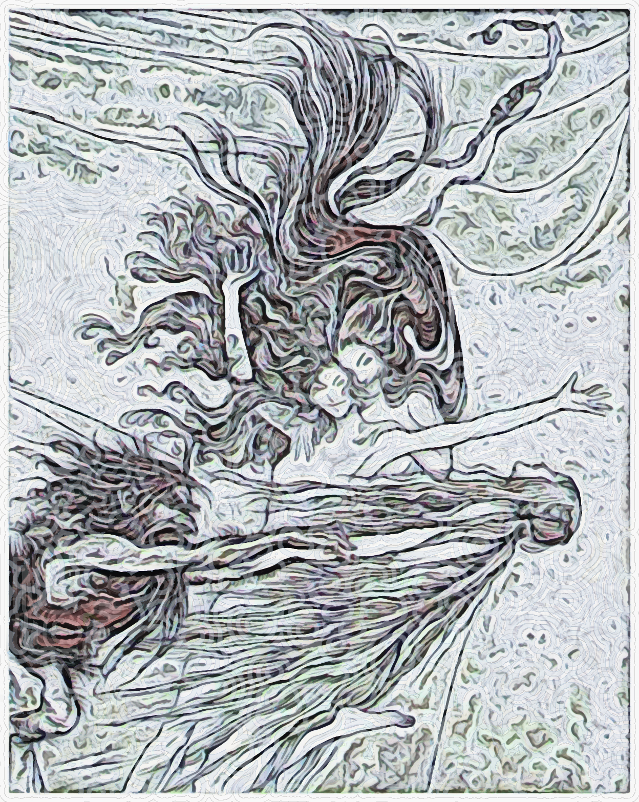
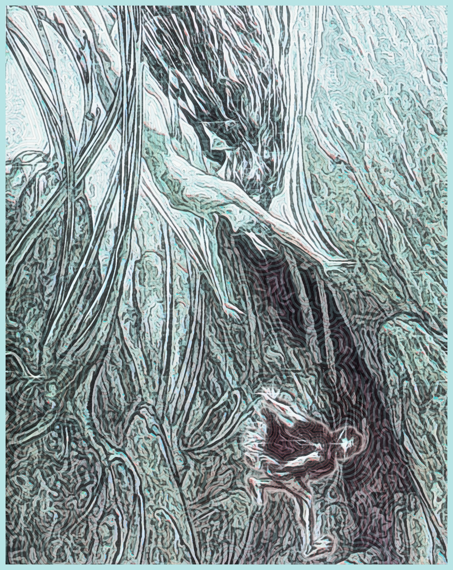
The New York Public Library recently uploaded to the Internet Archive a scanned copy of the 1910 The Rhinegold & the Valkyrie, the librettos of two operas (Link1): Das Rheingold and the Valkyrie, written by Richard Wagner, lavishly illustrated by Arthur Rackham. On the left, an illustration showing the Rhine Maidens, three mermaid-like creatures charged by the Norse Gods with protecting a magic hoard of gold hidden under the Rhine River; the gold can be used to make a ring "which measureless power imparts." The gold is also protected by a spell that say "Only the man who love defies/ Only the man from love who flies/ can learn and master the magic/ that makes a ring of the gold." One day, the three beauties are swimming about, when they come upon Alberich, an ugly, horny dwarf who happens to pass by. The dwarf is entranced by their beauty and woos one after another to their cruel amusement. Finally, frustrated by their seductive tease and the way they elude his grasp, he renounces love and women forever. This fulfills the prophecy that the gold can only be taken by someone who renounces love. Alberich then steals the gold, setting the complex plot in motion. The picture to its right shows Alberich being chased by one of the water sprites as he dives to his cave hideout.
See a 12-minute stretch of the operatic staging at Bayreuth and a 16-minute stretch from the Metropolitan Opera (the action starts after a 7-minute overture).
As an old man with unkempt hair and beard, from whom all trace of youthful beauty has flown, I sympathize with Alberich, the "amorous imp" -- especially living as I do in the Rittenhouse Square/University of Pennsylvania neighborhood, where there are so many beautiful young women.
For maximum effect with my images, click on the image until it is full-size, which may be larger than your computer screen.
Sources:
Link1: http://archive.org/details/rhinegoldvalkyri00wagn
Saturday, January 18, 2014
Eisenstein Drawing and Mathematical Graph
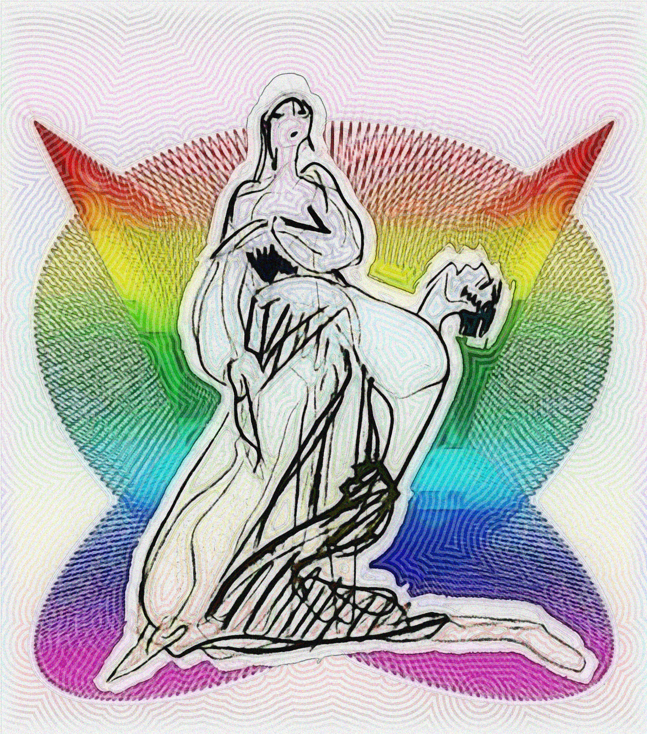
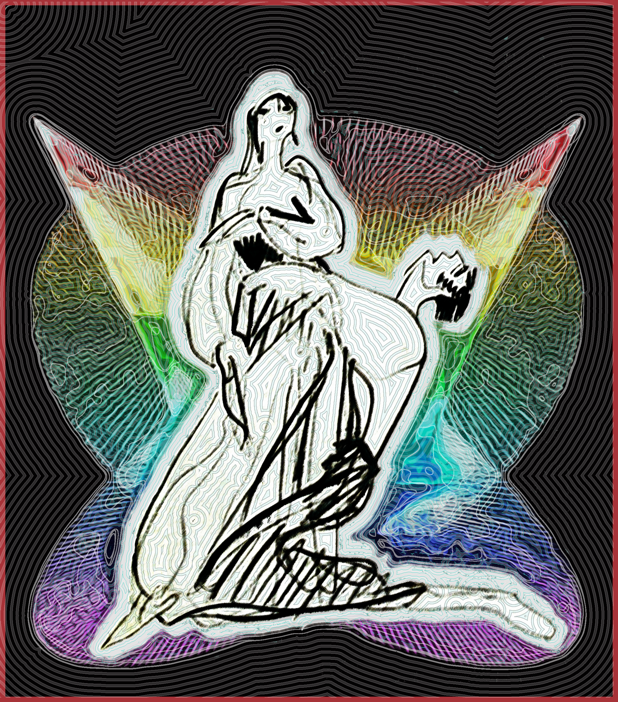
Another Hamid Naderi Yeganeh graph (Link1) from the Aesthetic Appeal collection on Internet Archive. I don't include the equation that produced the graph; it's at the source. Yeganeh's image serves as background for a sketch by Russian film director Sergei Eisenstein's 1959 Notes of a Film Director (Link2). The quick gestural drawing titled "Tragedy" shows a man on his knees howling with heartbreak as he grasps the waist of an aloof, uncaring woman. The book is from the American Public Domain collection. The sketches Eisenstein made for his movies' costumes, scenes, and setting are in the book, showing his quick, direct, fluid drawing style.
Made another version of the picture, on the right, attempting to subdue the rainbow chart.
For maximum effect with my images, click on the image until it is full-size, which may be larger than your computer screen.
Sources:
Link1: archive.org/details/8g5sj6f9
Link2: archive.org/details/notesoffilmdirec00eise
Tuesday, January 14, 2014
Romanian Fata and Mathematical Equation
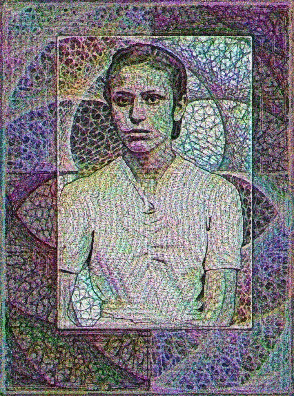

Another combination of two images from two collections. The background of this image comes from the Aesthetic Appeal collection on Internet Archive, which is Iranian computer scientist Hamid Naderi Yeganeh's selection of what he considers the most visually appealing graphs created by his software. Here, a detail of the graph of the equation on the right. The graph is used as a "frame" for a picture from the Flickr Commons Costica Acsinte collection of photographs taken by Costica Acsinte, who ran a photo studio in Romania between 1897 and 1984. The collection notes that the woman's name is Fata.
For maximum effect with my images, click on the image until it is full-size, which may be larger than your computer screen.
Sources:
Link1: archive.org/details/727vhn62
Link2: www.flickr.com/photos/costicaacsinte/11654700095/
Monday, January 13, 2014
Revolution Arts Model II
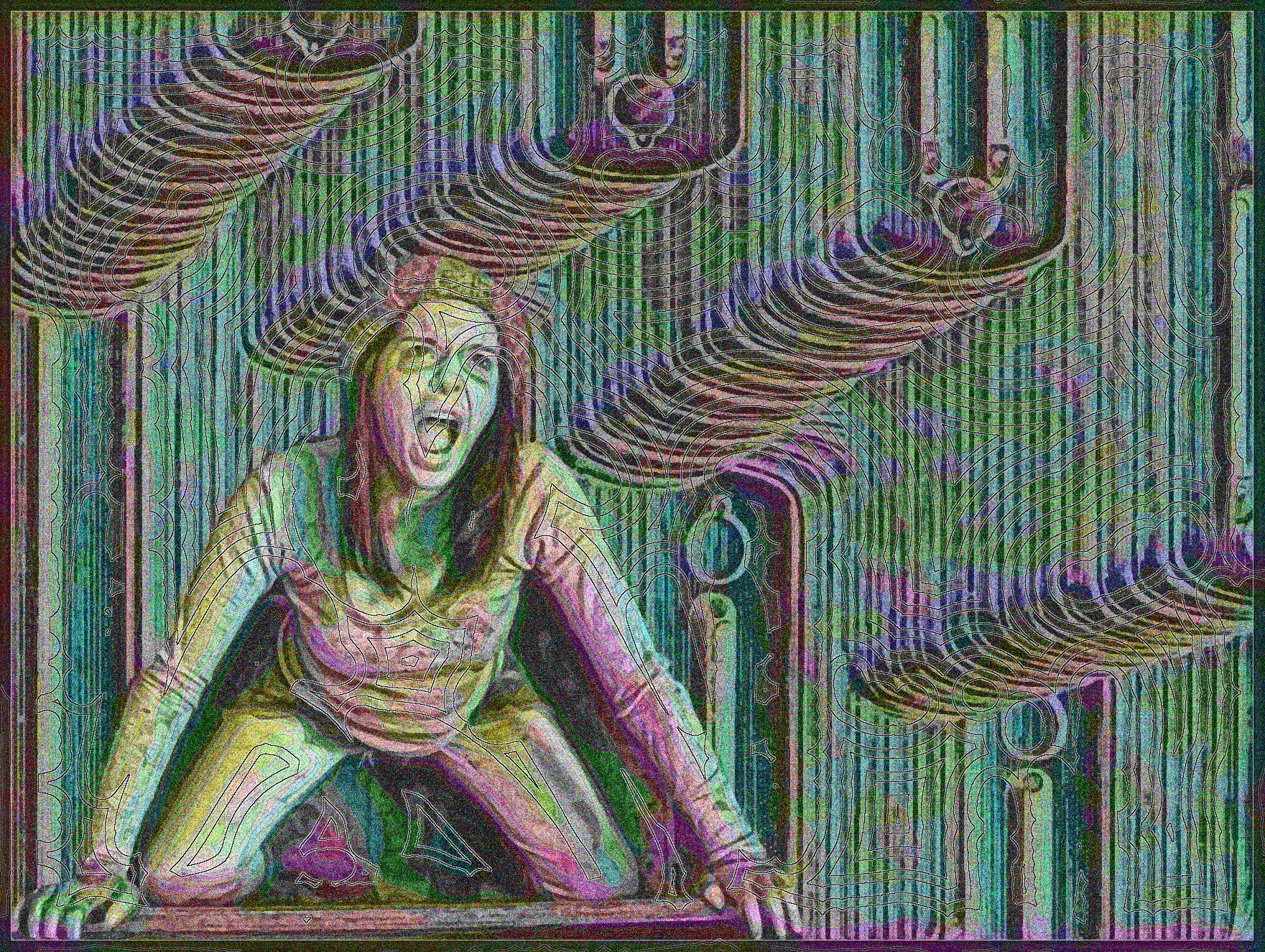
A combination of two images from two collections. From the Building Technology Heritage Library, a collage of different-sized steam and hot-water radiators from Harris Brothers' 1924 Catalog of building supplies (Link1). The catalog copy extolls the radiators' "plain design, without old-fashioned ornamentation which covered imperfect careless castings." I remember painting old radiators in various rented apartments during my student days, and there was something sad about the fancy designs covered by half a century of sloppy paint jobs. The radiator piece is background for an image from the Community Library 2012 edition of Revolution Arts magazine (Link2): one of model and photographer Lauri Garcia Jones' photos from a set of pictures that seem to show people after some unspecified disaster. (Incidentally, Ms. Jones graciously responded to my January 10 query and agreed to my use of her pictures as long as I included "original credit" -- and spelled her name correctly).
Revolution Arts Models I
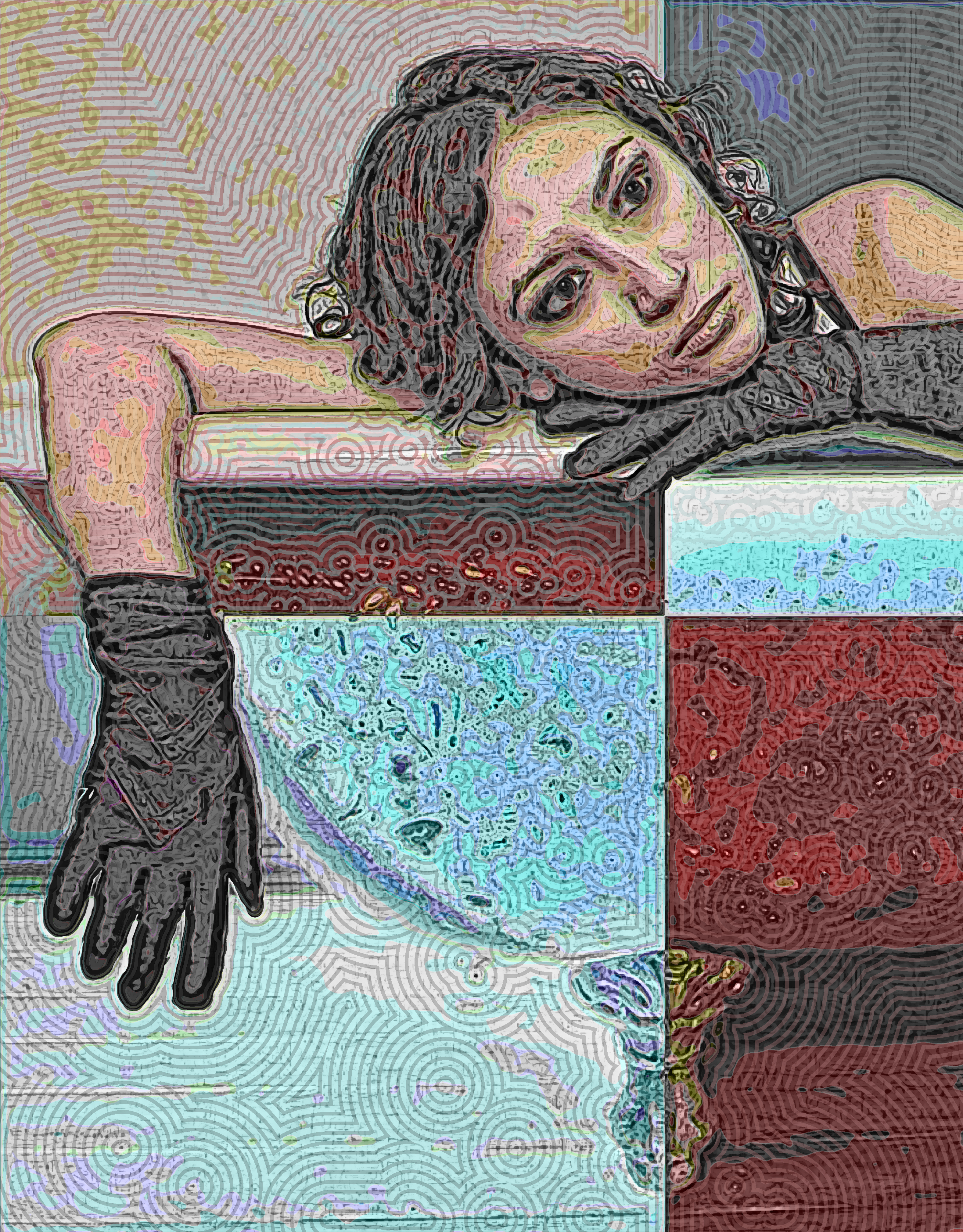

One of the pleasures of exploring the Internet Archive Community Library collection is a slick, high-production-value online magazine called Revolution Arts, here the 2012 edition #34 (Link1). One of their features is Revolution Arts Models, "a showcase for photographers, models, make up artists and fashion designers." Pix of pretty young women like in the fashion magazines, sure -- but since these are the models themselves offering their portfolios, there is room for individuality. Each Revolution Arts portfolio includes website information, so you can find out about the model. Here, for instance, is a picture from the online portfolio of Lauri Garcia Jones, a Texas model and photographer who offered up a set of pictures that seem to be set in some post-apocalyptic after-the-disaster world. Jones is a mother of three and a part of the San Antonio art scene. She also participated in presenting the poster on the right (Link2)-- the very antithesis of the typical "pretty young woman" esthetic.
Note: Since Ms. Jones is presumably still working and selling her photographs, I contacted her using her website's "Contact Me" form and asked permission to use her work in this way. She graciously responded, giving me permission as long as I provided her name for "original credit" -- and spelled it right, which I didn't do the first time.
For maximum effect with my images, click on the image until it is full-size, which may be larger than your computer screen.
Sources:
Link1: archive.org/details/revolutionart_issue_34
Link2: laurigarciajones.wordpress.com/page/2/
Friday, January 10, 2014
Lysergic Acid (LSD) Cookbook
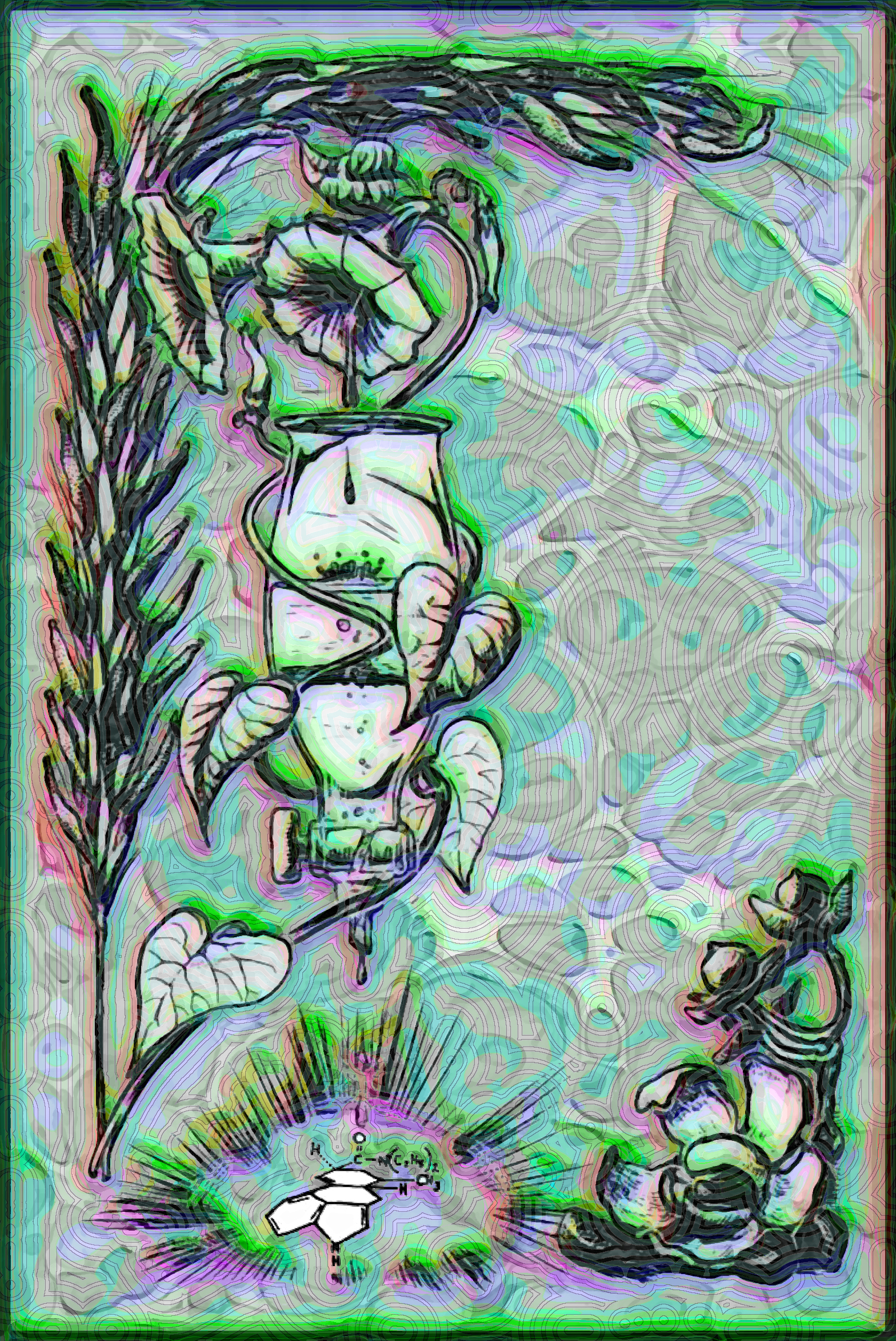
Again from the Internet ArchiveCommunity Library collection, the cover illustration to the Book of Acid: Easy to Follow Instructions for Making Organic LSD from Legal and Available Materials, a 1975 manual to making the hallucinogenic LSD-25 from the seeds of various plants (Morning Glory or Baby Hawaiian Wood Rose) or from various molds and fungi. The cover shows a drawing of morning glory vines and laboratory apparatus. A note in the Internet Archive entry says "The organic reactions in this book are quite dangerous so, for the novice please do not attempt it."
For maximum effect with my images, click on the image until it is full-size, which may be larger than your computer screen.
Sources:
Link1: archive.org/details/BookOfAcid
Thursday, January 9, 2014
Early L.Ron Hubbard Cover
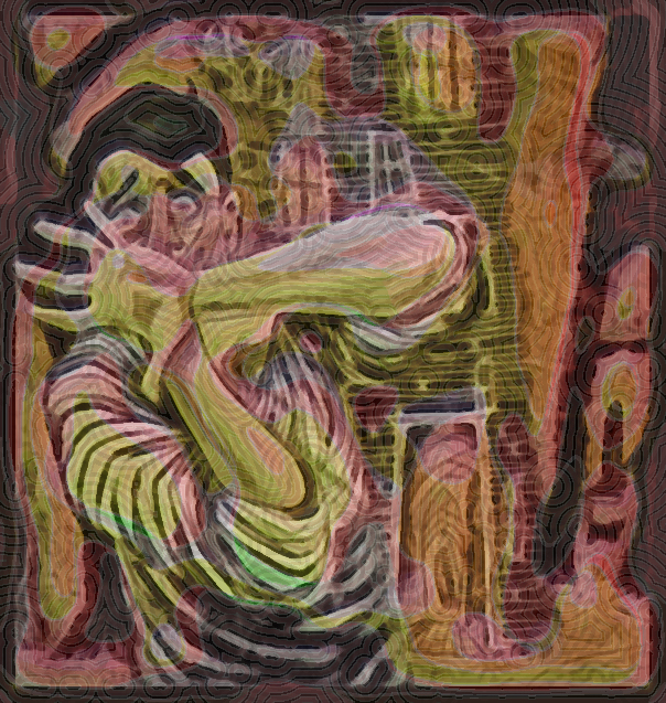
Turning now the Community Library, a much wilder and diverse library, I find a cover of one of L. Ron Hubbard's early science fiction works, a novella called Fear, first published in a magazine in 1940 and later (1954) reprinted in book form.. Hubbard went on to form Scientology, a scary organization (in my opinion).
For maximum effect with my images, click on the image until it is full-size, which may be larger than your computer screen.
Sources:
Link1: archive.org/details/Galaxy_Novel_Number_29_Fear_
Wednesday, January 8, 2014
Butterfly & Constructive Anatomy
White figures in the foreground are a pair of torsos (top) and a clenched fist (bottom) from George Bridgman's 1920 book of drawing techniques, Constructive Anatomy (Link1). Those are placed over three copies of a drawing of an Atis Butterfly from the 1832 The Book of Butterflies, Sphinxes and Moths.
...
Opening went well. No sales.
For maximum effect with my images, click on the image until it is full-size, which may be larger than your computer screen.
Sources:
Link1: archive.org/details/constructiveanat00briduoft
Link2: archive.org/details/bookofbutterflie01browuoft
Monday, January 6, 2014
Cover of Spanish Book of Spells
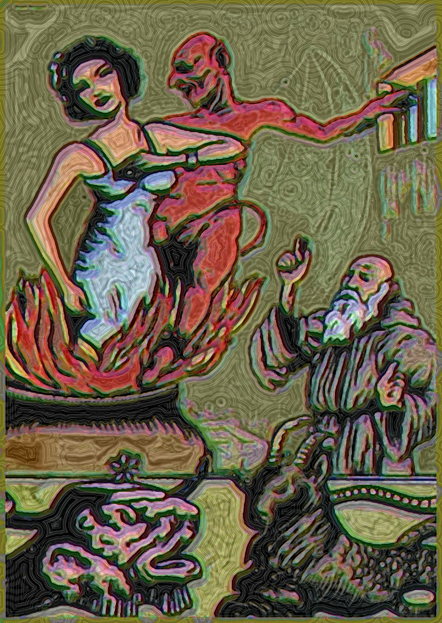
From the Internet Archive Canadian library collection, the cover of an undated (probably early 20th-century) pulp edition of El libro de San Cipriano (Link1), a collection of magic spells, talismans, and amulets attributed -- almost certainly falsely -- to Saint Cyprian of Antioch (Turkey), the pagan sorcerer who attempted to seduce the Christian virgin Justina but instead was converted to Christianity. The two were tortured and martyred by Diocletian. The first known edition appeared in 1849; this scan is from the University of Toronto. Much woo-woo about this book. Some bookstores keep it chained in a box. Legend has it that if you read the book from back to front, the devil will appear. Anyway, this cover pretty much has all the elements for a popular best-seller: a curvaceous damsel in a blue dress being burned by a red-skinned devil while a white-haired monk prays and two infernal creatures stand by. Or something like that. I don't believe in any of it -- but you won't catch me reading it from back to front because the human mind (including my own Skeptical Humanist brain) is so suggestible to these old, old scare stories.
For maximum effect with my images, click on the image until it is full-size, which may be larger than your computer screen.
Sources:
Link1: archive.org/details/ellibrodesancipr00surf
Saturday, January 4, 2014
Starfish, Dancers, Chicken
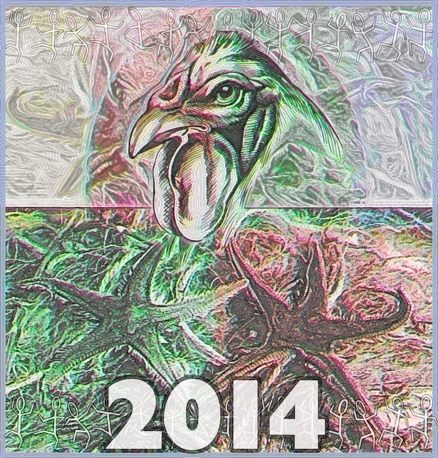
Switching over to Internet Archives Americana text collection, I put together a drawing of the head of a chicken from the 1921 Book of Poultry (Link1), superimposed on an image of seafloor starfish from a 2004 issue of Novapex, a Belgian magazine on mollusks and seashells (Link2). At top and bottom are dancing figures from a 1994 symbol font called DANCEMAN.
For maximum effect with my images, click on the image until it is full-size, which may be larger than your computer screen.
Sources:
Link1: archive.org/details/bookofpoultry00mcgr
Link2: archive.org/details/novapextrimestri52soci
Wednesday, January 1, 2014
To contact Philly-Bob, email me at bobmoore [at symbol] pobox.com (of course, replace "[at symbol]" with "@"].
Masthead Portrait by Andy Hoffmann, 2014